
Fit To Scale. My site is now responsive.
The more I work with flexible images & grids and media queries, the more I appreciate what can be achieved. Any apprehension I may have had about whether or not a responsive approach would harmonize with my design sensibilities and Paravel’s workflow was erased while working on the redesign of The Do Lectures website.
We didn’t have to overhaul our process, were able to stay on budget, and ensured that the site hierarchy remained intact all the way from desktop down to mobile device views. I had such a positive experience on the project that I decided to take what I learned and the opinions I formed to this site for an update. It’s been almost a year since Ethan Marcotte’s watershed A List Apart article on Responsive Web Design, and the horizontal scrollbar that showed when my site was viewed on my wife’s laptop has pained me ever since.
21 top tools for responsive web design. Responsive design : définition, fonctionnement, ressources et tutoriels « Design Spartan : Graphisme, Webdesign, Digital painting, Illustration… Si vous vous intéressez de près ou de loin au webdesign ou à l’intégration, vous n’avez pas pu échapper au dernier terme à la mode : le “responsive web design”.
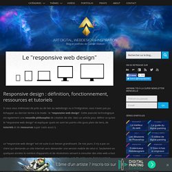
Cette avancée technologique est également une nouvelle philosophie de création de site. Voici un article pour définir ce qu’est le “responsive web design” et expliquer quels en sont les points-clés (puis plein de liens, de tutoriels et de ressources super cools aussi !). Le “responsive web design” est né suite à un besoin grandissant. De nos jours, il n’y a pas un client qui demande un site Internet sans demander une version mobile de celui-ci.