
Type classifications are useful, but the common ones are not. This is an article I wrote for the publication about the conference Research in Graphic Design at the Academy of Fine Arts Kattowice where I gave a talk on the subject in January 2012.

Please excuse the lack of illustrations. I will try to add some later, but usually those are empty promises as you can see in other posts on this site. Estimated reading time: 16 minutes It is a recurring phenomenon that we tend to sort what comes in large amounts to be able to grasp it, for quicker reference, and to find it back more easily. Once organized, you don’t have to look at everything all the time but only consult the parts of your current interest.
Any categorization covers three aspects: 1. sorting in (this is what scholars and historians do, also type manufacturers), 2. reference (educating) and 3. taking out or finding back (this is what the user usually does). What happened? Assigning names to typefaces and classifying them is a rather new occurrence in our 560 years of type. 1. 2. On Choosing Type. First Principles Typography is not a science.

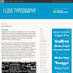
Typography is an art. There are those who’d like to ‘scientificize’; those who believe that a large enough sample of data will somehow elicit good typography. However, this sausage-machine mentality will only ever produce sausages. That typography and choosing type is not a science trammeled by axioms and rules is a cause to rejoice. Before we get to the nitty-gritty of choosing type, let’s briefly talk about responsibility. If you’ve understood the above two paragraphs, then you’ll know that what follows is not a set of rules, but rather a list of guiding principles. Sans or Serif? In my opinion, a lot of time is wasted attempting to prove that one is better than the other for setting extended text.
Rather than write another ten paragraphs on this topic, I’ll simply say that we read most easily that which we are most familiar with. Guideline One: honour content This, of course, should be every typographer’s mantra. Guideline Two: read it. How To Choose The Right Face For A Beautiful Body. Advertisement What is it that makes a typeface into a text font, instead of a font for larger sizes?

The answer differs slightly, depending on whether one aims for print or Web-based environments. Nevertheless, there are certain features that most good text faces have in common. Familiarity with these helps to select the right fonts for a given project. This article presents a few criteria to help the process along. Some of today’s most successful typefaces were designed to excel in very specific areas of use: Frutiger grew out of airport signage, Georgia and Verdana were among the first mass-market fonts created for on screen reading, FF Meta was conceived as a telephone book face, and even the Stalwart Times New Roman was tailored for the pages of the London Newspaper The Times.
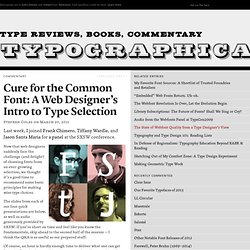
Features Of A Good Text Typeface The features outlined in this article are those that type designers keep in mind while developing new typefaces. 1. 2. In her book Thinking with Type, Ellen Lupton writes: 4. 5. “Cure for the Common Font” — A Web Designer’s Introduction to Typeface Selection. Now that web designers suddenly face the challenge (and delight) of choosing fonts from an ever-growing selection, we thought it’s a good time to recommend some basic principles for making wise type choices.

The slides from each of our four quick presentations are below, as well as audio generously provided by SXSW. If you’re short on time and feel like you know the fundamentals, skip ahead to the second half of the session — I think the Q&A is as useful as our prepared stuff. Of course, an hour is hardly enough time to deliver what one can get from the first day in a good Type 1 course, and as I listen to the audio I cringe at all the crap I missed or said poorly, but I think we did a decent job of introducing some concepts that will launch young designers more confidently into the new typographic web.
Slides Audio Or view the slides at full screen to autoplay the audio. Related Links Recommended Books Webfont Providers Typefaces Used and Mentioned Our Favorite Typefaces of the Moment. The Anatomy of Type. Typography for Lawyers.