

Responsive Web Design. The English architect Christopher Wren once quipped that his chosen field “aims for Eternity,” and there’s something appealing about that formula: Unlike the web, which often feels like aiming for next week, architecture is a discipline very much defined by its permanence.
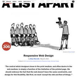
Article Continues Below A building’s foundation defines its footprint, which defines its frame, which shapes the facade. Each phase of the architectural process is more immutable, more unchanging than the last. Creative decisions quite literally shape a physical space, defining the way in which people move through its confines for decades or even centuries. Working on the web, however, is a wholly different matter. But the landscape is shifting, perhaps more quickly than we might like. FancyBox 2 Responsive Lightbox Download. Responsive web design. If you’ve been working in the web design field for the past couple of years you should know that designing a fixed interface for a widescreen computer is not enough.

Most of the clients you’ll be dealing with from now are going to request that their site is not only desktop-compliant but is also optimized for smartphones and tablets. This issue presents the necessity of working with different screen resolutions in order to guarantee that a website looks good in all sorts of devices. But if the devices’ production continues at the same speed that it has for the past couple of years, the amount of screen resolutions and formats that designers will have to deal with is going to become unbearable. Designing for Retina Display. The devices on which the web can be displayed increases everyday.

Rather recently Apple released its new set of Macbook Pros with retina display, so called because at a normal viewing distance users wont be able to see any pixels. Designing for such a high resolution however, can become a little more tricky than you would expect. Over the years the resolution of your average monitor has gotten bigger and bigger. If you’ve upgraded your monitor to a larger resolution but with the same physical monitor size you will probably notice that the elements (windows, icons, etc) will have reduced in size. That’s because the pixels are smaller, so if the window was 180 pixels wide, it now takes up 180 smaller pixels.
Foundation Icons Fonts - ZURB Playground - ZURB.com. Settings heart star plus minus checkmark remove mail calendar page tools globe cloud error right-arrow left-arrow up-arrow down-arrow trash add-doc edit lock unlock refresh paper-clip video photo graph idea mic cart address-book compass flag location clock folder inbox website smiley search phone.
Tips, Resources and Patterns for Responsive Web Design. Maintaining Image Hierarchy And Aspect Ratio In Responsive Design. For the last few weeks we’ve been talking about images in the context of responsive design.
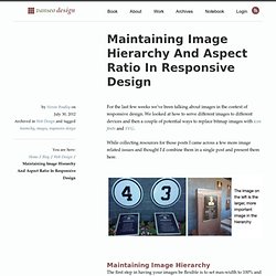
We looked at how to serve different images to different devices and then a couple of potential ways to replace bitmap images with icon fonts and SVG. While collecting resources for those posts I came across a few more image related issues and thought I’d combine them in a single post and present them here. Maintaining Image Hierarchy The first step in having your images be flexible is to set max-width to 100% and let the height of the image adjust. This maintains the aspect ratio of the image, but there’s a got’cha that’s not immediately obvious.
But because of this banner image’s wider aspect ratio, when it’s squeezed down to fit a narrow column it loses its position in the visual hierarchy of the page. Because adaptability is based on width, horizontal images need to scale more than vertical images. Andy’s solution involves some css and some thought about what’s the important part of the image. How to Build a Responsive Thumbnail Gallery. Recently I set out to build a responsive thumbnail gallery.
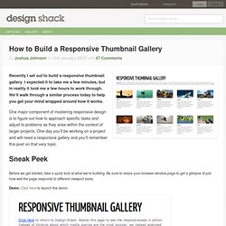
I expected it to take me a few minutes, but in reality it took me a few hours to work through. We’ll walk through a similar process today to help you get your mind wrapped around how it works. One major component of mastering responsive design is to figure out how to approach specific tasks and adjust to problems as they arise within the context of larger projects. ReView. The Responsive Viewport. Installation Include ReView.js in the head of your HTML document, just after your viewport meta tag.
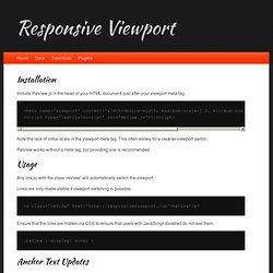
Note the lack of initial-scale in the viewport meta tag. This often allows for a cleaner viewport switch. ReView works without a meta tag, but providing one is recommended. Usage Any link(s) with the class ‘reView’ will automatically switch the viewport. Links are only made visible if viewport switching is possible. How to Use Responsive Web Design to Support Old Browsers. In my previous article, Is Internet Explorer Development Really a Waste of Time?

, I hinted that it’s possible to support older browsers without significant development effort. In this tutorial, we’re going to create a simple web page which works in all modern browsers as well as IE8, IE7, IE6 and possibly earlier versions. Before we start, please note that we’re not aiming for pixel perfection or identical functionality. That will never be possible, so don’t even bother. However, we’re NOT going spend any time testing, fixing or hacking IE bugs and the page will still work. The Objective. Creating a Mobile-First Responsive Web Design. Introduction We're going to walk through how to create an adaptive web experience that's designed mobile-first.
This article and demo will go over the following: Style Tiles.