
Different CSS3 Box Shadows Effects. Different CSS3 Box Shadows Effects by PaulUnd.
These effects were first designed in Photoshop and then implemented using CSS3. The main key here is the use of box-shadow property. Text Input Effects. CSS Gradient Animator. 40 CSS3 Button Tutorials For Designers. 90+ Useful jQuery CSS3 Image Hover Effects Tutorials. jQuery Mouseover is really very attractive for visitor to see your blog.

There are more style of jquery mouse-over effect such as jquery popup, jquery mouseover event, jquery on mouseover, jquery mouseover toolkit.etc. It is really useful tooltip jquery plugin can help you create high quality professional web design. Some effect on jquery image effect when you take mouse over the button or images the active effects will happen, it similar using flash design. But now we only using query or css to make beautiful action effect and more compatible. 40 CSS3 button examples with effects & animations. Entity Conversion Calculator. HTML Entities. CSS3: Animations vs. Transitions. In CSS, you have two techniques for visualizing change that are competing for your attention: Animations & Transitions.
In this article, let's examine the similarities and differences between them so that you can know when to use which. To make the most of this article, it would be helpful for you to be familiar with using both animations and transitions. If you haven't had a chance to get your hands dirty with them, the Creating a Simple CSS Animation and Looking at CSS3 Transitions tutorials will help you get started. Similarities From a distance, both animations and transitions are very similar. Animated Books with CSS 3D Transforms - Demo 1. House of Buttons. Design in the browser with web fonts and real content. By Aral Balkan One of the iconic representations of the digital age is an image of the ubiquitous digital screen, stereotypically represented as a grid of brightly-lit pixels.
This, like many of our other traditional perceptions of digital and interactive experiences, are either changing or being replaced altogether as we enter the post-PC era. New devices have such high resolution displays that individual pixels become imperceptibly small. Other devices, like the Amazon Kindle, eschew pixels altogether — opting to use electronic ink. These new devices are radically transforming what is possible in digital visual design and this has radical implications for digital typography. The death of the pixel leaves you with a flowing, magazine-quality canvas to design for. 6 Methods For Vertical Centering With CSS. Centering elements vertically with css is something that often gives designers trouble.

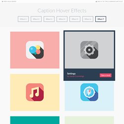
There are however a variety of methods for vertical centering and each is fairly easy to use. Today I want to present 6 of those methods. I’ve usually skipped over the topic of vertical centering, since there are some good posts already out there that are easy enough to find, but recently Bikram commented requesting a tutorial on vertically centering so I thought why not. Pure. Caption Hover Effects - Demo 7. Previous Demo Back to the Codrops Article.
Uso de “media queries” (CSS3) en la creación de páginas web. La creciente utilización de pantallas de PC de gran tamaño y la extensión del uso de internet en los móviles obliga a los webmasters a ser capaces de crear páginas webs que se muestren correctamente y sean funcionales en cualquiera de los dispositivos que sean visualizadas.
Hasta hace unos pocos años, esto sólo era posible en la práctica con el uso de estructuras “fluidas” (usando porcentajes para definir el ancho de la web respecto a la pantalla), pero con la creciente aceptación por los navegadores de CSS3, ya es viable en la práctica el uso de una novedosa técnica: las “media queries”. Hover.css - A collection of CSS3 powered hover effects. All Hover.css effects make use of a single element (with the help of some pseudo-elements where necessary), are self contained so you can easily copy and paste them, and come in CSS, Sass, and LESS flavours.
Many effects use CSS3 features such as transitions, transforms and animations. Old browsers that don't support these features may need some extra attention to be certain a fallback hover effect is still in place. / tapety na Plochu. Wallpapers in. CSS3 Transform to Matrix Filter converter. This is the hardest of all the transform functions to understand unless you are mathematically gifted.
However, for those who are stubborn, geeky, or both, a brief explanation follows. If you don't undertand everything below, don't fret — you'll probably never use this function. This function is almost the direct equivalent to Microsoft's Matrix Filter. These first four values, a , c , b and d , correspond to the first four values of Microsoft Matrix Filter, M11 , M12 , M21 and M22 .
In other words, this statement transform: matrix(1, 2, 3, 4, 0, 0); is the same as this statement: filter: progid:DXImageTransform.Microsoft.Matrix( M11=1, M12=3, M21=2, M22=4, SizingMethod='auto expand'); Note that c and b are out of order. Webflow CSS Playground. Hongkiat HTML5 / CSS3. CSS Almanac. The Shapes of CSS. Learn Development at Frontend Masters CSS is capable of making all sorts of shapes.
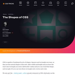
Squares and rectangles are easy, as they are the natural shapes of the web. Add a width and height and you have the exact size rectangle you need. Add border-radius and you can round that shape, and enough of it you can turn those rectangles into circles and ovals. We also get the ::before and ::after pseudo elements in CSS, which give us the potential of two more shapes we can add to the original element. Square Rectangle Circle Oval. Creative Link Effects. An inspirational collection of experimental link effects mostly using transitions on pseudo-elements. View demo Download source Today we’d like to share some experimental and creative link effects with you. The idea is to use pseudo-elements and animate them to create a subtle and modern effect. In the examples we are using hover transitions, but you could also imagine these effects on click or as an initial animation.
Please note that pseudo-element transitions don’t work in every browser. In most cases the HTML is simply a nav with some anchors: