d3.js. JavaScript Tutorial. Where are the Visualization Tools? I got several requests in the last few days about tools for doing visualization and visual analytics. Looking around, I don’t see a lot of good, affordable (or free) visualization software. There are lots of papers, but few of those programs are available. And those that are often are of very low quality, very limited in their functionality, and are not being maintained. Please help me collect links to visualization tools that let people with data experience that visualization magic. There is a demand for visualization software; I was reminded of this when the Parallel Sets were mentioned on a BBC website without even a link, and I kept (and keep) getting emails from people wanting to try it out. We’re still working on releasing the program by the end of the month, and things are looking good so far.
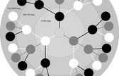
One commercial program that comes to mind, of course, is Tableau. What comes closest to Tableau in terms of free software is Chris Weaver’s Improvise. Mondrian. What else is there? Human Development Index (HDI) Tree. Protovis. Protovis composes custom views of data with simple marks such as bars and dots. Unlike low-level graphics libraries that quickly become tedious for visualization, Protovis defines marks through dynamic properties that encode data, allowing inheritance, scales and layouts to simplify construction. Protovis is free and open-source, provided under the BSD License.
It uses JavaScript and SVG for web-native visualizations; no plugin required (though you will need a modern web browser)! Although programming experience is helpful, Protovis is mostly declarative and designed to be learned by example. Protovis is no longer under active development.The final release of Protovis was v3.3.1 (4.7 MB). The Protovis team is now developing a new visualization library, D3.js, with improved support for animation and interaction. D3 builds on many of the concepts in Protovis; for more details, please read the introduction and browse the examples.
Updates May 28, 2010 - ZOMG! Getting Started. A Protovis Primer, Part 1. Protovis is a very powerful visualization toolkit. Part of what makes it special is that it is written in JavaScript and runs in the browser without the need for any plugins. Its clever use of JavaScript’s language features makes it very elegant, but it can also be confusing to people who are not familiar with functional programming concepts and the finer points of JavaScript. This multi-part tutorial shows how to create a visualization (my interactive Presidents Chart) in Protovis, and explains the concepts that are involved along the way.
This introduction is based on my experiences with using Protovis in my Visualization and Visual Communication class earlier this spring. This has grown from being a single article into several parts (and is still expanding). Protovis requires a modern browser, which means any recent version of Safari, Chrome, FireFox, or Opera. A Simple Example The following code creates this chart: Let’s look at this line by line. Function Chaining Marks Bar Layout. 37 Data-ish Blogs You Should Know About. You might not know it, but there are actually a ton of data and visualization blogs out there. I'm a bit of a feed addict subscribing to just about anything with a chart or a mention of statistics on it (and naturally have to do some feed-cleaning every now and then).
In a follow up to my short list last year, here are the data-ish blogs, some old and some new, that continue to post interesting stuff. Data and Statistics By the Numbers - Column from The New York Times visual Op-ed columnist, Charles Blow, who also used to be NYT's graphics director.Data Mining - Matthew Hurst, scientist at Microsoft's MSN, also the co-creator of BlogPulse.Statistical Modeling - We might disagree on certain things, but Andrew's blog is one of the few active pure statistics blogs.The Numbers Guy - Data-minded reporting from Carl Bialik of the Wall Street Journal.Basketball Geek - Like statistical analysis and basketball? Statistical/Analytical Visualization Maps Design & Infographics Others Worth Noting. Information Is Beautiful | Ideas, issues, knowledge, data - visualized! I Love Charts.