
SSofML9-700x2430. Refugee crisis exposes deep divide in Europe. Queen Elizabeth II's reign: how do other monarchs compare? A Closer Look at the Different Occupations - Visual Cinnamon. So bunt sind Berlins Kieze - Migranten machen den Mauerverlauf sichtbar. Geben Sie Ihre Adresse ein Die Adresse wurde nicht gefunden Mitte Friedrichshain Lichtenberg Prenzlauer Berg Spandau Tegel Charlottenburg Schöneberg Kreuzberg Neukölln Steglitz Köpenick Marzahn Pankow Wedding Reinickendorf Wannsee Zehlendorf Legende ausklappen Berliner mit Migrationshintergrund Klicken Sie auf die Länder für die Top-10-Kieze Migrationshintergrund 1. 2. 3. 4.

How happy is your country? - Washington Post. Is the NASDAQ in Another Bubble? A virtual reality tour of the NASDAQ. Mapping Poverty in America. National Geographic. Population map: Use our interactive map to figure out how many flyover states it takes to equal one New York City. Equal Population Mapper New York City Population: 8.18 million Total Area: 469 square miles Red Region Population: Total Area: New York City Los Angeles County Wyoming New Jersey Texas Coasts Earlier this week, I split up the United States into 50 regions of equal population.

Created by Ben Blatt But don’t let my New York City–centric comparisons hinder your imagination. Click the button at the bottom of the interactive to select Los Angeles County, for instance, and then click anywhere on the map to generate a (roughly) circular region of (roughly) equal population. How baby names spread across the US - interactive map.
Animagraffs - Animated infographics by Jacob O'Neal. Jobs Charted by State and Salary. The industries that people work in can say a lot about an area.
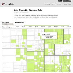
Is there a lot of farming? Is there a big technology market? Couple the jobs that people work with salary, and you also see where the money's at. You see a state's priorities. For example, look at California. For a drastic change, switch to Washington, D.C., where people who work in the legal and business sectors are much more common.
Move the median salary up a bit, and you get a sense of overall salaries (and a correlating cost of living, kind of) as you check out different states. Anyway, it's an interesting first look at employment data from the Bureau of Labor Statistics. OECD Regional Well-Being. Unmas_539904ad1b9cb_w1500.jpg (JPEG Image, 1500 × 3368 pixels) - Scaled (19%) Legislative Explorer. Private-prison-profit.jpg (JPEG Image, 800 × 3204 pixels) - Scaled (20%) Where does coffee come from? A journey from bean to cup. Pixelated Vision: One Clock - clock. Metropolitain.io - A visual and interactive experiment on the Parisian underground network. Solar System. Which Languages Are Learned Where. Compose Mail - paul.murray37 - Gmail.
Newsbound - Black Marble. The Infinite Jukebox. Dance, Factors, Dance – A Variation On Yorgey's Factorization Diagrams. Upon first sight of Brent Yorgey’s brilliant Factorization Diagrams, I knew that I should take his lovely little dots and make them dance.

Our first tango would be inspired by the digital clock, with a separate diagram for each of the hours, minutes, and seconds. For example, we’d portray 4:34:27 am like so: One night, plans discreetly set, we stole away, rendezvoused, and had our fun prancing about. But alas, although our encounter had grace, it begged for drama. Quite simply, there wasn’t enough panache – dynamic range – because while hours go up to 23, and minutes and seconds to 59 (*), the diagrams don’t really start cooking until they reach the triple digits.
So, instead, we practiced the best parts of our “clock” routine – the rhythmic movements and snappy transitions – and distilled the remainder to its essence. Please play with the interactive, and do give it a minute to hit its stride. This is what the dance clubs look like on Alpha Centauri. PBSG : State of The Polar Bear. Local - Visual analysis of local data. Climb every mountain: visualising the world's 50 most prominent peaks. Data scientist Robert Mundigi has created a multi-faceted visualisation of the world's 50 most prominent peaks.
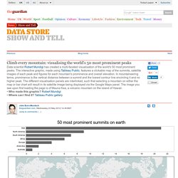
The interactive graphic, made using Tableau Public, features a clickable map of the summits, satellite images of each peak and figures for each mountain's prominence and overall elevation. In mountaineering terms, prominence is the vertical distance between a summit and the lowest contour line encircling it and no higher peak. The different visualisation panels are interlinked, such that selecting a mountain on either the map or bar chart will result in its satellite image being displayed via the Google Maps panel. The image you see upon first loading the page is of Mauna Kea, a volcanic mountain on the island of Hawaii.• Who made this graphic? Robert Mundigi• Where can I find it? What is Missing? Massive Health.