
Nigel Holmes Explanation Graphics. Big ideas worth pursuing. Online. Infographic App & Presentation Tool. Create and share visual ideas online. Twitter's languages of New York mapped. The US Election 2012. With burgers & fries. The debate on foreign policy as a plate of fries?
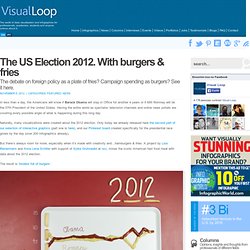
Campaign spending as burgers? See it here. In less than a day, the Americans will know if Barack Obama will stay in Office for another 4 years or if Mitt Romney will be the 57th President of the United States. Having the entire world as spectator, television channels and online news portals are covering every possible angle of what is happening during this long day. Naturally, many visualizations were created about the 2012 election. But there’s always room for more, especially when it’s made with creativity and…hamburgers & fries. The result is ‘binders full of burgers’: (image: Lisa Rienermann and Anna Lena Schiller | binders full of burgers) Visit the Tumblr blog for more of these tasty visualizations.Links: ‘binders full of burgers – visualizing the US Election 2012. with burgers & fries. The Motley Roots of Data Visualization in 19th Century Census Charts - Design. The U.S.
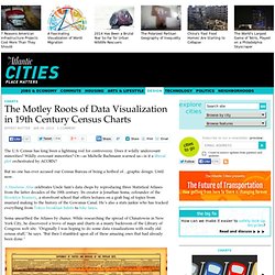
Census has long been a lightning rod for controversy. Does it wildly undercount minorities? Wildly overcount minorities? Or—as Michelle Bachmann warned us—is it a liberal plot orchestrated by ACORN? But no one has ever accused our Census Bureau of being a hotbed of…graphic design. A Handsome Atlas celebrates Uncle Sam’s data chops by reproducing three Statistical Atlases from the latter decades of the 19th century. Create Infographics online. Information is Beautiful Awards – The Results! Last night, at a packed party venue in London, we announced the winners of the inaugral Information is Beautiful Awards.

Thank you to all our amazing judges, supporters, staff and our ever generous sponsors Kantar. And the biggest high-five to the 1000+ talented people who courageously entered their work. Below are the categories winners. See the complete list here.Data Journalism Gold: CNN Home & Away, Stamen Silver: Government Spending, Guardian data and graphics teams Bronze: Metallica on Stage, Deniz Cem Önduygu, Amaç Herdağdelen, Eser Aygün Interactive Visualisation Gold: Notabilia, Moritz Stefaner, Dario Taraborelli, Giovanni Luca Ciampaglia Silver: The American Energy Spectrum, Hyperakt, Deroy Peraza, Eric Fensterhei Bronze: Evolution of Web, Hyperakt, Deroy Peraza, Eric Fensterhei Data Visualisation Gold: Information graphics in context, Peter Ørntoft Silver: Look at the sky, Carla Fernandez / Arce Bronze: Lunar calendar, Dimitre Lima Infographic/Infodesign Motion Infographic.
Newsmap. The Work of Edward Tufte and Graphics Press. Edward Tufte is a statistician and artist, and Professor Emeritus of Political Science, Statistics, and Computer Science at Yale University.
He wrote, designed, and self-published 4 classic books on data visualization. The New York Times described ET as the "Leonardo da Vinci of data," and Business Week as the "Galileo of graphics. " He is now writing a book/film The Thinking Eye and constructing a 234-acre tree farm and sculpture park in northwest Connecticut, which will show his artworks and remain open space in perpetuity. He founded Graphics Press, ET Modern gallery/studio, and Hogpen Hill Farms LLC. Visual Display of Quantitative Information 200 pages Envisioning Information 128 pages Visual Explanations 160 pages Beautiful Evidence 214 pages Same paper and printing as in original clothbound editions.
All 4 clothbound books, autographed by author $150 Available directly from Graphics Press. Die visuelle Darstellung quantitativer Informationen, (200 Seiten), $12 数量情報の視覚的表示, (200 ページ)、$12. Journalisme graphique. Ask Media. Interactive News Graphics Collection.