
Choosing_colors.pdf. Color tools for map makers. By Aileen Buckley, Mapping Center Lead My friend and one of my mentors, Dr.
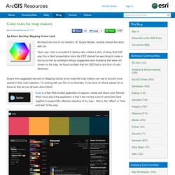
Duane Marble, recently shared this story with me: Years ago I met a consultant in Sydney who related a story of being fired half way thru a client presentation since the CEO claimed he was trying to make a fool out of him by pointing to things (suggested store locations) that were not shown on the map. He found out later that the CEO had a rare form of color blindness.
Duane then suggested we post on Mapping Center some tools that map makers can use to be a bit more careful in their color selection. Kuler is a free Web-hosted application to explore, create and share color themes. Tips for using color in maps. If you've found yourself on this page, we're assuming you've Color Theory and Mapping It’s important to realize how much your choice of color on a map can affect the story you are trying to tell with your data.
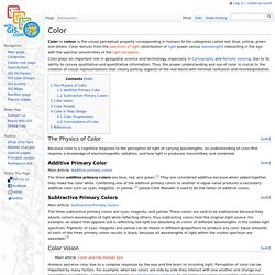
As a brief introduction to some theories behind how to use colors on maps, here are three primary scheming designs for mapping data. Sequential Schemes. Value (Color Theory) - GIS Wiki. Color Properties: Hue, Tint, Shade, Saturation, Brightness, Chroma. In this section we have a look at the terminology of color properties and their meaning in different contexts.
Color properties allow us to distinguish and define colors. The more we know about color properties, the better we can adjust colors to our needs. Hue Hue defines pure color in terms of "green", "red" or "magenta". Hue also defines mixtures of two pure colors like "red-yellow" (~ "orange"), or "yellow-green" (limitations to this statement will be addressed later).
Hue is usually one property of three when used to determine a certain color. Hue is a more technical definition of our color perception which can be used to communicate color ideas. Hue ranges from 0° to 359° when measured in degrees. Cartographic Design - GIS Wiki. From Wiki.GIS.com Cartographic design is the visual representation of geographic and spatial information on a map.[1] The purpose of Cartographic Design[2] is to create a map that is visually appealing and effectively communicates pertinent information to the audience.[3] Cartographic design consists of planning and layout.[3] During preliminary designing phases, the cartographer determines the elements that will enhance the map's purpose.[4] As a mapmaker begin composition of maps, the basic elements need to be worked on, such as the subject area, the title, the legend, the scale indicator, color schemes, the north arrow, labeling/supplementary text, frame/border, and insets.
A map does not always contain all of these elements. [5] Cartographic design is subjective to the cartographer's idea of a "good" map.[6] “We all know that there are good maps and bad maps, the problem is defining which is which. Arthur H. The GIS Encyclopedia. From Wiki.GIS.com Color or colour is the visual perceptual property corresponding in humans to the categories called red, blue, yellow, green and others.
Connotations of Color - GIS Wiki. Choropleth map - GIS Wiki. From Wiki.GIS.com.
Schools - Teachers - The Beauty of Maps - Teacher's Resources. Color Theory and Mapping. Originally published by Miranda Mulligan, executive director of Northwestern University Knight Lab, and formerly design director for digital at the Boston Globe, on Source under a Creative Commons Attribution 3.0 licence.
Of all the forms of non-verbal communication, the most instantaneous method of conveying messages and meaning through visual cues is color. In our design work, we use white space, typography and color theory to create and support the information architecture of a composition or a story. Information layering—organizing large amounts of data into short, digestible chunks—is a method for providing multiple points of entry into a story package, presentation, or layout.
Color not only helps highlight or reinforce the information architecture of a layout, it can also set a mood, evoke an era or time period, or induce an emotional response to the information often unique to any given individual. Map-Based Storytelling. The Map Academy › Design for Beginners › Lesson 2. Ugly maps, like the one we showed you at the end of the last lesson, are not hard to find.
You can probably think of several maps you’ve seen that make you cringe. At the same time, you can likely think of many beautiful maps. One major component that makes a beautiful map beautiful is the color choices made for that map. Learning how to pick good colors for your data and basemaps can be challenging, and applying color principles is sometimes hard to do. Selecting good colors for data visualization has it’s roots in math and color theory. For now, we are going to get our feet wet by looking at color in practice. Why to think about colors? To get started, go ahead and import the following data set on earthquakes into your account.
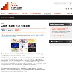
When we pull up the data, what we see is a distribution of dots (representing locations of earthquakes) that is hard to interpret. This is where color could help us out. Where Bad Maps Come From. ColorBrewer: Color Advice for Maps. How The Rainbow Color Map Misleads. Colors are perhaps the visual property that people most often misuse in visualization without being aware of it.
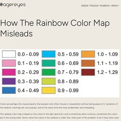
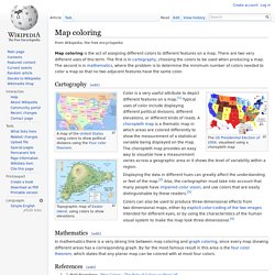
Variations of the rainbow colormap are very popular, and at the same time the most problematic and misleading. The rainbow color map is based on the colors in the light spectrum, and is sometimes done correctly, sometimes the colors are in the wrong order. Quick, name the colors in the rainbow in order! See, that’s part of the problem. Even if they were used consistently, nobody would know the right sequence anyway. Color Hearts Color. Using Color in Maps. DESIGN:-The Good, Bad and Ugly. Map coloring. Map coloring is the act of assigning different colors to different features on a map.
There are two very different uses of this term. OnTheMap. EJView. EJView This form creates an interactive map. Interactive mapping tools are a challenge for accessibility due to the inherent visual aspects of mapping. These maps cannot be made fully accessible under Section 508 of the Rehabilitation Act of 1973 (as amended in 1998). If a person needs accommodations due to a disability, additional assistance is available in obtaining information. Individuals, who may need information not accessible to them, can email us for assistance (ejmap@epa.gov). Go to EJView A study area can be a place or an area. The 2012 Statistical Abstract. What is the Statistical Abstract? The Statistical Abstract of the United States, published since 1878, is the authoritative and comprehensive summary of statistics on the social, political, and economic organization of the United States.
Use the Abstract as a convenient volume for statistical reference, and as a guide to sources of more information both in print and on the Web. Sources of data include the Census Bureau, Bureau of Labor Statistics, Bureau of Economic Analysis, and many other Federal agencies and private organizations. The U.S. GIS in Environmental Epidemiologic Research. GIS as a Tool in Interdisciplinary Environmental Studies.
Marsha Alibrandi is an Assistant Professor at North Carolina State Universitymarsh@cape.com The twentieth century concludes in much the same way as it began--with the redrawing of maps. However the new maps are not so much of geographic territory, but of landscapes depicting new and developing networks of finance, people, and culture . . . The ultimate work of education is to learn to be a human being . . . But as we struggle for new identities we must be able to transcend these notions of territory and engage new concepts of energy and place (Hartoonian, 1996: 6-8).
One of the ways that energy and place are being re-mapped by certain schools and communities is in environmental community service projects. This article describes an application of GIS technology as a tool in an environmental community service project in which students and adult community members participated in water quality monitoring and biological assessment. What Is GIS? Question Technology?
What is GPS? Figure 1. GEOG 487: Environmental Applications of GIS. To learn more about the course, click the play button below or check out Welcome to Geography 487 (link is external). You may need to refresh your browser to load the video. The 5 minute video provides a brief overview of the GIS and environmental concepts covered in the class. New to GEOG 487? GIS in environmental contamination. GIS in environmental contamination is the use of GIS software in mapping out the contaminants in soil and water using the spatial interpolation tools from GIS.[1][2][3] Soil and water contamination by metals and other contaminants have become a major environmental problem after the industrialization across many parts of the world.[4] As a result, environmental agencies are placed in charge in remediating, monitoring, and mitigating the soil contamination sites.
GIS is used to monitor the sites for metal contaminants in the soil, and based on the GIS analysis, highest risk sites are identified in which majority of the remediation and monitoring takes place. GIS is used in making spatial interpolations of contaminants in the soil and water. Spatial interpolation allows for more efficient approach to remediation and monitoring of soil and water contaminants. How We Use Data in the Mid-Atlantic Region. GIS Layers Credit: Bureau of Land Management On this page.