
UI-Patterns.com. The Data + Design Project: Pie Charts February. Here at Visual News, we’ve been looking for designers/illustrators to participate in an ongoing design series called the Data + Design Project. As an off-shoot of Column Five Media, we are ardent supporters of the union between data and design. Last month we started curating the Data + Design Project gallery as a way to show how flexible and beautiful data visualizations can actually be. With the Visual News website getting over 1.1 million monthly visitors, 13,000 Facebook fans and 2,900 Twitter followers, we hope this can become a valuable resource for inspiration.
Each month, a few designers are invited to create a data visualization piece, using data about a subject which interests them. We will be assigning a featured visualization theme at the beginning of the month, then it is up to the designer to decide how complex or simple they want to make their graphic based on that theme. Data is everywhere, and we want to see the many ways data from everyday life can be interpreted. Infographics After Effects Template.
Infographics & Data Visualizations. Welcome to Quid. Ben fry. Piktochart- Stories from Data. Your presentation/data visualization tool. 5 Examples of Good and Bad Information Design « Helen Weselcouch's Blog. When I lived in Paris two years ago I loved the Subway system so much more than the godawful subways here.

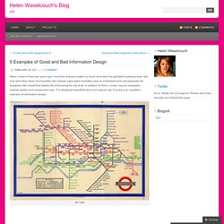
Not only were they clean and beautiful, the subway maps were incredibly easy to understand and use especially for foreigners like myself that started off not knowing the city at all. In addition to Paris, London has an exemplary subway system and subsequent map. IT is designed beautifully and is so easy to use. It surely is an excellent example of information design. the Tube I think the following example is an excellent example of information design because it takes a difficult and complex process and makes it incredibly easy to understand through the use of text and eye catching colors.
How Laws are Made When I googled “good examples of information design,” the following image came up and I personally think it’s terrible. Bad Information Design The following design illustrates how much money we’re spending on the current ware effort in the Middle East in 10 “easy” steps. Like this: Google's Long History of Social Media Attempts [INFOGRAPHIC] Sure Facebook privacy issues can be frustrating, but what's the alternative?
![Google's Long History of Social Media Attempts [INFOGRAPHIC]](http://cdn.pearltrees.com/s/pic/th/history-attempts-infographic-4398826)
With more than 400 million users, no other social media platform has been able to touch Facebook's grip on person-to-person networking. But rumors have already started to fly that Facebook may soon face some stiff new competition. Google is supposedly getting into the market with Google Me, a not-yet-launched, oft-rumored social network that will directly compete with Facebook. Nothing is for certain yet, but more and more sources are saying Google Me does exist, and that could mean good things for all of us. If anyone were to take on Facebook, Google has the engineering talent, deep pockets, and customer loyalty required to give it a fair shot.
Still, Google hasn't had the best track record when it comes to social media attempts. EDIT: The graphic has been updated to include Google Lively. More Google Resources from Mashable: [img credit: Robert Scoble] Visual.ly. Users activity on Google+ The Importance of DNS. Digital Nostalgia on the Behance Network.