
The Psychology of Color [Infographic] Download the infographic as a PDF Embed this image on your site:
![The Psychology of Color [Infographic]](http://cdn.pearltrees.com/s/pic/th/psychology-infographic-design-22091616)
ColorTheory_Screen_White.jpg (JPEG Image, 1224x792 pixels) - Scaled (81%) Piknik Color Picker. 0to255. Multicolr Search Lab - Idée Inc. Beyond Pink and Blue: A Look at Gender Colors. It goes beyond culture.

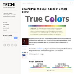
There is science behind the gender-relationships when it comes to colors. A study by John Hallock compares the color preferences among various demographics and takes into account information collected from 22 countries. Our friends at KissMetrics put together this informative infographic that tears down the gender barriers to reveal what really goes on in visualizations. Click any portion to enlarge. Colors by Gender The Color Purple - The most notable gender difference can be seen in the color purple. Blue Reigns Supreme – Both males and females like the color blue, which receives favor with 35% of female respondents and more than half of the male respondents. A Closer Look In 2007, Doctor Anya Hurlbert and Yazhu Ling created an experiment to explore how men and women differ in their perceptions of color.
Results of the Experiment The experiment showed that men and women both preferred blue out of the sets of colors. Color Naming: Men Keep It Simple. Color Wheel Pro: Color Meaning. Red Red is the color of fire and blood, so it is associated with energy, war, danger, strength, power, determination as well as passion, desire, and love.

Red is a very emotionally intense color. It enhances human metabolism, increases respiration rate, and raises blood pressure. It has very high visibility, which is why stop signs, stoplights, and fire equipment are usually painted red. In heraldry, red is used to indicate courage. Red brings text and images to the foreground. Light red represents joy, sexuality, passion, sensitivity, and love.
Orange Orange combines the energy of red and the happiness of yellow. To the human eye, orange is a very hot color, so it gives the sensation of heat. Orange has very high visibility, so you can use it to catch attention and highlight the most important elements of your design. Dark orange can mean deceit and distrust. Color Scheme Designer 3.
How_i_see_color___a_tutorial_by_purplekecleon-d31xj5t. Logo Design Articles. When studying colour theory we are given an understanding of the colour wheel and the harmonious relationships that can be forged between these brothers of reflecting light… It is here that we are given a cheat sheet on how to use colour effectively to communicate the right message.

Below we use this knowledge to go behind the scenes of colour theory in logo design while looking at various case studies of logo designs that use these principles. Enjoy. The Colour Wheel – Our Cheat Sheet. This wheel, that shows the relationships of colours, is a handy little tool to understand. Without going into any great detail of how the colours of the wheel are established (which is pretty interesting to know), we’ll just tip or toes into the water.
The panels that have an outline above, with their linking lines, show the relationships colours have. Colour Meanings & Theory Colour can make or break a design so it is vital that you know what colours mean and what they can communicate. Visa – Complementary.