
educational technology researcher
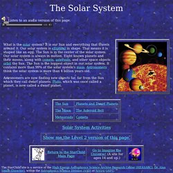
VirtualTours. UX. Techie treats. Argumentation. Bookbinding. Stats. Reference & search. Recipes. New media criticism and digital literacy. Digitart. Music. LLL. Fun. EduTECH. Edublogs. Critical & Creative Education. StarChild: The Solar System. The Solar System Listen to an audio version of this page.
Solar System Activities The StarChild site is a service of the High Energy Astrophysics Science Archive Research Center (HEASARC), Dr. Alan Smale (Director), within the Astrophysics Science Division (ASD) at NASA/GSFC.