
Jour2300. Fonts. Colour. COAP. 16 Week Topical Outline. 4 excellentes ressources pour des photos libres de droit. Si vous avez un projet et que vous recherchez des photos pour illustrer celui-ci (web, édition, graphisme), il peut ête intéressant d’avoir sous la main quelques ressources gratuites.
Des sites se sont spécialisés dans le partage de photographies libres de droits, je vous dresse aujourd’hui la liste de mes préférés. 1- Gratisography Ce site propose des photos récentes prises par un artiste. Les délais de mise à jour ne sont pas garantis, mais les photos sont de bonne qualité et ont des sujets variés. 2- Unsplash J’adore ce site, qui propose 10 nouvelles photos tous les 10 jours (1 photo par jour, donc, si je calcule bien). 3- Picjumbo Ce site fait un peu plus ordonné que les autres, déjà parcequ’il prend la peine de classer les photos par thèmes. 4- New Old Stock Photos vintages des archives publiques, sans aucun copyright. Avec tout ça, vous devriez pouvoir trouver votre bonheur. Quelques livres sur le sujet. 960 Gridder - Lay out websites with ease. What is this?
960 Gridder is an excellent tool for any web developer/ designer that wants to easily align, match and/or lay out websites. The idea came when designing a website for a student organization where I worked with several designers that handed their lay outs and designs in Photoshop format with a similar grid built-in to me. After a while I noticed how hard it became to make sure everything looked exactly how they intended it, especially in the different browsers. 960 Gridder is cross-browser compliant and works well in Internet Explorer 6/7/8, Firefox 2/3 and Chrome.
Safari 4 Beta and Opera 9 is also working as expected and it should work in Safari 2.x-3.x also. According to browsershots, all A-grade browsers now display the grid perfectly (version 1.3.1). Amazon. Designing for the Web. The web professional's online magazine of choice.

In: Columns > Design in Theory and Practice By Joshua David McClurg-Genevese Published on January 9, 2006 In the last two articles we looked at the basic tenets of the design practice, the principles and elements of design. Dimensions Of A Paper Sizes - A0, A1, A2, A3, A4, A5, A6, A7, A8, A9, A10 - In Inches & mm.
A Paper Sizes - Quick Lookup Select the standard paper size from the 'Size' selector and the unit from the 'Unit' selector - the dimensions will be shown in the dimensions box.
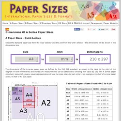
The dimensions of the A series paper sizes, as defined by the ISO 216 standard, are given in the table to the right of the diagram in both millimetres and inches (cm measurements can be obtained by dividing mm value by 10). The A Series paper size chart, below left, gives a visual representation of how the sizes relate to each other - for example A5 is half of A4 size paper and A2 is half of A1 size paper. A Series Paper Sizes Chart. Image courtesy of Office 365. Fontifier - Your own handwriting on your computer! Infographics for Web Designers: Information You Ought to Know. Infographic is a great way to turn the most boring data into the most comforting graphic, which is much easier for reader to digest.
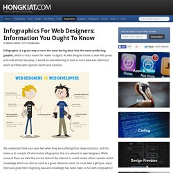
As web designers have to deal with pixels and code almost everyday, it would be overwhelming to look at more data and references which are filled with hypnotic words and numbers. We understand how your eyes feel when they are suffering from sleep induction, and this leads us to compile 43 informative infographics that are relevant to web designers. While some of them are data like current state of the internet or social media, others contain useful knowledge which can also be used as a great reference sheet.
Mockups. Take a second.
Let it sink in. The first impression might be disorienting. There are very few interface elements on the screen. Start exploring however, and you'll find out that Mockups is filled with powerful yet only-visible-when-you-need-them features. Page Layout Design. The Anatomy Of A Perfect Landing Page. The Next Steps On The Road To Becoming A CSS Jedi Master. Last time I introduced you to the absolute beginner steps required to learning how to style websites with CSS.
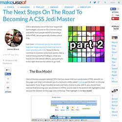
Today I’d like to continue to examine some basic points, take a look at how powerful FireBug is, show you how to do CSS rollover effects, and point you in the right direction for where to go next. The Box Model One of the key concepts behind CSS is the box model that surrounds every HTML element on the page. Last time I introduced you to a fantastic utility called Firebug and the built-in Chrome equivalent. If you’ve got installed already and had a chance to play with it, you should have noticed that hovering over any element in HTML source view in the bottom left highlights a box around the element on the page view at the top.
One of the first mistakes any CSS learner will make is to confuse and use MARGIN and PADDING interchangeably. Typography. Typography Portals, Font Foundries.