Berfarah/LESS-build-sublime. Responsive Deliverables - daverupert.com. In a world of growing front-end complexity, what are we handing off to clients?
April 02, 2013 • Reading Time: 05:38 During the era of Print Design, companies would approach agencies for a brand identity system. Emmet Documentation. Designing Device Assets: Templates and Tips. In olden times, as long as you remembered to create a favicon you were golden.
Now, between phones, tablets, retina screens, iOS 7, Windows 8, everything and the kitchen sink, there are literally dozens of icons, images, and assets a designer can create for a project. FUTURE INTERFACES - GUI Design on Behance. Butterick’s Practical Typography. Responsive background images with fixed or fluid aspect ratios – Voormedia. What's the easiest way to scale background images in responsive layouts?
We use an old technique and enhance it to fluidly change the aspect ratio of background images. Responsive layouts make it possible to dynamically scale the width of a website to fit on small mobile devices as well as larger desktop computers. An <img> element with a percentual width will have its height automatically adjusted. Sound by Setuniman.
Worpress. Resources. A Responsive Web Design Process. Despite the huge amount of knowledge being shared on the subject of responsive design, I get the feeling that the workflow is still very mysterious.
I’ve been thinking about a right process for quite a long time and finally came up with what I think is a good look at the practical side of designing websites in 2013. 1. Plan your Content Planning your content is the first and foremost solution to any design project. It is clearly the most underrated part of the job, and it’s not because you are a designer that you shouldn’t be doing it. Content audit: get everything you can, from text to images and logos.Lay out your website in a Google Doc (or anything similar) starting with the general overview (brand message, site architecture, etc) and detailing every page’s content. These are only the very basic components of a content strategy. 2. From my personal experience, the Mobile First approach is excellent for the content strategy and sketching part, but not for Photoshop. TinyPNG – Compress PNG images while preserving transparency. FlickrBomb: Rapid Prototyping.
2.
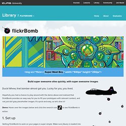
Implementing Using flickrBomb in your prototypes is really quite simple. Web fonts and desktop fonts. The first commented line is your dabblet’s title ✿ dabblet.com. JavaScript: The Good Parts Chapter about grammar explains everything in grammar diagrams.
This is just not how humans learn. Then there are chapters introducing some programming techniques many of which were new to me. Text and code in these is too concise and lacks something that lets you understand something you didn't know already. Usually I would read a chapter a couple of times, not understand it, google the chapter name, read a random blog about it and understand the concept then come back to the book and still find the chapter difficult to understand.
Code examples include more complexity than is needed to explain the new concept, contain js grammar errors and are cluttered with comments that should be in the main text. There are many functions written in the book that make JavaScript easier to use. The book gives some useful warnings about the strange stuff in the language. "This Is How We Built It" Case Studies. Advertisement Unlike many other industries, the Web design community is all about sharing knowledge and experience.
Each of us is very lucky to be part of such a great and useful learning environment, and it is up to us to embrace it — to embrace our learning experiences, and also to embrace our ability to share. Create a Slick and Minimalist Web Layout in Photoshop. In this Photoshop web design tutorial, we’re going to learn how to create a slick and minimal-looking website layout.
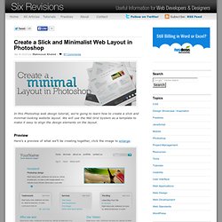
We will use the 960 Grid System as a template to make it easy to align the design elements on the layout. Preview Here’s a preview of what we’ll be creating together, click the image to enlarge. Create a new Photoshop document 1 We’ll be using the 960 Grid System (download it at as a starting template. Creating the background 2 First of all, right-click on the Background layer in the Layers Panel and then choose Layer From Background. 3 Now select the Gradient Tool (G), set your Foreground color to #efefef and your background color to #cacaca. Designing the header section. 10 Rock Solid Website Layout Examples. Keeping It Simple Page layout is equal parts art and science.
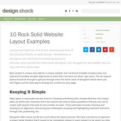
Creating something that’s visually attractive and unique takes an artist’s eye. However, there are several very easy to follow guidelines that you can use to create solid layouts that work for any number of cases. These principles include choosing and sticking to an alignment, structuring your whitespace properly and highlighting important elements through size, positioning, etc. Designers often stress out far too much about the layout process. In this article we’re going to take a look at ten very common layouts that you can find on countless sites across the web. The Big Badass List of Twitter Bootstrap Resources.
Subnav for Bootstrap 2. Pines Notify. PNotify downloads come with the following files: