
Home of the Universal Font Classification System. With so many fonts available on the market today, a simple alphabetical font list can't do the job and font vendors have accordingly devised a variety of ways to help users find the font they are looking for, leveraging the accessibility and power of the Web.
Different tools are available, suitable to the offering of the vendor and the user's level of expertise. Such tools typically include these kinds of font classifications: style, letter shape, keywords, designer, foundry, usage and category. The list below covers the main tools available on the Web. If you have suggestions for additions, by all means contact us at: info@type-expertise.com. Identifont. The International Typographic Style Timeline. Graphis #1 Graphis, The International Journal of Visual Communication, was first published in 1944 by Walter Herdeg in Zurich, Switzerland.
Lettering vs Calligraphy. Say No to Faux Bold. Browsers can do terrible things to type.
If text is styled as bold or italic and the typeface family does not include a bold or italic font, browsers will compensate by trying to create bold and italic styles themselves. The results are an awkward mimicry of real type design. In this article you’ll find ways to avoid putting the browser in this bind. Article Continues Below You can’t fault the browser for compensating. These faux face styles aren’t much of an issue with web-safe fonts, as most of these fonts include bold and italic styles. Taking A Second Look At Free Fonts. Once thought of as amateurish by professional designers, free and open-source fonts have gone through something of a renaissance in just the last few years.
The quality of available free fonts has increased dramatically. To be frank, free fonts don’t have a good reputation, and often they are knock-offs of thoroughly crafted, already established typefaces. So is it time for professional designers to take a second look? First, A Story Link Early in my design career, around 2003, I wanted to purchase the font DIN1 for a project at work. I popped the CD in my computer and found a collection of the most horrendous fonts you could imagine.
Nowhere to be found was DIN or, for that matter, any font that a professional designer would actually use. Fast-forward to 2014. Where Do Free Fonts Come From? Why Is Having Multiple Weights With Italics So Important? Google Fonts Alegreya. Grumpy wizards make toxic brew for the evil Queen and Jack.
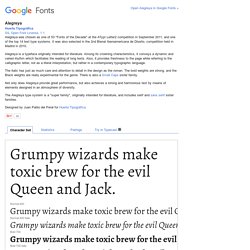
Normal 400Grumpy wizards make toxic brew for the evil Queen and Jack. Normal 400 ItalicGrumpy wizards make toxic brew for the evil Queen and Jack. Bold 700Grumpy wizards make toxic brew for the evil Queen and Jack. Bold 700 ItalicGrumpy wizards make toxic brew for the evil Queen and Jack. Google Fonts Anonymous Pro. Anonymous Pro is a family of four fixed-width fonts designed especially with coding in mind.
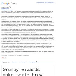
Characters that could be mistaken for one another (O, 0, I, l, 1, etc.) have distinct shapes to make them easier to tell apart in the context of source code. Anonymous Pro also features an international, Unicode-based character set, with support for most Western and European Latin-based languages, Greek, and Cyrillic. It also includes special "box drawing" characters for those who need them. While Anonymous Pro looks great on Macs and Windows PCs with antialiasing enabled, it also includes embedded bitmaps for specific pixel sizes ("ppems" in font nerd speak) for both the regular and bold weight. (Since slanted bitmaps look pretty bad and hard to read at the supported sizes, I chose to use the upright bitmaps for the italics as well.) Anonymous Pro differs from Anonymous™ and Anonymous 9 in a few key characters.
Anonymous Pro is distributed with the SIL Open Font License. Fonts. Why are there hardly any sans-serif typefaces with a high contrast in stroke weight? - Quora. Typography Inspiration for the Modern Web. Typography on Smashing Magazine. We use ad-blockers as well, you know.
We gotta keep those servers running though. Did you know that we publish useful books and run friendly conferences — crafted for pros like yourself? E.g. upcoming SmashingConf Oxford, UK, dedicated to smart front-end techniques and design patterns. Posts Tagged ‘Typography’. We are pleased to present below all posts tagged with ‘Typography’. Hands On The Sigmund Freud Typeface: Making A Font For Your Shrink Handwritten text shows a personal side of its author, a side that is not easy to put into words and that contrasts with the standardized look of digital communication.
Over the past four years, I’ve completed three typefaces inspired by handwriting. Read more... Unicode For A Multi-Device World A while ago, I was working on a website that required a number of icons. “I’ll even use a Unicode character as the base of the icon, so that if @font-face isn’t supported, then the user will still see something like the intended icon.” Read more... Read more...
Typeverything. We Love Typography. Lullaby - Decorative Font Design by Ania Szerszen.