
Don’t Use Automatic Image Sliders or Carousels, Ignore the Fad. 553inShareinShare I’m sure you’ve come across dozens, if not hundreds of image sliders or carousels (also called ‘rotating offers’).
You might even like them. But the truth is that they’re conversion killers. Psychology of Color in Marketing Infographic. Perhaps no choice is as vital to marketing success as the colors you use.
Whether selecting the color for a specific product or for a email marketing campaign, there is no doubt that color has significant effect on all as subconsciously, we associate different colors with different things. For example, did you know that restaurants use red to stimulate appetite and that blue creates a sense of trust and security in a brand?
The following infographic, created by the folks at WebpageFX, takes a look at the psychology of color and presents some common associations of different colors. It also shows the overall importance of color to consumers and characteristics of many individual colors. The numbers are pretty fascinating. The Role of Color in Marketing [INFOGRAPHIC] Use the right colors to increase brand recognition and drive purchasing.
![The Role of Color in Marketing [INFOGRAPHIC]](http://cdn.pearltrees.com/s/pic/th/marketing-infographic-social-56109798)
It’s more important than ever for brands to project their value. Marketers in general understand the need for consistency in color and design. Matthew Moore Design. Flat design is both hot and controversial in world of user interface.
Microsoft led the charge to introduce it to the masses and many others have followed suit: LayerVault, The Next Web, and more. Many designers have been calling it a fad since early on, thanks in large part to the UX problems it presents in interfaces that reach a certain level of complexity. Flat design is beautiful and refreshing. It’s also generally faster to design and easier to make responsive. If it was a graphic design trend, it’d be well received. Fresh and Creative Web Design Techniques. Space, peachy colors, big and real images and movement will top designer’s to-do lists this year.
As a designer, this is one of the most exciting parts of a new year. Here we are, trying to figure out what’s going to be big for design trends in 2013. It absolutely makes sense. Stop Misusing Select Menus. By anthony on 01/22/13 at 8:34 am A form has many user interface elements.
If you don’t know how to use them all properly, you could make filling out forms difficult for your users. One interface element that’s commonly misused is the select menu. Étude de cas : le site Internet PAYOT. UX FAIL #3: How dated design trends can hurt your brand. Dated design trends may come to haunt you like yearbook photos of the past.
Are you using the web design equivalent of shoulder pads, acid washed jeans, or teased bangs? I fear the day my mom will post my old school photos on Facebook when I was rocking the Mary Lou Retton bowl cut and purple/teal/pink oversized sweaters. No matter how aWeSoMeLy cOoL I thought I looked then with the latest trends in neon stirrup leggings and Blossom hats, times change and I can expect that years from now I'll groan at my choice in big belts, feather earrings, and ombre hair. Looking back at my own print and web design work from a few years ago resulted in a few similar groans.
My cringe-worthy moments were all from the cheesy Photoshop layer effects I had piled on, thinking the result was awesomely cool. 5 Former Design Trends That Aren’t Cool Anymore (So Stop Using Them) If you’re like me, looking at your own design work from a few years ago can often result in some laughable or even cringe-worthy moments.

Design styles have been steadily evolving and most of us can’t help but be affected by these changes. Who among us hasn’t piled on the cheesy Photoshop layer effects, all the while thinking the result was downright awesome? However, some of us are a little slower to evolve than others. Est-on obligé de créditer une photo libre de droits ? Question. Moleskine Writing Template by Rod Graves. Moleskine Writing Template by Rod Graves This template is based on a medieval page layout principle described in Robert Bringhurst’s excellent book on typography, ‘The Elements of Typographic Style’.
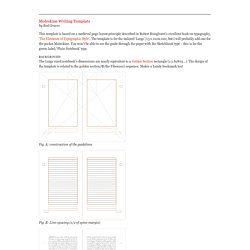
The template is for the unlined ‘Large’/13 x 21cm size, but I will probably add one for the pocket Moleskine. La technique Pomodoro, un atout pour votre créativité ? Il y a quelques semaines, j’ai vu passer quelques tweets parlant d’une technique de productivité s’appelant Pomodoro.
Sur le coup, je me suis dit “encore une…”. Il faut dire que j’avais auparavant testé le GTD et que j’avais trouvé ça tellement contraignant au final que je perdais du temps plutôt que d’en gagner. Et puis, à force d’en entendre parler, ma curiosité a pris le dessus et je suis allé voir sur le web ce que c’était. Qu’est-ce que la technique Pomodoro ? La technique Pomodoro est une méthode permettant de mieux gérer son temps sur la journée.
Démystifions le Pixel Art : interview d'Olivier Huard. Great Resume Designs that Catch Attention–and Got People Hired. Inspiration June 21, 2011 When applying for a job, you have no choice but to do your best to outshine competition. Even before winning an interview, your qualifications (or in some instance, your character) are already judged by the resume you’ve submitted. It is then important to make your resume or CV as honest, concise, and striking as possible. If you are looking forward to a creative position, you will be expected to come up with something grand and extra creative as well. The Photoshop Etiquette Manifesto for Web Designers. Definitive Guide to making a popular shot on Dribbble.
Step 1 Whatever you do never, ever, upload unfinished work or Work in Progress (WIP). The work you want to upload should be finished and super polished. Infographics for Web Designers: Information You Ought to Know. Infographic is a great way to turn the most boring data into the most comforting graphic, which is much easier for reader to digest. As web designers have to deal with pixels and code almost everyday, it would be overwhelming to look at more data and references which are filled with hypnotic words and numbers. We understand how your eyes feel when they are suffering from sleep induction, and this leads us to compile 43 informative infographics that are relevant to web designers. While some of them are data like current state of the internet or social media, others contain useful knowledge which can also be used as a great reference sheet. So come take a glimpse, enjoy them and grab them! Digesting data and knowledge has never been so fun with infographics!
Recommended Reading: More Infographic related posts. Hongkiat Exclusive Freelance to Freedom. Les 10 lois du design - DesignMichel. Nous sommes des designers.