
maniche
marketing web marketing
MANICHE WEBDSIGNE. MANICHE WEBMASTERS. MANICHE SOCIAL MEDIA. MANICHE DREAMWEAVER. MANICHE JOB AND WORKS FREELANCER. MANICHE INFOACTIV. MANICHE INFOGRAPHI. WORDPRESS MANICHE. The Newspaper Clipping Image Generator - Create your own fun newspaper. 5 Reasons Your Small Business Should Start a Podcast Today. Since the dawn of digital there has been a ton of talk about what your company should be doing for digital marketing.
Whether it is paid search, social media or blogging, there is no shortage of ideas and advice. However, one of the undeniable forces drawing businesses and their customers closer together is the ability to weave a better story. Content marketing is a great way for brands to tell their story, and I would argue that one of the best vehicles for content marketing today has to be the podcast.
Indeed, podcasts like Serial have found a way to captivate an audience of hundreds of thousands, and create a loyal following. The buzz around that particular podcast has primed the medium for take off. Besides uncovering interesting and relevant information chosen by the person, podcasts are an easily consumable content format, and it doesn’t require a person’s undivided attention like video or text-based content does. 1. 2.
Six règles pour persuader dans les médias sociaux. Uproot One Year In. Grafikart.fr. Game about Squares. Agario. Jurassic World. Formations. Bootstrap. Focal Point: Intelligent Cropping of Responsive Images. The practice of implementing responsive images is still in its infancy.
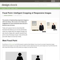
We’ve seen a lot of ideas and suggestions for how it should be done and we’re bound to see a lot more. Today we’re going to look at a fascinating little framework that allows you to not only automatically resize your images when the viewport changes, but also crop the images with a specific important focal point in mind. Amazingly enough, it does all this with pure CSS. Read on to see how it works. Meet Focal Point Focal Point is a GitHub project and CSS framework created by Adam Bradley. The problem with this idea of course is that if you arbitrarily crop an image, you could be cutting out the most important part of the image! The top 25 responsive web design tools. Over the past few years we've seen an explosion of web-enabled devices with varying resolutions, capabilities, form factors, pixel densities, interaction methods and more.
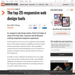
This onslaught of connected devices is just the beginning, and we're bound to see people accessing the web from a greater number of devices in the coming years. It's futile to create a dedicated web experience for every single device class out there, and the need to create a smart, flexible, adaptable web experiences is becoming more apparent every day. Responsive/adaptive/multi-device web design (whatever you want to call it) is here to stay. Just because responsive design is becoming necessary doesn't mean it's easy. 15 Best Responsive Web Design Testing Tools. Responsive Web Design is regarded as being the approach which suggests that web design and development should respond to the end-user’s behavior and environment based on their screen size, platform and orientation.
Responsiveness consists of a mix of flexible grids and layouts, images and an intelligent use of CSS media queries. When the end-user switches from their laptop over to their iPad, the website being viewed should automatically switch to accommodate that particular resolution, image size and scripting abilities. In other words, the website should have the technology to automatically respond to the end-user’s preferences. This would eliminate the need for a different design and development phase every time a new gadget device is introduced on the market. Along with all of the newest devices – also come varying screen resolutions, definitions and orientations. 1. ProtoFluid simplifies the development of fluid layouts, adaptive CSS and responsive design. Outils pour créer des capsules vidéo.
MANICHE HTML. Formations. A Complete Guide to Flexbox. Background The Flexbox Layout (Flexible Box) module (a W3C Candidate Recommendation as of October 2017) aims at providing a more efficient way to lay out, align and distribute space among items in a container, even when their size is unknown and/or dynamic (thus the word “flex”). The main idea behind the flex layout is to give the container the ability to alter its items’ width/height (and order) to best fill the available space (mostly to accommodate to all kind of display devices and screen sizes). Ergonomie web et logiciel, architecture de l'information, utilisabilité sites Internet – Ergolab. Télécharger Adobe Dreamweaver CC gratuit, version d'essai.
Intro to Webmaster Academy - Webmaster Tools Help. 14 fonctions que Google vous cache sur Android. Comment accéder aux options développeurs En premier lieu, vous devez vous rendre dans les paramètres de votre téléphone.
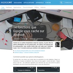
Cliquez sur Paramètres >A propos du téléphone. Vous verrez un menu appelé « numéro de build ». Cliquez dessus sept fois : une notification apparaîtra vous informant que vous avez activé les options développeurs (qui seront désormais présente dans le menu des paramètres). 1. Si vous travaillez sur de longues durées avec votre téléphone et en avez marre de l’écran qui s’éteint tout seul, cette option est faite pour vous. 2. Cette option permet de limiter le nombre d’applications qui peuvent tourner en arrière plan. 3. Cette option montre tous les bords et contours du système virtuel. 4. Cette option s’activera sur toutes les applications de hardware 2D, même si elles sont prévues pour fonctionner avec d’autres rendus. Applications, sites et logiciels pédagogiques. Tools. Télécharger Adobe InDesign CC.