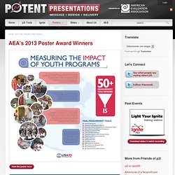

Review Other Posters. View the poster here View the poster here “What the winning designs had in common were an emphasis on the results/findings of the work featured in the poster.

Most posters had the punchline, the findings or results, at the lower bottom right hand corner, which is the most de-emphasized real estate of the poster. Typically the amount of real estate that the findings/results took up was less than 25% of the poster. In the winning designs, the results/findings took up nearly half of the real estate of the poster (The designs could have been even better if that information was located in the upper left hand corner–prime poster real estate).
You will notice that the NASA poster has noticeably more detail than the Youth Impact Measurement poster. . - Poster Contest Judge Note the consistent use of color, inclusion of graphics, readable text, and demarcation of sections via headings in bands of color. Note the use of large graphics, unconventional headings, succinct study description. 10 Fun Tools To Easily Make Your Own Infographics. People love to learn by examining visual representations of data. That’s been proven time and time again by the popularity of both infographics and Pinterest. So what if you could make your own infographics ? What would you make it of? It’s actually easier than you think… even if you have zero design skills whatsoever. Below are my two favorite infographic-making web 2.0 tools that I highly recommend. Click the name of each tool to learn more! Visual.ly One of the more popular ways to discover infographics, Visual.ly actually just launched a design overhaul of their website.
Dipity Want to get a beautifully simply visualization of data over time? Easel.ly I absolutely love Easel.ly. Venngage Venngage (likely named for Venn diagrams) is a double threat. Infogr.am One of the most simple tools, Infogr.am lets you actually import data right into the site and then translate it all into useful visualizations. Tableau Public Photo Stats. Many Eyes. The NodeXL Series: Conducting a Hashtag Network Search of Twitter (Part 5) Sometimes, it’s interesting to learn what is being Tweeted (micro-blogged) about particular topics in real time along with who is posting which messages.

NodeXL enables the extraction of individuals engaged in a particular hashtag-labeled microblogging conversation through Twitter’s application programming interface (API). This entry will provide an overview of how this is done. Hashtags A hashtag is a snippet of text prefaced with a # (hashtag or pound) sign which indicates that the message is focused on a particular theme or topic. In Twitter, the microblogging site, various Tweeted threads are collected around hashtags for coherent 140-character conversations from people from around the world. A hashtag search of Twitter, then, involves the extraction of entities (Twitter accounts representing people, robots, and cyborgs) who have conversed around a particular topic. The Hashtag Network Capture First, start up the NodeXL template on Excel.
Defining Edge Parameters Setting Limits. Create and share visual ideas online.