

Cartografias. Virgin America Boarding Pass. 6 Questions For Tom Geismar, Illustrious Designer Of PBS, Xerox, And Mobil Logos. Since leaving the Army in 1957 to cofound a graphic design firm at a time when graphic design as an industry barely existed, Tom Geismar has created more than 100 corporate identities.
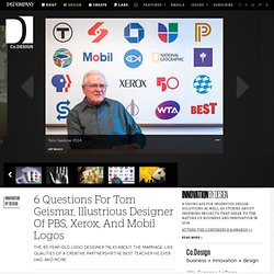
Many have universally recognizable logos--as partner at Brownjohn, Chermayeff, & Geismar (now Chermayeff & Geismar, and Haviv), Geismar oversaw the designs for PBS, Xerox, Chase Bank, National Geographic, and Mobil. And he's an equally prolific exhibit designer, having worked for the likes of the Ellis Island Immigration Museum, the Statue of Liberty Museum, and the Smithsonian. Now 83 and still working in the now thriving graphics industry, Geismar is being honored with a retrospective at New York’s School of Visual Arts. The 26th annual Masters Series showcases work from Geismar's more than six-decade-long career--from early student sketches and hand-set type to famous logos to lesser known designs for birthday cards, posters, and book covers.
LaFraise: Online Graphic T-Shirt Design Contest for Cool & Funny Shirts. Is Flat Design Already Passé? Over the last few years, we've seen an upheaval in the way computer interfaces are designed.
Skeuomorphism is out, and flat is in. But have we gone too far? Perhaps we've taken the skeuomorphic death hunts as far as they can go, and it's high time we usher in a new era of post-flat digital design. Ever since the original Macintosh redefined the way we interact with computers by creating a virtual desktop, computer interfaces have largely been skeuomorphic by mimicking the look of real-world objects.
In the beginning, computer displays were limited in resolution and color, so the goal was to make computer interfaces look as realistic as possible. But skeuomorphism didn't make sense once photo-realistic computer displays became ubiquitous. DOSPUNTOSDISEÑO. Thousands of Free Icons. A Non-Designer's Guide to Typefaces and Layout. Book Written Entirely In PowerPoint Aims To Reinvent How Businesses Communicate. Raise your hand if you like sitting through slide-show presentations.
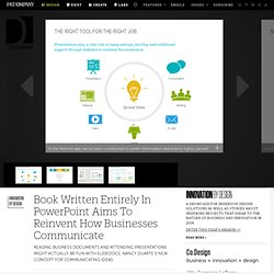
How about reading dense, jargony business documents? These are the staples of modern business communication, and yet they're enjoyed by precisely no one. Enter Nancy Duarte, CEO of Duarte Design. Duarte thinks she can redesign business communication with Slidedocs, a new concept she defines as “a visual document, developed in presentation software, that is intended to be read and referenced instead of projected.” Think of it as a kind of a hybrid between slide-show presentations and prose documents--but one that eliminates the most annoying qualities of each. “The inspiration came from being sick of presentations,” Duarte tells Co.Design. Duarte imagines a world in which a Slidedoc would be passed around an organization and read before a presentation, and then the speaker wouldn’t waste his time reiterating what it has already covered.
Duarte is offering webinars on how to use Slidedocs. Book Written Entirely In PowerPoint Aims To Reinvent How Businesses Communicate. Monogram Designs by Emily McCarthy. A Teenager Redesigns The Web For The Color Blind. Color-blindness affects 7% of the world’s population.
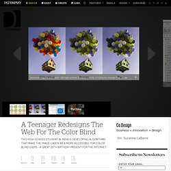
When it comes to surfing the web, the condition can make it impossible to understand the infinite influx of videos, images, and charts. Animesh Tripathi, a 17-year-old high school student in India, is trying to change that. While other teenagers experimented with poor life choices, Tripathi spent the last two years experimenting with algorithms that allow color schemes online to be adjusted to accommodate the needs of the color blind. This Twitter Logo Redesign Takes Simplicity Too Far. First launched in 2010, Twitter's icon--a cheery blue bird--has become an important part of the micro-blogging service's visual identity.
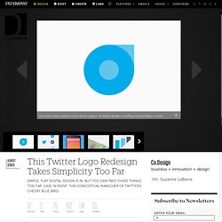
At a time when pretty much every aspect of digital design is shifting toward flatter, more abstract designs, Italian designer Roberto Manzari has released a proposal to vastly simplify the Twitter logo by reducing it to just a few geometric shapes. But is such a vastly simplified logo really right for Twitter's brand? "The main idea of this logo is simplicity," says Manzari on his Behance page. "As Twitter simplifies our ways of communicating, this logo reflects the value of Twitter giving it a recognizable and strong identity. " Design Your Own Creative Brush Packs in Photoshop & Illustrator.
This class is for anyone who has access to Adobe Illustrator or Photoshop, and a scanner or camera (if making raster brushes).
If you have an inclination to start creative side projects that can help enhance your work and the work of your peers, then this class is for you!. Cómo diseñar campañas políticas. Read in english.
Diseño de libros. Color Template. How Many Brands’ Distinct Shades of Blue Can You Correctly Identify? Feeling blue?
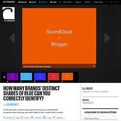
Good--because that’s the kind of mindset you’ll need to play Name That Blue, a simple game that not only reveals how many companies prefer that particular hue, but also your perhaps unrealized ability to distinguish between them. Created by web developer Colin Gourlay, Name That Blue is a testament to your investment in the brands that wallpaper your world. If you are able to distinguish Facebook-sapphire from IBM-azure, then you are either incredibly observant or around these particular shades so often that they’ve seeped into subconscious associations. Photoshop Cs5 Filters Animation. Designjargonbullshit. Flat design casts a long shadow. Whilst many designers embrace flat design wholeheartedly, it seems a growing number have already tired of its charms and are casting around for the next big thing.
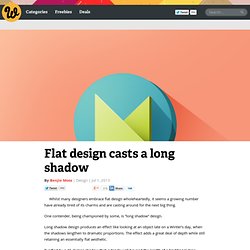
One contender, being championed by some, is “long shadow” design. Long shadow design produces an effect like looking at an object late on a Winter’s day, when the shadows lengthen to dramatic proportions. The effect adds a great deal of depth while still retaining an essentially flat aesthetic. Typified by a 45 degree shadow that extends well beyond the length of a traditional drop shadow, the diagonal lines are reminiscent of early Soviet posters and collages by the likes of Malevich — produced before Socialist Realism became the only acceptable style.
WWW Design — Por qué no pedir favores a los diseñadores gráficos. La historia dice así:
Design - David Bray. Surface Design, Pattern Design Studio. Deconstruir. Condiments Give Spankings In Eye-Popping Italian Ad Campaign. Italian diners have been very, very naughty. Milan-based advertising agency Alch1m1a Adv has created a three-ad series entitled "Gioni’s Revenge," in which Gioni condiments go all 50 Shades on us. The sauces and dressings are personified as dispensers of punishment. There’s "Don’t Spank His Bottom Again" for brown sauce, "Did You Spank His Mom’s Bottom" for ketchup. And "Learn To Squeeze Her" for salad dressing, (known in Italy as salad "cream").
But unless you actually have a condiment fetish and dream of being spanked by your ketchup, you probably won’t want to squirt Gioni’s on your burger after you’ve seen these ads. Infographic: The Intricate Anatomy Of UX Design. Dirt Poster. Dirt Poster is a Design and Graphic-Design work made by Roland Reiner Tiangco, a new graduate of a Design School, living in New York. While handling the poster, your hands starts to get dirty, and this dirt allows you to see what’s the poster is all about. Check out also the artist’s Website.
Meet A Modern-Day Master Of The Classic Neon Sign. Neon lights are a sirens’ call, brightly advertising the likes of strip clubs, used cars and everything in between; Todd Sanders was captivated by the signs themselves as a boy growing up in Hunstville, Texas. Later, he began his creative career as a graphic designer and helped pay his way through college hand-painting signs (also experiencing a renaissance of sorts), but 20 years ago, a fateful trip to Austin, that iconoclastic hub of weird, gave him the nudge he needed to pursue his lifelong dream of mastering the noble gas.
“I apprenticed at [custom sign makers] Ion Art, but my real education came from finding the old masters of the '40s and '50s who were still around,” Sanders tells Co.Design. Cien años de La Catrina. Typeface manager. Graphic Design. Web Blog / Squarespace Website Design Contest Winners by COLOURlovers. Howdy COLOURlovers! You guys have done it again -- great job with your colorful entries in our Website Design Contest, which was brought to you by our friends at Squarespace.
Squarespace's mission is to provide creative tools that power the future of the web. From designers creating the next generation of web and mobile experiences, to anyone managing their own online presence for the first time, Squarespace provides elegant solutions that set new standards for online publishing. By focusing their efforts on the fusion of design and engineering, they strive to create long-lasting products that delight and surprise their customers.
Just a quick recap of what the 5 talented winners of this contest will receive: El espíritu de los cínicos. The Forty Story. Pentagram Rebrands Cigarettes, to Make Deadliness a Virtue. Yesterday, President Obama signed new legislation that aims to make the marketing of cigarettes more difficult than ever--and the law has some provisions that would affect graphic designers, such as a mandate that print ads be in black and white, rather than color. So the St. Petersburg Times asked Pentagram partner DJ Stout to redesign the cigarette package, in light of these changes. What he produced is meant to appeal to smokers, while also turning off others. 9 Big Ideas That Changed The Face Of Graphic Design. What makes for good graphic design? You’ve probably formed your own opinions on the subject as you’ve looked through countless books, magazines, posters, and signage. And chances are you’ve also begun to recognize certain patterns: diagonal lines lend a certain dynamism to a page, typography can be readable or illegible, a layout can honor or obliterate white space.
But how did graphic design develop into what it is today? Fortunately, there are people like Steven Heller to pinpoint the big-bang ideas that led to the standards we take for granted. Regulamentação das profissões de Designer e Designer de Interiores: um "mal" necessário? Por Camila Mariana Coutinho - DesignBR. Link Original. Grafología y Diseño Gráfico Publicitario. Detalles Categoría: Editorial.
Desarrollo web. Portafolios. Infografias. Letra. Tipografía. Caligrafía. Cartelismo. Diagramacion web e impresa. Referentes frontera con ilustracion. Referentes frontera con arte. Graphic Desing for starters. Expresión de Marca. Artículos. El arte y el Diseño pueden generar grandes cambios en el mundo. Hola amigos y amigas Alguna ves se han preguntado si lo que hacemos de verdad puede contribuir a cambiar ciertos aspectos del mundo en el que vivimos actualmente? , si mediante lo que hacemos a diario podemos generar un futuro mejor? Hoy tengo algo muy especial que compartir con todos ustedes, hoy quiero decirles que así nos digan lo que nos digan, el Arte y el Diseño si pueden transformar el mundo!!!! Y si no me creen, les dejo estos 2 videos para que se inspiren muchísimo y se apasionen mucho por lo que les gusta por que ese es el único camino de generar un gran cambio, la pasión y el amor por lo que hacemos Disfrútenlos!!!
Para los que estén interesados en buscar mas información sobre estos Inspiradores artistas aquí están los links para que puedan conocerlos un poco mas: - www.jr-art.net - janemcgonigal.com.
Graphic Design Inspiration, Tutorials, Resources, Freebies, and More! SaveDelete.com - design, technology news, cool software and internet tips. Vintage Me Oh My.