

Delivering a Responsive UI. Creating a Mobile-First Responsive Web Design. Introduction We're going to walk through how to create an adaptive web experience that's designed mobile-first.
This article and demo will go over the following: There is even more up to date responsive guidance on our new Web Fundamentals site. Why we need to create mobile-first, responsive, adaptive experiences How to structure HTML for an adaptive site in order to optimize performance and prioritize flexibility How to write CSS that defines shared styles first, builds up styles for larger screens with media queries, and uses relative units How to write unobtrusive Javascript to conditionally load in content fragments, take advantage of touch events and geolocation What we could do to further enhance our adaptive experience The Need for Adaptivity As the web landscape becomes increasingly complex, it's becoming extremely important to deliver solid web experiences to a growing number of contexts.
However, mobile context is much more than just screen size. View the demo Structure Style Less JS. Conditionally load Javascript based on media query > Responsive Web Design. This page is unfinished and needs further work Best practice for a long time has been to load your javascript at the end of the document to improve website performance, however in todays world of mobile devices we need an even faster solution.
Responsive design has provided us with the ability to change the way the content is displayed to the end user. Most of the time we follow best practices and reorder the content into a linear page layout allowing the most relevant content to float to the top. Sometimes, however, we fall back on display: none; for content that might not be appropriate to load onto a particular breakpoint. There are plenty of bad examples of this, but a good example might be to hide an advanced mapping application on the mobile in favour of linking the user to a built in phone feature. In this case you could look at the width of the device and determine if it is of a certain size you could load in the resources, if (screen.width >= 600 ) { } Breakpoints.js - XOXCO - Web and Community Development. 20 tools to help you create responsive web designs. Building responsive design has become a huge trend in the web design world.
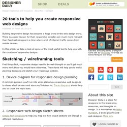
There is a good reason for that: responsive websites are much more relevant than fixed web designs in a time where a lot of internet traffic comes from mobile devices. In this article we take a look at some of the most useful tool to help you with the creation of responsive designs. Sketching / wireframing tools. Adapt.js: More efficient responsive design. A Simple Device Diagram for Responsive Design Planning. Updated for 2015!
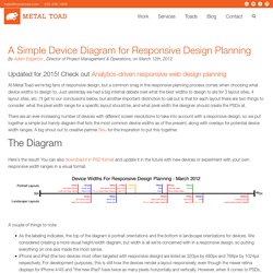
Check out Analytics-driven responsive web design planning At Metal Toad we're big fans of responsive design, but a common snag in the responsive planning process comes when choosing what device widths to design to. Just yesterday we had a big internal debate over what the best widths to design to are for 3 layout sites, 4 layout sites, etc. I'll get to our conclusions below, but another important distinction to call out is that for each layout there are two things to consider: what the pixel width range for a specific layout should be, and what pixel width the designer should create the PSDs at.
There are an ever-increasing number of devices with different screen resolutions to take into account with a responsive design, so we put together a simple but handy diagram that lists the most common device widths as of the present, along with overlays for potential device width ranges. The Diagram Here's the result! Media.smashingmagazine.com/wp-content/uploads/2010/05/CSS3-Help-Sheet1.pdf. Coding Q&A With Chris Coyier: Responsive Sprites And Media Query Efficiency. Advertisement Howdy, folks!
Welcome to more Smashing Magazine CSS Q&A. It works like this: you send in questions you have about CSS, and at least once a month we’ll pick out the best questions and answer them so that everyone can benefit from the exchange. Your question could be about a very specific problem you’re having, or it could even be a question about a philosophical approach. We’ll take all kinds. If you’re interested in exploring more Q&A, there’s a bunch more in my author archive. Resolution Aware Sprites Joshua Bullock asks: Your last round of questions was titled “Box-Sizing And CSS Sprites” which offered some great answers for two separate items, but didn’t take them that one step further for responsive design.
Retina displays made a really quick and big jump in resolution. If you are drawing a solid red box on the screen, no problem at all! One solution is to make all your original images bigger. Your question was explicitly about sprites. Here’s a demo of that. See demo. 70 Expert Ideas For Better CSS Coding. Advertisement CSS isn’t always easy to deal with.
Depending on your skills and your experience, CSS coding can sometimes become a nightmare, particularly if you aren’t sure which selectors are actually being applied to document elements. An easy way to minimize the complexity of the code is as useful as not-so-well-known CSS attributes and properties you can use to create a semantically correct markup.
We’ve taken a close look at some of the most useful CSS tricks, tips, ideas, methods, techniques and coding solutions and listed them below. We also included some basic techniques you can probably use in every project you are developing, but which are hard to find once you need them. And what has come out of it is an overview of over 70 expert CSS ideas which can improve your efficiency of CSS coding. We’d like to express sincere gratitude to all designers who shared their ideas, techniques, methods, knowledge and experience with their readers. 1.1. 1.2. 1.3. Downloads/CSS3-Media-Queries_indieconf_111119.pdf. Downloads/Building-Responsive-Layouts_CSSDevConf_121205.pdf. Essential considerations for crafting quality media queries. CSS3 media queries are dead simple, in terms of their syntax.

You’ve got an @media directive, a media type (which you already know from good ol’ CSS 2, like screen, print, all, etc.) and one or more media features (the characteristics we’re testing against).