
4. etäluento: Visualisointia 2. Statistics: Making Sense of Data. About the Course We live in a world where data are increasingly available, in ever larger quantities, and are increasingly expected to form the basis for decisions by governments, businesses, and other organizations, as well as by individuals in their daily lives.
To cope effectively, every informed citizen must be statistically literate. This course will provide an intuitive introduction to applied statistical reasoning, introducing fundamental statistical skills and acquainting students with the full process of inquiry and evaluation used in investigations in a wide range of fields.
In particular, the course will cover methods of data collection, constructing effective graphical and numerical displays to understand the data, how to estimate and describe the error in estimates of some important quantities, and the key ideas in how statistical tests can be used to separate significant differences from those that are only a reflection of the natural variability in data. Getting Started With The Gephi Network Visualisation App – My Facebook Network, Part I. A couple of weeks ago, I came across Gephi, a desktop application for visualising networks.
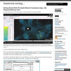
And quite by chance, a day or two after I was asked about any tools I knew of that could visualise and help analyse social network activity around an OU course… which I take as a reasonable justification for exploring exactly what Gephi can do :-) So, after a few false starts, here’s what I’ve learned so far… First up, we need to get some graph data – netvizz – facebook to gephi suggests that the netvizz facebook app can be used to grab a copy of your Facebook network in a format that Gephi understands, so I installed the app, downloaded my network file, and then uninstalled the app… (can’t be too careful ;-) Once Gephi is launched (and updated, if it’s a new download – you’ll see an updates prompt in the status bar along the bottom of the Gephi window, right hand side) Open… the network file you downloaded. You can also generate views of the graph that show information about the network. Gephi. Guides/data-bulletproofing.md at master · propublica/guides. Network Graph - Fusion Tables Help.
Current limitations include: The visualization will only show relationships from the first 100,000 rows in a table.
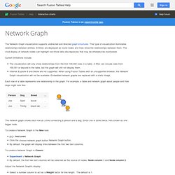
A filter can include rows from 100,001 or beyond in the table, but the graph will still not display them. Internet Explorer 8 and below are not supported. When using Fusion Tables with an unsupported browser, the Network Graph visualization will not be available. Embedded network graphs are replaced with a static image. Each row of a table represents one relationship in the graph. The network graph shows each row as a line connecting a person and a dog. To create a Network Graph in the New look: [+] > Add chart Click the Network Graph button. Interactive News Graphics Collection. Journalism and Media Studies Center at the University of Hong Kong, Spring 2013. For this assignment you will evaluate the performance of OpenCalais, a commercial entity extraction service.

You’ll do this by building a text enrichment program, which takes plain text and outputs HTML with links to the detected entities. Then you will take five random articles from your data set, enrich them, and manually count how many entities OpenCalais missed or got wrong. 1. Get an OpenCalais API key, from this page. 2. 3. Each instance has “offset” and “length” fields that indicate where in the input text the entity was referenced. 4.
In many cases, like the example in step 3, OpenCalais will not be able to give you any information other than the string corresponding to the entity, result.entities[x]['name']. Coding for Journalists 101 : A four-part series. Photo by Nico Cavallotto on Flickr Update, January 2012: Everything…yes, everything, is superseded by my free online book, The Bastards Book of Ruby, which is a much more complete walkthrough of basic programming principles with far more practical and up-to-date examples and projects than what you’ll find here.
I’m only keeping this old walkthrough up as a historical reference. I’m sure the code is so ugly that I’m not going to even try re-reading it. So check it out: The Bastards Book of Ruby -Dan Update, Dec. 30, 2010: I published a series of data collection and cleaning guides for ProPublica, to describe what I did for our Dollars for Docs project. So a little while ago, I set out to write some tutorials that would guide the non-coding-but-computer-savvy journalist through enough programming fundamentals so that he/she could write a web scraper to collect data from public websites. Data presentation, visualization & analysis software for Data Professionals. Data Visualization Gallery. KdmcBerkeley.
1. luento: Johdatus datajournalistmiin 15.2. 2. luento: Datajournalistinen prosessi 15.2. Data journalism: 22 key links « Simon Rogers. Simon Rogers Data journalism and other curiosities Search Subscribe to RSS you're reading...
Ideas, issues, knowledge, data - visualized! How to make a map with Google Fusion tables « Simon Rogers. The workshop below was written by Kathryn Hurley at Google and is a brilliant guide to how to get started with Fusion tables.

Fusion Tables is a modern data management web application making it easy to host, manage, collaborate on, visualize, and publish data tables online. Follow the steps below to upload your own data to Fusion Tables and create a map! Datajournalismi. Welcome to Google Docs. Visualize your Twitter network « Verkostoanatomia – the Network Approach.