
Tips and best practices to develop responsive websites. Start with a template Sure, you can start coding from scratch, but there’s a lot of interesting free templates that will make you save a lot of time.
Among others, I recommend Mobile boilerplate, The 1140 grid and Skeleton. There’s a lot more than those ones, so feel free to google “responsive web design template” if you want more. Working with fluid grid based layouts Fluid layouts are an important part of a good responsive layout. To get the size in percents from a size in pixels, you have to take the element’s width and divide it by the full grid size. This is why it is interesting to work with a 1000px grid. 1000 is a round number, and it is easy to calculate that 24% of this size will be equal to 240 pixels. Flexible images A very important aspect of a responsive layout is how images can adapt to the size of their parent container. A better solution is to use context-aware image sizing. And the related CSS: For more info about this technique, check out this article.
Get inspired. Wirefy – A Framework For Responsive Wireframes. If you are a web designer/developer who first creates wireframes for a web project, Wirefy will help you a lot.

It is a CSS-JS framework for creating responsive and cross-browser wireframe layouts very quickly. Wirefy is style-agnostic so that clients won't get hung up on the look or colors but just the layout and -maybe- functionality. The framework includes styles for all major web design elements like typography, grid, tables, images, forms, buttons, pagination,slideshow and more. 40 Examples of Brilliant Responsive Website Layouts. Responsive web design become a very popular trend in 2011.
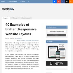
It’s likely something we’ll see continuing well into 2012 as designers are beginning to support a myriad of mobile devices. Building layouts for the web can be tough, but inspiration is a huge factor. In this gallery I’ve collected 40+ amazing responsive website layouts. These designs are built to support a set of different resolutions and re-size accordingly. It’s tricky building this functionality in HTML5, even advanced web developers may not understand responsive design trends. Fork CMS Full View: Mobile View: SimpleBits White Lotus Aromatics 1140px CSS Grid Atlason 10K Apart Cognition Reverse Buro Sunday Best. Responsify.it - A responsive template generator. The Challenge of Responsive Images. Images are one of the most important elements on a web page in terms of user experience.
Few objects on a page have the same impact on everything from emotional responses to bounce rates. When users are viewing your site on mobile devices, small screens, or in other unusual situations the images can distort the page and ruin your careful site design. That’s why responsive design is being developed. In this post we examine the challenge of responsive images. The Challenge Of Images In Responsive (& Mobile) Design Responsive design has the web industry talking. A Simple Fit Seting the images so their width can never be greater than their container element is one of the easier ways to allow images to adjust to the page size automatically. This looks great if you’re using a modern browser on Linux or a Mac.
If you want to read more about solving this scaling issue there’s another great post about it here: Fluid Images. It’s Too Big! Taller Images Dominate The Feature Image Other Solutions. Pixel Perfect Responsive Design Testing Tool.