
US of the Environment. In the spirit of two popular infographics that map out the best and worst of all 50 U.S. states — the United States of Awesome and the United States of Shame — MNN decided to see how each state shines or suffers in regard to environmental and public health.
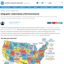
Our "United States of the Environment" maps depict each state's No. 1 and No. 50 ranking for issues such as conservation, agriculture, energy efficiency, disease prevalence, pollution, natural resource availability and education, among others. Check out the two maps below, and see our list of states, stats and sources for more information. Sources for "good U.S. " map:Alabama: Lowest rate of alcohol abuse or dependence (U.S. Substance Abuse and Mental Health Services Administration) Alaska: Most wetlands (U.S. Geological Survey) Arizona: Most solar power potential (USA Today, National Climatic Data Center) Arkansas: Home of Buffalo River, first U.S. India's Population Grows To 1.21 Billion. Chipmaker Advanced Micro Devices Inc. said Thursday after the markets closed that its first quarter loss narrowed from last year, helped by strong revenue growth in its graphics and visual solutions business.

The company's quarterly earnings per share, excluding items, also came in above analysts' expectations as did its quarterly revenue. athenahealth reported a slip to loss in the first quarter, hurt by lower margins even as revenues jumped 30 percent. Both earnings and revenue for the quarter came in short of Wall Street estimates. Time zones: About time. How To Have A Rational Discussion. Visualizing The Cost of Urban Water. World map of HAPPINESS by Country. Global arms exports: Present arms. Mobile By The Numbers [INFOGRPAHIC] Mobile is a rapidly developing sector.
![Mobile By The Numbers [INFOGRPAHIC]](http://cdn.pearltrees.com/s/pic/th/mobile-the-numbers-infographic-11406444)
According to some projections, mobile internet usage will overtake desktop usage before 2015. In preparation, companies are developing new mobile commerce platforms, strategies, and marketing efforts. Microsoft Tag recently attempted to sum up this constantly changing space with a single infographic. Here's the summary: The mobile market is large; local searches, games, and YouTube are all doing well on Mobile; and socializing is the most prominent use of the mobile Internet. World Water Day Slideshow: Everything You Need to Know About H2O. Chart: Why $4-Per-Gallon Gas Is Damn Cheap. Inspired by Cord's thought-provoking post on the per gallon prices of various liquids, and by Sarah Palin's ill-informed Facebook rant on the "$4-Per-Gallon President," I decided to take a closer look at gasoline prices around the world.
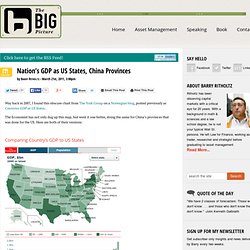
Mrs. Palin might be interested to learn, that the world already has quite a few $4-Per-Gallon Presidents. In fact, the world already has $6-Per-Gallon Parliaments, $7-Per-Gallon Prime Ministers, and $8-Per-Gallon Presidents! We've collected a broad sample of gas prices from throughout the industrialized Western world in the chart below. Important to note: this chart includes only official data from throughout the European Union and North America. Nation’s GDP as US States. Way back in 2007, I found this obscure chart from The York Group on a Norwegian blog, posted previously as Countries GDP as US States.
The Economist has not only dug up this map, but went it one better, doing the same for China’s provinces that was done for the US. World's nuclear reactors location. Nuclear power plants have only a few decades of working life before they have to be shut down – so how big is the problem?
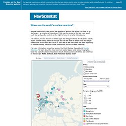
Roll over the circles to find out more about each site, and use the controls on the right to home in on what interests you. For instance, to view reactors of similar type and vintage to those at Fukushima Daiichi, Japan, choose 'boiling water' as the type and use the slider to select those that began construction in the 1960s and 1970s. If you'd like to see how China has been expanding its nuclear industry, check the 'under construction' box on the east Asia map.
For more information, consult our source: the World Nuclear Association's Reactor Database. To learn about the most common reactor types, scroll below the graphic. Pressurised water reactors (PWRs) This is the most common type worldwide. Nuclear power: The nuclear family. Defence budgets: Military ranking. Inequality- How Rich is the SuperRich.
Want more charts like these?

Women In The World. Best of FlowingData – 2/2011. 2010 US Census News & Data. The 12 States of America. World Development Indicators (subset) - Google Public Data Explorer. Our changing world in cartograms. In this series of interactive cartograms, FedEx shows our changing world (and I guess, how they are changing with it) through a variety of worldwide demographics such as access to mobile Web, growth, and happiness.
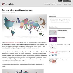
Above is the cartogram for richest countries i.e. GDP. 200 Countries, 200 Years, 4 Minutes. World Health & Wealth Graph. Economic Freedom of the World.
GDP. CO2 Emmissions- Interactive Map. Oil. Urban Population. Internet Users. Population Distribution. SHOW®- Interactive Maps. BroadBand.