
How to Visualize and Compare Distributions. There are a lot of ways to show distributions, but for the purposes of this tutorial, I’m only going to cover the more traditional plot types like histograms and box plots.
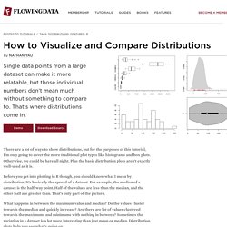
Otherwise, we could be here all night. Plus the basic distribution plots aren’t exactly well-used as it is. Before you get into plotting in R though, you should know what I mean by distribution. It’s basically the spread of a dataset. For example, the median of a dataset is the half-way point. What happens in between the maximum value and median? Want more? If you don’t have R installed yet, do that now. Box-and-Whisker Plot This old standby was created by statistician John Tukey in the age of graphing with pencil and paper. The method might be old, but they still work for showing basic distribution. To get started, load the data in R. Remove the District of Columbia from the loaded data. Oh, and you don’t need the national averages for this tutorial either. Multiple box plot for comparision.
Histogram. Visualizing tags over time. Data VisualizationTutorials. KDMC produces a wealth of digital media tutorials to support our training sessions and classes.
While the focus of some tutorials is on technology and journalism, most are general enough to be of use to anyone. Spreadsheets Updated March 11, 2012 in Data Visualization This tutorial covers the basics of creating and doing calculations with a spreadsheet. It is based on using Google Docs spreadsheets, with notes on some differences with Excel spreadsheets. Protovis Part 4: External data and animated labels Updated Sept. 7, 2011 in Data Visualization Learn to how to load data into your Protovis charts from an external file and learn new tricks to animate bars and labels simultaneously. QGIS basics for Journalists Updated March 16, 2012 in Maps, Data Visualization QGIS is a free, open source GIS application that works on most major operating systems. 7 Basic Rules for Making Charts and Graphs.
Charts and graphs have found their way into news, presentations, and comics, with users from art to design to statistics.
The design principles for these data graphics will vary depending on what you're using it for. Making something for a presentation? You'll want to keep it extremely simple and avoid using a lot of text. Books - The Visual Display of Quantitative Information. Information is beatiful - examples. A lot of people have been emailing asking how I create these images, what software I use and so on.
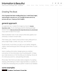
So I thought I’d share a bit of my process with you. I hope you find it helpful. As a general rule, I create the images by hand in Adobe Illustrator CS4. It’s an amazingly powerful drawing package. Adobe have a fully functional 30-day trial version to download if you want to take it for a spin. Data visualization wise, it can output a few basic graphs, but otherwise, it doesn’t render data. That means, yes, I have to hand position every data point on every single image I create. To be honest, most times, you get a much better, designed, organic result working by hand.
Hand-creating information designs gives you a better connection to the information you’re working with. How to Become a Data Visualization Freelancer. I kept my promise: the interview with Moritz Stefaner on data visualization freelancing is finally here!
And I am really excited. As I said in my introductory post, I think data visualization freelancing is one of the most exciting trends in visualization; even though it’s a little bit hidden. After recording the interview, I must say I am really satisfied. I learned something out of it and I am sure the same will be totally true for you. The video is a bit long (see the content breakdown below) but it’s really worth it: we covered a very large number of questions and they all came directly from the readers (thanks to all of you guys)!
Any comment, question, or suggestion for me and Moritz is more than welcome. Video content breakdown with timing: [01:00] Starting Out (building a portfolio)[08:30] Design Practice (iterative approach, designing 20 prototypes!) Additional versions of the interview. Visual Complexity: Mapping Patterns of Information. The Syntax of a New Language Large 35" x 23" 89 x 58 cm Medium 16" x 20" 41 x 51 cm Small 11" x 17" 28 x 43 cm All posters depict the 15 visual methods of network visualization as showcased in Chapter 5 of Visual Complexity: Mapping Patterns of Information, by Manuel Lima (Princeton Architectural Press)
Think Stats. Gephi Tutorial Layouts. Your Random Numbers – Getting Started with Processing and Data Visualization. Over the last year or so, I’ve spent almost as much time thinking about how to teach data visualization as I’ve spent working with data.
I’ve been a teacher for 10 years – for better or for worse this means that as I learn new techniques and concepts, I’m usually thinking about pedagogy at the same time. Lately, I’ve also become convinced that this massive ‘open data’ movement that we are currently in the midst of is sorely lacking in educational components. The amount of available data, I think, is quickly outpacing our ability to use it in useful and novel ways. How can basic data visualization techniques be taught in an easy, engaging manner? This post, then, is a first sketch of what a lesson plan for teaching Processing and data visualization might look like. Let’s Start With the Data We’re not going to work with an old, dusty data set here. Even on a Saturday, a lot of helpful folks pitched in, and I ended up with about 225 numbers. It’s about time to get down to some coding. OK.