
Swifticons: Premium Icons Pack (1,600+) - Designmodo Market. Experiment With Color in Adobe Illustrator to Create an Abstract Rose Illustration. I had a bouquet of yellow roses on the table and decided to draw it.

Without a clear picture in mind I usually experiment a lot with colors, gradients, and transparency. In this tutorial I am going to highlight a few tricks that I use when drawing with Adobe Illustrator. First I take a couple pictures of the bouquet with my smart phone and sketch the flowers that I like. I draw a sketch using the Pencil Tool (N) with a fine Stroke Weight of around 0.1 pt. This thickness is convenient because you see the lines, but they don't get too thick no matter how much you zoom in, and they don’t distract you. I decide on the dimensions of the picture and outline the composition. When you decide on the background, it’s better to take the color two shades darker than you want.
To outline the shapes with color, I normally use Radial Gradients. Using yellow gradients I emphasized the roses. I’m experimenting with colors again. One of my favorite tricks is creating luminous sparks. 9 basic principles of responsive web design. Responsive web design is a great solution to our multi-screen problem, but getting into it from the print perspective is difficult.
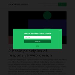
No fixed page size, no millimetres or inches, no physical constraints to fight against. Designing in pixels for Desktop and Mobile only is also the past, as more and more gadgets can open up a website. Therefore, let's clarify some basic principles of responsive web design here to embrace the fluid web, instead of fighting it.
To keep it simple we'll focus on layouts (yes, responsive goes way deeper than that and if you want to learn more this is a good start). Responsive vs Adaptive web design It might seem the same but it isn't. The flow As screen sizes become smaller, content starts to take up more vertical space and anything below will be pushed down, it's called the flow. Relative units The canvas can be a desktop, mobile screen or anything in between. Breakpoints Max and Min values. 6 simple rules for designing mobile websites. It is projected by ComScore the by the end of 2014, around 1.75 billion people worldwide will use smartphones regularly.

That means that those who’ll be the first to adapt to this rapidly growing segment of the market will reap the most benefits and enjoy the most success. What that means to your business is that you have to be easily accessible through all the different devices, and thus your web design has to cater not only to computer users, but also to smartphones. Here are six simple rules that will help you ensure your site is optimized for mobile: 1) Know your target audience One of the best things about working online is that you can use analytics to track almost any data and use it to make tremendous improvements on all parts of your business.
After you get the information you need, you can build your site in a way that will be the most convenient to the largest portion of your audience. 2) Context is key 3) Think of touch screen users 4) Keep the design simple Conclusion. Learning Xcode As a Designer. 10 Handy Tips To Keep Your Color Swatches & Palettes Organized. Knowing that you have something, but not knowing where it is can be a frustrating feeling.

This can be particularly true of colors you’ve created or saved for your design projects. It’s a waste of time to have to hunt through color swatches, just to have to start the search all over when it’s time to switch hues. Finishing a project can be difficult if you’re constantly using your eyedropper tool or plugging in CMYK values into the Color Picker. As any experienced designer knows, whether you’re designing for print or web, having your color swatches and palettes well-organized can help speed up your process. With Adobe Illustrator and Photoshop, it’s easy to keep your color swatches and palettes organized. Read Also: Basics Behind Color Theory For Web Designer Getting Started To start organizing, start up Adobe Illustrator or Adobe Photoshop, then click on the Window menu and put a check mark next to Swatches. 1. 2. A clean swatch palette is empty, yet full of possibilities.
10 Handy Tips To Keep Your Color Swatches & Palettes Organized.