
Visualizing min-heap algorithms with D3.js. I haven't done any real work on learning Javascript and D3.js since my last attempt a couple months back.
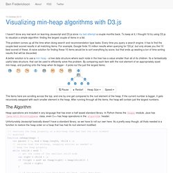
To keep at it, I thought I'd try using D3.js to visualize a simple algorithm: finding the largest couple of items in a list. This problem comes up all the time when doing search and recommendation type tasks. Every time you query a search engine, it has to find the couple best scored results in all matching items. For example, Google finds 15 million results when querying for 'D3.js', but only shows you the 10 best scored of these. A naive solution for finding these 10 items would be to sort everything by score, but that ends up wasting a ton of time sorting results that will be discarded. A better solution is to use a min-heap - a tree data structure where each node in the tree has a value smaller than all of its children.
Note: you need Javascript enabled and a SVG compatible browser to view the diagrams here! The Algorithm Displaying in D3. WhoDoTheyServe.com. GBD Arrow Diagram. Song Networks: Interative Network Tutorial. Dizzib/WhoDoTheyServe.com. Stephen Boak — Tutorial: Network Flow Visualizations With Directed Edges in D3. Back in May I posted some network visualization experiments we did at Boundary to the Boundary Blog.
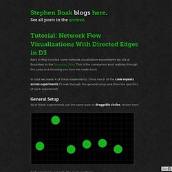
This is the companion post walking through the code and showing you how we made them. In total we made 4 of these experiments. Since much of the code repeats across experiments I’ll walk through the general setup and then the specifics of each experiment. General Setup All of these experiments use the same base of draggable circles, shown here: First, I randomly generate the circle positions: var width = 600, height = 300; var radius = 25; /* radius of circles */ var numCircles = 6; /* number of circles to make */ /* array of random x,y coords for circles, away from edges */ var circles = d3.range(numCircles).map(function(i, d) { return [ Math.round(50 + (i/numCircles)*(width - 50)), Math.round(30 + Math.random()*(height - 80)) ]; }); After creating the SVG element, and a group to contain the circles, I append the circles to the new group… Scales and Links Straight Edges Arrows Tapers, Joined. Ignacioola/insights. Untitled. Spacetree - Tree Animation. Sankey Diagram. Source: Department of Energy & Climate Change, Tom Counsell.
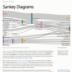
Sankey diagrams visualize the magnitude of flow between nodes in a network. This intricate diagram shows a possible scenario for UK energy production and consumption in 2050: energy supplies are on the left, and demands are on the right. Intermediate nodes group related forms of production and show how energy is converted and transmitted before it is consumed (or lost!). The thickness of each link encodes the amount of flow from source to target. This example is built with D3’s Sankey plugin. The fully automatic layout is convenient for rapid visualization—positioning nodes manually is tedious! Many thanks to Tom Counsell, whose Sankey library provided inspiration for this example.
CodeMirror. Selected Tools. Re-usable charts for d3.js. Www.mathjax.org. Using D3.js to visualise Hierarchical Classification. Why D3.js?

I’ve been playing around with a fairly new visualisation library called D3.js for the last couple of weeks. Given my last post about how awesome the python plotting library matplotlib is, why bother? D3 is for visualisation, as opposed to plotting. Where matplotlib is great for easily generating publication quality plots (by calls like pylab.hist(data) to make a histogram), D3 is more general. The basic concept is that you create a collection of objects (usually shapes in an svg), and bind data to them. What are we trying to visualise? My current PhD research is in the area of classifying content of underwater images. My first paper was on how to make a system that detects whether a point in an image was kelp (a species of algae), or something else.
One way to deal with this set of hierarchical classes (or taxonomy) is to create a network of binary classifiers. How to interpret the visualisation. Examples. Code Playground. Eloquent JavaScript.