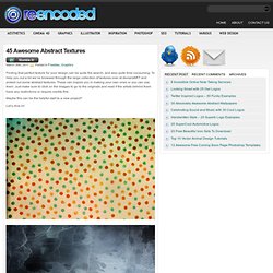

Search. #ededed #e8dcca #b08a61 #66503c #6b636a #aba2a4 Find The Palettes You Love seasoned tones posted 04.27.14 comments 1 geode tones posted 04.25.14 comments 0 sponsored links culinary color posted 04.25.14 comments 1 geode brights posted 04.22.14 comments 0 dried tones. Infographic of the Day: How Color Affects Purchases. 45 Awesome Abstract Textures. Finding that perfect texture for your design can be quite the search, and also quite time consuming.

To help you out a bit we’ve browsed through the large collection of textures over at deviantART and picked out some abstract textures. These can inspire you in making your own ones or you can use them. Just make sure to click on the images to go to the originals and read if the artists behind them have any restrictions or require credits first. Maybe this can be the helpful start to a new project? Let’s dive in! 100 Principles for Designing Logos and Building Brands.
The psychology of color. The Secret Law of Page Harmony. “A method to produce the perfect book.”

The perfect book. This is how designer-genius Jan Tschichold described this system. Not the ok book, nor the pretty good book, but the perfect book. This method existed long before the computer, the printing press and even a defined measuring unit. No picas or points, no inches or millimeters. And you can still use it. The Secret Canon & Page Harmony Books were once a luxury only the richest could afford and would take months of work to be brought to fruition. And they were harmoniously beautiful. The bookmakers knew the secret to the perfect book. So elegant is this method of producing harmony that a few designers saw to rediscover it. They found the way to design a harmonious page. There’s a dance to all this Let’s look at this dance, shall we? And here it is with them (using the Van de Graaf Canon and Tschichold’s recommended 2:3 page-size ratio, which we’ll get into next).
This is where the harmony is found. How is this dance beautiful? The J. Lessons. Drawspace Pro Lessons are designed for artists of all levels and educators, and are logically organized into resources and activities.

Eventually, all lessons and E-books authored by Brenda Hoddinott will be available here: four to eight brand new lessons and newly-revised older lessons are being added every month! Upgrade Now: Download all 310 lessons and 4 e-books! Try for Free: Download lessons marked as "Free"! 1.1.R1 Glossary Of Art Terms Definitions of art-related terms used in the resources and activities of Drawspace Curriculum (updated February 2013) $3.99or Upgradeto access all files 1.1.R2 Travelling Back in Time with Graphite A few fun tidbits of information about the history of graphite $0.99or Upgradeto access all files 1.1.R3 Examining Graphite and Grades Understanding the differences between H and B grades of graphite.
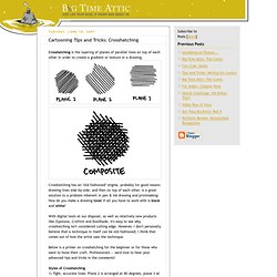
Big Time Attic: Cartooning Tips and Tricks: Crosshatching. Crosshatching is the layering of planes of parallel lines on top of each other in order to create a gradient or texture in a drawing.

Crosshatching has an "old-fashioned" stigma, probably for good reason: drawing lines side-by-side, and then on top of each other, is a great solution to a problem inherent in pen & ink drawing and printmaking: How do you make a drawing tonal if all you have to work with is black and white? With digital tools at our disposal, as well as relatively new products like Zipotone, Craftint and DuoShade, it's easy to see why crosshatching isn't considered cutting edge.
However, I don't personally believe that a technique in itself can be old-fashioned; I think that comes out of how the artist uses the technique. Below is a primer on crosshatching for the beginner or for those who want to hone their craft. Professionals -- we'd love to hear your advanced tips and tricks in the comments! Styles of Crosshatching1) Tight, accurate lines. Consistency.