
The Graphic Continuum Poster - Now in French! Well, my week of data and story posts has come to an end.

And today I head off to Pamplona, Spain for what I expect will be an incredible and exhausting week at the Malofiej Infographic World Summit. I’ll be part of an incredible panel of judges reviewing hundreds of infographics and visualizations from the past year, and then on Thursday I’ll deliver my talk about data and stories. The posts I’ve posted this week were drawn from my research preparing for that talk (you can also watch a shorter version of that talk here). As I wrap up the week of blog posts and podcasts (though more podcasts on story yet to come), I thought it might be useful to provide my list of books, blogs, videos, podcasts, news articles, and other links I used in my process of researching the concept of data and stories (though perhaps this is most useful for me, to have these resources organized and listed).
Square pie chart beats out the rest in perception study. Many hate pie charts.
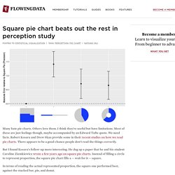
Others love them. I think they’re useful but have limitations. Most of these are just feelings though, maybe accompanied by an Edward Tufte quote.
Chorématique. Pyramide d'Ackoff. La Graphique, Jacques Bertin 2000.