
Defining and Informing the Complex Field of User Experience (UX) Articles - Baymard Institute. Nine great examples of web form design. Filling in forms online can be a pain, but good design can make a lot of difference to the user experience.
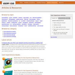
To coincide with our new Marketer’s Guide to Form Optimisation, produced in association with Fospha, I’ve collated some examples of great form design, or aspects of forms that are worth learning from. Schuh: easy address entry Schuh uses this predictive postcode entry tool on its checkout, which suggests matching addresses as you begin to type them in. This has two benefits: The customer doesn’t have to spend time typing out their whole address.It reduces the risk of making mistakes and subsequent delivery problems. Threadless: use of micro copy Some form fields can sow confusion amongst customers, perhaps due to uncertainty about entry formats, or the information required.
This can often be solved with some explainer text placed next to the relevant form field. AO.com: easy input formats for mobile users Booking.com: card scanning on mobile Autoglass: clear error messaging Related reading. Researching the best ways to improve the online user experience. Usability articles and resources. Browse by topic Browse by category Latest article 5 reasons why your first user research activity should be a usability test 4 April, 2016 - A usability test is the wrong research method when you want to discover if there's a real user need for your product; when you want to understand the environment where your system is used; and when you want to find out how people use your product in their daily lives.
67 Percent of Online Shoppers Will Leave a Website Due to Slow Performance, New Harris Poll Reveals—Consumers Will Quickly Go To a Competitor When Experiencing Site Glitches. August 14, 2013 67 Percent of Online Shoppers Will Leave a Website Due to Slow Performance, New Harris Poll Reveals—Consumers Will Quickly Go To a Competitor When Experiencing Site Glitches Riverbed Technology, an application performance company, recently announced the results of one of the most extensive surveys to date on website performance and mobile shopping.
According to the Riverbed-sponsored Harris Poll, once online, shoppers consult three websites on average before making a purchase and poor website performance causes the shopper to go to a competitor. A majority of U.S. adults (68 percent) expect to shop online for gifts this upcoming holiday season. Over 40 percent of U.S. adults who shop online evaluate their purchase with a local retailer before buying online, a practice known as showrooming. Today, an increasing number of shoppers are using mobile phones and tablets to make purchases. ABtests.com - Share A/B Testing Results. Improve your conversion today. Horizontal Attention Leans Left. Parallel & Iterative Design + Competitive Testing = High Usability. Responsive Web Design: What It Is and How To Use It - Smashing Magazine. Advertisement Almost every new client these days wants a mobile version of their website.
It’s practically essential after all: one design for the BlackBerry, another for the iPhone, the iPad, netbook, Kindle — and all screen resolutions must be compatible, too. In the next five years, we’ll likely need to design for a number of additional inventions. When will the madness stop? It won’t, of course. In the field of Web design and development, we’re quickly getting to the point of being unable to keep up with the endless new resolutions and devices.
Responsive Web design is the approach that suggests that design and development should respond to the user’s behavior and environment based on screen size, platform and orientation. The Concept Of Responsive Web Design Ethan Marcotte1 wrote an introductory article about the approach, “Responsive Web Design992,” for A List Apart. Transplant this discipline onto Web design, and we have a similar yet whole new idea. Adjusting Screen Resolution. Information aesthetics - Information Visualization & Visual Communication. iQ Blog - a blog about usability, accessibility and user-centred design. We’re a small country.
And Ireland probably isn’t the first place that jumps to mind when you think about international creativity hubs. That’s why OFFSET, the annual creative industry festival held in Dublin’s Docklands, is all the more remarkable. It’s an event that punches above its weight on the international scene, to the point where it was recently ranked as one of the most significant milestones in modern design by Computer Arts Magazine (just beside the iPad). And over the years has attracted luminaries and legends of design, illustration and photography including Paula Scher, George Lois, Bob Gill and Oliviero Toscani.
These heavy hitters speak alongside an amazing pedigree of Irish talent; this year alone featured Maser (street art), Richard Moss (photography), Brown Bag Films (animation) and Chris Judge (illustration). The fifth annual festival, which finished up just over a week ago, attracted over 2,200 delegates, including many from the IQ team. Brian at Offset. Photos as Web Content.