
Reorder CSS Columns Using Bootstrap. CSS Diagonal Border for Containing Element. Media Queries for Standard Devices. If you think responsive's simple, I feel bad for you son.
We got 99 viewports, but the iPhone's just one. —Josh Brewer, March 10, 2010 A major component of responsive design is creating the right experience for the right device. With a gazillion different devices on the market, this can be a tall task. We've rounded up media queries that can be used to target designs for many standard and popular devices that is certainly worth a read. If you're looking for a comprehensive list of media queries, this repository is a good resource.
If you're reaction to this is: you should never base your breakpoints on devices!! Phones and Handhelds iPhones Galaxy Phones Google Pixel HTC Phones Nexus Phones Windows Phone Tablets iPads Galaxy Tablets Nexus Tablets Kindle Fire Laptops Media Queries for laptops are a bit of a juggernaut. Wearables Yes, we're going there. Apple Watch @media (max-device-width: 42mm) and (min-device-width: 38mm) { } Moto 360 Watch. Formas básicas con CSS: triángulos, círculos, trapecios, rectángulos, cuadrados … – CybMeta.
Estoy desarrollando mi primer tema comercial para WordPress y en el diseño se utilizan algunas formas geométricas básicas como elementos decorativos.
Podría haberlos insertado mediante imágenes o mediante iconos vectoriales pero he decidido crearloos con CSS. La razón: mismo resultado, mayor rapidez. En este post he recopilado los snippets CSS para crear formas básicas como cuadrados, círculos y triángulos. Derivadas de estas se pueden construir fácilmente otras formas tales como rombos, trapecios y otros paralelogramos. Espero que te sean útiles. Transforms - An Advanced Guide to HTML. Lesson 7 With CSS3 came new ways to position and alter elements.
Now general layout techniques can be revisited with alternative ways to size, position, and change elements. All of these new techniques are made possible by the transform property. The transform property comes in two different settings, two-dimensional and three-dimensional. Each of these come with their own individual properties and values. Within this lesson we’ll take a look at both two-dimensional and three-dimensional transforms. Transform Syntax#transform-syntax The actual syntax for the transform property is quite simple, including the transform property followed by the value. Notice how the transform property includes multiple vendor prefixes to gain the best support across all browsers.
In the interest of brevity, the remainder of this lesson will not include vendor prefixes. 2D Transforms#two-dimensional-transforms 2D Rotate The transform property accepts a handful of different values. 2D Scale 2D Translate 2D Skew Demo. 8 simple CSS3 transitions that will wow your users. CSS3 has introduced countless possibilities for UX designers, and the best thing about them is that the coolest parts are really simple to implement.
Just a couple of lines of code will give you an awesome transition effect that will excite your users, increase engagement and ultimately, when used well, increase your conversions. What’s more, these effects are hardware accelerated, and a progressive enhancement that you can use right now. Here are 8 really simple effects that will add life to your UI and smiles to your users’ faces. All of these effects (bar one) are controlled with the transition property. So we can see these effects working, we’ll set up a div in an HTML page: Having done so, set its width and height (so it has dimensions), its background color (so we can see it) and its transition property. Now all we need to do is change properties, and they’ll animate for us… If you’d like to follow along you can download the demo files here. 1. 2. 3. 4.
Tutorial para incluir en nuestra Web cualquier tipo de fuente: Tipos de archivos de fuentes (ttf, eot, otf, svg), propiedad CSS2 @font-face. Históricamente los diseñadores web nos hemos encontrado con el problema de poder incluir únicamente un puñado de aburridas fuentes “seguras” en nuestros diseños web.
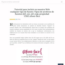
Afortunadamente desde hace un tiempo este problema fue resuelto mediante nuevas propiedades de CSS (como la @font-face) permitiéndonos embeber las fuentes en nuestro site y que se visualizaran correctamente, con indiferencia de si el usuario final tiene instalada o no la fuente en concreto en su ordenador. Pero esta propiedad mágica (@font-face) de CSS seguro que os ha dado más de un dolor de cabeza al comprobar que no es tan “mágica” después de todo. Lo mas seguro es que vuestra Web se vea completamente diferente en cada nuevo navegador con la que la probáis…verdad?
Y ya no hablemos de versiones del mismo navegador…todo un mundo! Da igual que ya hayáis empezado a trabajar con esta propiedad o que no la conocierais hasta ahora. Untitled.