
70+ essential resources for creating liquid and elastic layouts. Understanding Responsive Web Design Archives. Grid. Responsive patterns. Build a basic responsive site with CSS. Knowledge needed: Basic CSS and HTML Requires: Text editor Project Time: 1-2 hours Everyone’s talking about responsive web design.
But does everyone understand what it’s for? I’m not sure. Many web designers and developers seem to me to have misunderstood the problem it’s trying to solve. Put simply, it’s not about making sites for mobile devices, it’s about adapting layouts to viewport sizes. In this tutorial I’ll look at the principles behind responsive web design in detail, so we’re sure to understand the concepts correctly. Responsive web design has mainly become a hot topic because more and more people are using mobile devices such as iPhones, iPads, and BlackBerrys to access the internet. So it’s becoming increasingly important to understand that a website should not be specifically about either the desktop or the mobile device, but about building in such a way that its layout adapts to varying viewport sizes.
Frustrating? User frustration The walkthrough <! Main navigation switch. CSS: Responsive Navigation Menu. Previously I wrote a tutorial on how to make a mobile navigation for responsive design, now I've discovered a new technique to produce a responsive menu without having to use Javascript.
It uses clean and semantic HTML5 markup. The menu can be aligned left, center or right. Unlike the previous tutorial where it is clicked to toggle, this menu toggles on hover which is more user friendly. It also has an indicator to show the active/current menu item. It works on all mobile and desktop browsers including Internet Explorer!
Responsive Design in 3 Steps. Responsive web design is no doubt a big thing now.
If you still not familiar with responsive design, check out the list of responsive sites that I recently posted. To newbies, responsive design might sound a bit complicated, but it is actually simpler than you think. To help you quickly get started with responsive design, I've put together a quick tutorial. I promise you can learn about the basic logic of responsive design and media queries in 3 steps (assuming you have the basic CSS knowledge). Step 1. Most mobile browsers scale HTML pages to a wide viewport width so it fits on the screen. CSS3 Media Queries. CSS2 allows you to specify stylesheet for specific media type such as screen or print.

Case-studies and examples. References. Frameworks. Responsive Design Testing. Fixed vs. Fluid vs. Elastic Layout: What's The Right One For You? Advertisement The problem has boggled the minds of Web designers for years: fixed, fluid, elastic or a hybrid layout design?

Each option has its benefits and disadvantages. But the final decision depends so much on usability that it is not one to be made lightly. So, with all the confusion, is there a right decision? By considering a few factors and properly setting up the final design, you can end up with a successful layout design that reaps all the benefits. This article discusses the pros and cons of each type of layout. Also consider our previous articles: Flexible Layouts: Challenge For The Future1, which discusses the challenges of flexible layouts for the future.Applying Divine Proportion To Your Web Designs2, which explains the process of applying divine proportion to fixed layouts, but concludes with applying the Rule of Thirds to fluid layouts.
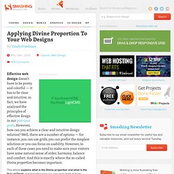
Why all the debate? 1. Fixed Website Layouts The image above shows the general outline of a fixed-width website layout. 2. Pros Cons. Applying Divine Proportion To Your Web Designs. Advertisement Effective web design doesn’t have to be pretty and colorful — it has to be clear and intuitive; in fact, we have analyzed the principles of effective design in our previous1 posts2.
However, how can you achieve a clear and intuitive design solution? Well, there are a number of options — for instance, you can use grids, you can prefer the simplest solutions or you can focus on usability. However, in each of these cases you need to make sure your visitors have some natural sense of order, harmony, balance and comfort. And this is exactly where the so-called Divine proportion becomes important.
This article explains what is the Divine proportion and what is the Rule of Thirds and describes how you can apply both of them effectively to your designs. Divine Proportion Consider the example above. First, calculate the width of your #content-block. The Perfect Fluid Width Layout. I've been thinking a lot about screen resolution lately and how the use of fluid width websites is the best way to accommodate all visitors screen resolutions. The alternative, static width websites, have to make a choice. You can optimize for 800px width, the lowest common denominator, and give up the use of several hundred pixels of width for users with larger screens.
Or, you can optimize for 1024px and just make your 800px visitors horizontal scroll. Anything wider than 1024px is too much for static width sites, in my opinion. I think the best possible scenario is to make a fluid width site that accomodates everyone. Works in all major browsersShrinks to 780pxThis accomodates users with 800x600 resolution, with no horizontal scroll!