
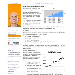
Piktochart- Infographic & Presentation Tool. How to make graphs that work. 1.
Don't let popular spreadsheets be in charge of the way you look 92% of all the business presentations made in the United States are done with templates created by big companies in Excel or Powerpoint. 7 Basic Rules for Making Charts and Graphs. Charts and graphs have found their way into news, presentations, and comics, with users from art to design to statistics.
The design principles for these data graphics will vary depending on what you're using it for. 5 misconceptions about visualization. Last month, I had the pleasure of spending a week at the Census Bureau as a "visiting scholar.
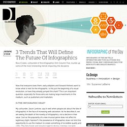
" They're looking to boost their visualization efforts across all departments, and I put in my two cents on how to go about doing it. For being a place where there is so much data, the visual side of things is still in the early stages, generally speaking. 3 Trends That Will Define The Future Of Infographics. Now that everyone loves them, early adopters and forward thinkers want to know what is next for the infographic.
Is this just the beginning of a visual revolution, or have they already jumped the shark? Visual Complexity: Mapping Patterns for the Information Age. In Graphics Issue 2 on Datavisualization. The Berlin-based design studio Golden Section Graphics recently released their second edition of In Graphics. The magazine is published twice per year as a bilingual edition in English and German.
The first issue won 10 national and international design prizes, including a bronze award from the ADC Germany and a gold European Design Award in the magazine category. The cover story explores visually the events around 9/11. From 3D renderings of the plane crashes to a scatterplot comparing casualties of terrorist attacks to the wars in Afghanistan and Iraq.
Another big feature shows everything you need to know about the Berlin Wall as its’ 50 anniversary comes up in August 2011. The second edition of In Graphics is once again an extremely well put together piece of information design. IN GRAPHICS is published by Golden Section Graphics, founded in 2007 by Jan Schwochow. Fineo Creates Tufte-Worthy Diagrams With Just A Few Clicks. RStudio: a new IDE for R that makes coding easier. I tweeted this out earlier, but people are really excited about RStudio, an integrated development environment (IDE) that has the potential to make R coding and development a whole lot easier.
If you use R at all, you know how messy your desktop can get. There's a console, graphics devices, coding windows, etc. Why Infographics Matter [Video] The Most Interesting Papers at the Infovis Conference (VisWeek 2011) This post was written by Kim Rees, a partner at Periscopic (@periscopic), an interactive design firm specializing in data visualization and information presentation.
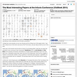
VisWeek has come and gone, but you can still get your fill by finding most of the papers online. I was able to attend most of the InfoVis and some of the TVCG tracks, and was really excited by much of the work. While many of the research was focused on trying to "do something better," there was one paper that presented a novel, new type of data visualization.
GestaltLines (PDF) by Ulrik Brandes and Nick Bobo of the University of Konstanz used balance to visualize dyadic relationships. Even in its most basic form, a 'Gestaltline' shows type, extent, and time of the relationship. Data and Design together. Great things are done by a series of small things brought together. - Vincent Van Gogh Helping people find meaning in large, complex datasets is becoming an increasingly important consideration in UX design.
While the need may be clear, the steps of transforming unprocessed data into effective visualizations are not always so apparent. Data are of various distinctive types, and different data types lend themselves more naturally to certain kinds of visual representation than to others. In addition, some visualization designs are more effective than others in summarizing and highlighting various characteristics of data. Why learning code for data is worthwhile. There are lots of tools that have come out in the past couple of years that make data easier to handle, analyze, and visualize.
Maybe you've used them. Introducing FlowingData Membership. It was about five years ago when I got into visualization.
The Miso Project. Data and visualization blogs worth following. Venngage. Create and share visual ideas online. Datavisualization.ch Selected Tools. Dexvis.com. Info Graphics. New open data platform launches. Do good with data. The Open Data Platform. Workspace: Collect, Enhance, Publish, Share, Analyze.
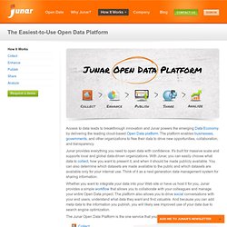
Access to data leads to breakthrough innovation and Junar powers the emerging Data Economy by delivering the leading cloud-based Open Data platform. The platform enables businesses, governments, and other organizations to free their data to drive new opportunities, collaboration, and transparency. Junar provides everything you need to open data with confidence. It's built for massive scale and supports local and global data-driven organizations. Resources for Getting Started with R. R, the open source statistical software environment, is powerful but can be a challenge to approach for beginners.
For me, the best way to learn R, especially on the visualization side of things, is to dive right in.