
22 free tools for data visualization and analysis. You may not think you've got much in common with an investigative journalist or an academic medical researcher.
But if you're trying to extract useful information from an ever-increasing inflow of data, you'll likely find visualization useful -- whether it's to show patterns or trends with graphics instead of mountains of text, or to try to explain complex issues to a nontechnical audience. There are many tools around to help turn data into graphics, but they can carry hefty price tags. The cost can make sense for professionals whose primary job is to find meaning in mountains of information, but you might not be able to justify such an expense if you or your users only need a graphics application from time to time, or if your budget for new tools is somewhat limited. If one of the higher-priced options is out of your reach, there are a surprising number of highly robust tools for data visualization and analysis that are available at no charge.
TULP interactive. jQuery.parallax. Download git clone github.com/stephband/jparallax Instantiation jQuery( '.parallax-layer' ).parallax( options ); What does jquery.parallax do?
jParallax turns nodes into absolutely positioned layers that move in response to the mouse. With a bit of CSS you can either set up windows to see these layers through, or leave them free to roam about. The diagram on the right illustrates what jParallax does to the html: and here's a demonstration with some images: More demos demos/index.html demos/stalkbuttons.html - multiple parallax. demos/remotecontrol.html - parallax by remote control. demos/thumbnails.html - beautiful interactive thumbnails. demos/target.html - demonstrates how smoothly jParallax handles window resizing. Using jParallax The default behaviour of jParallax is to show the whole width of a layer in response to the mouse travelling the whole width of the mouseport.
Therefore, the simplest way to use jParallax is to make the layers different sizes using CSS. Options Layer Options Events Tips. CIRCOS Circular Genome Data Visualization. Circos: An Amazing Tool for Visualizing Big Data. Storing massive amounts of data in a NoSQL data store is just one side of the Big Data equation.
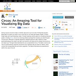
Being able to visualize your data in such a way that you can easily gain deeper insights, is where things really start to get interesting. Lately, I've been exploring various options for visualizing (directed) graphs, including Circos. Data visualization tools. When I meet with people and talk about our work, I get asked a lot what technology we use to create interactive and dynamic data visualizations.
At Interactive Things, we have a set of preferred libraries, applications and services that we use regularly in our work. We will select the most fitting tool for the job depending on the requirements of the project. Sometimes a really simple tool is all you need to create something meaningful. On other occasions, a more multifaceted repertoire is needed. But how does one choose the right thing to use? That’s why we have put together a selection of tools that we use the most and that we enjoy working with. Let me answer the most likely questions right away: No, not everything find its’ way into this list, so you might not find your personal favorite. Well-formed.eigenfactor.org : Visualizing information flow in science. Visualizious: Visualizing Social Indexing. Visualizious Visualizious is a research project about social indexing (a.k.a. social tagging), information retrieval and visualization.
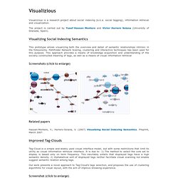
The project is carried out by Yusef Hassan Montero and Víctor Herrero Solana (University of Granada, Spain). Visualizing Social Indexing Semantics This prototype allows visualizing both the overview and detail of semantic relationships intrinsic in the folksonomy. Pathfinder Network Scaling, clustering and interactive techniques has been used for this purpose. Screenshots (click to enlarge) Related papers Hassan-Montero, Y.; Herrero-Solana, V. (2007) Visualizing Social Indexing Semantics.
Improved Tag-Clouds Tag-Cloud is a simple and widely used visual interface model, but with some restrictions that limit its utility as visual information retrieval interface. Our work presents a novel approach to Tag-Cloud's tags selection, and proposes the use of clustering algorithms for visual layout, with the aim of improve browsing experience. Related papers. 21 Ridiculously Impressive HTML5 Canvas Experiments. Ubigraph: Free dynamic graph visualization software. UbiGraph is a tool for visualizing dynamic graphs.
The basic version is free, and talks to Python, Ruby, PHP, Java, C, C++, C#, Haskell, and OCaml. Download Version alpha-0.2.4 Version alpha-0.2.4 is distributed as two separate components. The server application, which renders graphs, is distributed as a compiled binary. The client bindings, which use XMLRPC, are distributed under an open source license.
Download now ➠ Watch demonstrations The demonstrations on our Demos page illustrate the underlying technologies and some example applications. Watch demos ➠ Applications Algorithm Visualization UbiGraph can be used to visualize and debug complex algorithms and data structures... Ad Hoc Networks UbiGraph's ability to visualize dynamic, distributed graphs makes it ideal for visualizing wireless ad hoc networks, in which the network connectivity is changing. Real-time profiling Epidemiology Visualize the spread of a disease through a social network... Mailing list.