
Various. Network Workbench. Sci² Tool. CIShell Manual. Sci2 Tutorial. Cytoscape: An Open Source Platform for Complex Network Analysis and Visualization. Fast Thinking and Slow Thinking Visualisation. Last week I attended the Association of American Geographers Annual Conference and heard a talk by Robert Groves, Director of the US Census Bureau.

Aside the impressiveness of the bureau’s work I was struck by how Groves conceived of visualisations as requiring either fast thinking or slow thinking. Fast thinking data visualisations offer a clear message without the need for the viewer to spend more than a few seconds exploring them. These tend to be much simpler in appearance, such as my map of the distance that London Underground trains travel during rush hour. The explicit message of this map is that surprisingly large distances are covered across the network and that the Central Line rolling stock travels furthest.
It is up to the reader to work out why this may be the case. Or the seemingly impenetrable (from a distance at least), but wonderfully intricate hand drawn work of Steven Walter (click image for interactive version). Interactive Dynamics for Visual Analysis. Graphics Jeffrey Heer, Stanford University Ben Shneiderman, University of Maryland, College Park The increasing scale and availability of digital data provides an extraordinary resource for informing public policy, scientific discovery, business strategy, and even our personal lives.

To get the most out of such data, however, users must be able to make sense of it: to pursue questions, uncover patterns of interest, and identify (and potentially correct) errors. In concert with data-management systems and statistical algorithms, analysis requires contextualized human judgments regarding the domain-specific significance of the clusters, trends, and outliers discovered in data.
Visualization provides a powerful means of making sense of data. The goal of this article is to assist designers, researchers, professional analysts, procurement officers, educators, and students in evaluating and creating visual analysis tools. Some visualization system designers have explored alternative approaches. Over 100 Incredible Infographic Tools and Resources (Categorized)
This post is #6 in DailyTekk’s famous Top 100 series which explores the best startups, gadgets, apps, websites and services in a given category.

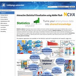
Total items listed: 112. Time to compile: 8+ hours. Looking 4 data visualization. Tableau Public. Stat eXplorer. Interactive Statistical Visualization using Adobe Flash Statistics eXplorer integrates many common InfoVis and GeoVis methods required to make sense of statistical data, uncover patterns of interests, gain insight, tell-a-story and finally communicate knowledge.

Statistics eXplorer was developed based on a component architecture and includes a wide range of visualization techniques enhanced with various interaction techniques and interactive features to support better data exploration and analysis. It also supports multiple linked views and integrated storytelling with a snapshot mechanism for capturing discoveries made during the exploratory data analysis process which can be used for sharing gained knowledge.
The eXplorer applications are available on the NCVA/LiU web site for educational and research usage only. Learn more about eXplorer through these 2 videos: Introduction to eXplorer eXplorer Data Management Explore, present and communicate Read Paper about: Statistikatlas (SCB) Weave (Web-based Analysis and Visualization Environment) Weave. Gapminder. Socrata. Visual Web Scraping and Web Automation Tool for FREE. Web-Harvest.