
How to upgrade to PHP 7 or version 5.6 on Mac OSX 10.11 El Capitan and OSX 10.6 - OSX 10.10. OSX 10.11 El Capitan ships with PHP 5.5.x and OSX 10.8 Mountain Lion ships with PHP version 5.3, there is an easy upgrade method to either the newer stable version 5.6 or an older stable PHP version or even the latest PHP version 7.

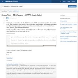
The latest PHP version in this guide is from this PHP Packaged site which is being maintained for OSX and is known as a reliable source. Download and Install PHP 5.6 Open the Terminal and issue one command – curl -s | bash -s 5.6. SourceTree + TFS Service + HTTPS: Login failed. I set up a free TFS account to test this and can reproduce the problem.

I can also reproduce it using the standard install of Git from - it appears that out of the box, TFS won't work with standard Git. However you can make it work by allowing 'Alternative Authentication Credentials' in TFS. Vertically Center Multi-Lined Text. If you only have a single word or a single line of text, there is a clever way to vertically center it in a block with CSS.

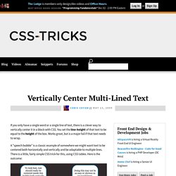
You set the line-height of that text to be equal to the height of the box. Works great, but is a major fail if that text needs to wrap. A "speech bubble" is a classic example of somewhere we might want text to be centered both horizontally and vertically and be adaptable to multiple lines. There is a little, fairly simple CSS trick for this, using CSS tables. Here is the outcome: View Demo Download Files The HTML is nothing fancy. <div class="area"><div class="bubble"><p>To look best, text should really be centered inside this bubble both vertically and horizontally.
The "bubble" we'll set to display: table;, which really doesn't do much by itself, but then we can set the <p> element inside to be a table-cell, which allows us to use the vertical-align property on it. Does the trick beautifully I think. What about IE <= 7 ?! Compass Documentation. CSS3 Please! The Cross-Browser CSS3 Rule Generator. Clagnut § Typography · CSS techniques. Text for the screen is sized with CSS in terms of pixels, ems or keywords.

As most of us know, sizing with pixels is easy: get your selector and give it a font-size – no more thought required. Sizing with keywords is more complicated and requires a few workarounds, but you’re in luck as the techniques are well documented. That leaves ems. At this point people often leg it. ‘Ems are too inconsistent,’ they say, ‘they’re too hard; they never work.’ Why ems? If the world were an ideal place, we’d all use pixels. Keyword-based text sizing will allow all browsers to resize text so this is a possibility, but I don’t find it gives me the precision that pixels would give me. Get on with it OK let’s dive into ems. This takes 16px down to 10px, which apart from being less huge is a nice round number. So this would give us a document where text in the navigation and side bar is displayed at 10px, the main content is 12px and the footer is 9px.
15 Detailed Responsive Web Design Tutorials. In the past few years the rise of mobile devices such as iPads, iPhones and other smart phones was extremely huge and that was the reason why responsive web design started to play more and more important role in the design industry.

But what is the responsive design you will ask. The idea of responsive web design, started by Ethan Marcotte, is that our websites should respond to the device that our page is shown on by adapting their layout and design to fit any device resolution. In his book “Responsive Web Design” he outlines the three parts to a responsive website: a fluid grid, fluid images and media queries. In this post I would like to share 15 useful responsive design tutorials to help you get started with responsive designing including fluid grids, fluid images and media queries. Beginner’s Guide to Responsive Web Design Beginner’s introduction to responsive design. Responsive Design in 3 Steps Techniques For Gracefully Degrading Media Queries Adaptive layouts with media queries.
Mobile.