
How to be a data journalist. Data journalism is huge.
I don't mean 'huge' as in fashionable - although it has become that in recent months - but 'huge' as in 'incomprehensibly enormous'. It represents the convergence of a number of fields which are significant in their own right - from investigative research and statistics to design and programming. The idea of combining those skills to tell important stories is powerful - but also intimidating. Who can do all that? The reality is that almost no one is doing all of that, but there are enough different parts of the puzzle for people to easily get involved in, and go from there. 1. 'Finding data' can involve anything from having expert knowledge and contacts to being able to use computer assisted reporting skills or, for some, specific technical skills such as MySQL or Python to gather the data for you. 2. 3. 4. Tools such as ManyEyes for visualisation, and Yahoo! How to begin? So where does a budding data journalist start? Play around. Junk Charts.
This post is part 2 of an appreciation of the chart project by Google Newslab, advised by Alberto Cairo, on the gender and racial diversity of the newsroom.

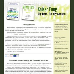
Part 1 can be read here. In the previous discussion, I left out the following scatter bubble plot. This plot is available in two versions, one for gender and one for race. The key question being asked is whether the leadership in the newsroom is more or less diverse than the rest of the staff. The story appears to be a happy one: in many newsrooms, the leadership roughly reflects the staff in terms of gender distribution (even though both parts of the whole compare disfavorably to the gender ratio in the neighborhoods, as we saw in the previous post.) Unfortunately, there are a few execution problems with this scatter plot. First, take a look at the vertical axis labels on the right side. I find this decision confounding. The horizontal axis? Here is the same chart with improved axis labels: Re-labeling serves up a new issue. Numbers Rule Your World. Two years ago, Wired breathlessly extolled the virtues of A/B testing (link).
A lot of Web companies are in the forefront of running hundreds or thousands of tests daily. The reality is that most A/B tests fail. A/B tests fail for many reasons. Typically, business leaders consider a test to have failed when the analysis fails to support their hypothesis. "We ran all these tests varying the color of the buttons, and nothing significant ever surfaced, and it was all a waste of time! " Bad outcome isn't the primary reason for A/B test failure. A visual exploration on mapping complex networks. Data journalism and data visualization from the Datablog. Information aesthetics - Data Visualization & Information Design.
40 Essential Tools and Resources to Visualize Data. One of the most frequent questions I get is, "What software do you use to visualize data?
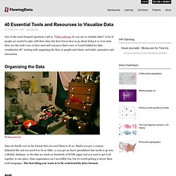
" A lot of people are excited to play with their data, but don't know how to go about doing it or even start. Here are the tools I use or have used and resources that I own or found helpful for data visualization – starting with organizing the data, to graphs and charts, and lastly, animation and interaction. Organizing the Data by sleepy sparrow Data are hardly ever in the format that you need them to be in.
PHP was the first scripting language I learned that was well-suited for the Web, so I'm pretty comfortable with it. Python Most computer science types - at least the ones I've worked with - scoff at PHP and opt for Python mostly because Python code is often better structured (as a requirement) and has cooler server-side functions. MySQL When I have a lot of data - like on the magnitude of the tends to hundreds of thousands - I use PHP or Python to stick it in a MySQL database. Data Visualization, Infographics, and Statistics. Ideas, issues, knowledge, data - visualized!
Gallery. Working with data in protovis – part 1 of 5. When I started using protovis I had only a very basic knowledge of javascript, which in theory isn’t a problem as protovis is meant to be learned by example, and as it has its own logic and structure which is different from typical javascript code.

So I started by looking and modifying examples which was enough to do basic stuff. But I soon felt limited by what hid behind a single property: data. I knew that protovis had lots of features to manipulate and process data but they were not obvious from the examples. I mean, Here, it’s pretty obvious that the bars represent the values 1, 1.2, 1.7, 1.5, 0.7 and 0.3 respectively. But protovis doesn’t usually look like this “hello world” kind of example, but rather like this: What just happened? To go beyond merely touching up examples, and do your own visualizations from scratch, it is important to get a good grip on how to feed protovis with data. Arrays, arrays, how do they work? In javascript, an array is an ordered list of stuff. d3.js. Datavisualization.