
Heuristic Evaluation, A System Checklist. By Deniese Pierotti, Xerox Corporation Heuristic Evaluation - A System Checklist 1.
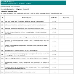
Visibility of System Status The system should always keep user informed about what is going on, through appropriate feedback within reasonable time. 2. The system should speak the user’s language, with words, phrases and concepts familiar to the user, rather than system-oriented terms. 3. Users should be free to select and sequence tasks (when appropriate), rather than having the system do this for them. 4. Users should not have to wonder whether different words, situations, or actions mean the same thing. 5. Error messages should be expressed in plain language (NO CODES). Ergonomie web: 3 principes à garder en tête pour une ergonomie e. Ergonomie web: 3 principes à garder en tête pour une ergonomie efficace de votre site Internet (PARTIE 6) Avant dernier article de la série “Les étapes détaillées pour créer un site capable de persuader et convertir ses visiteurs.”

Je considère personnellement l’ergonomie comme: 5 conseils à mettre en oeuvre pour bien écrire pour le web : Erg. Même si certains jouissent de facilités innées pour l’écriture, bien écrire pour le web s’apprend et se travaille.
Par “écrire pour le web”, j’entends des productions non littéraires comme celles que vous trouvez régulièrement dans ces colonnes. Il est même tout à fait possible, avec de l’entraînement, de pondre des articles de qualité sans aucun talent, la preuve… Je vous propose de mettre en application les cinq conseils suivants. Vous allez très rapidement gagner en qualité en structurant votre écriture, en clarifiant vos propos, et en étoffant votre argumentation. 1.
La première chose que l’on vous apprend en entrant à Science Po est la fameuse méthode Science Po, si prisée des entreprises et des administrations. Une introduction en entonnoir. 2 grandes parties. 2 sous-parties. 2 sous sous-parties dans lesquelles vous placerez à chaque fois un à deux arguments accompagnés d’un exemple. 2. Commencez vos billets par la fin : Définissez de quoi vous voulez parler. Plume Interactive. 10 Usability Nightmares You Should Be Aware Of. Advertisement Sometimes you just want to get the information you’re after, save it and move along.

And you can’t. Usability nightmares — which are rather the daily routine than an exception — appear every now and again; usually almost every time you type your search keywords in Google. In his article “Why award-winning websites are so awful1” Gerry McGovern points out that “the shiny surface wins awards, real substance wins customers” and that is absolutely true. Nevermind what design you have, and nevermind which functionality you have to offer — if your visitors don’t understand how they can get from point A to point B they won’t use your site. A clear, self-explanatory navigation,precise text-presentation,search functionality andvisible and thought-out site structure.
And that means that you simply have to folow the basic rules of usability and common sense. In this article we take a look at some of the usability nightmares you should avoid designing functional and usable web-sites. Ergophile _ analyse de l’ergonomie web. Usabilis - Conseil en ergonomie informatique (web et logiciel) Yu Blogue - Yu Centrik - Expertise en ergonomie Web et logiciel. Ergonomic Garden - sqli agency - Ergonomie Web -
Ergonoblog : veille ergonomique - Damien ANFROY.