
Wordmark.it - helps you choose fonts! Font2Web - Your Online Font Converter Converting .ttf and .otf to .woff, .eot and.svg. Better web typography in a few simple steps. Thinking with Type. 8 Definitive Web Font Stacks Article. A more traditional Garamond-based serif stack: font-family: "Palatino Linotype", Palatino, Palladio, "URW Palladio L", "Book Antiqua", Baskerville, "Bookman Old Style", "Bitstream Charter", "Nimbus Roman No9 L", Garamond, "Apple Garamond", "ITC Garamond Narrow", "New Century Schoolbook", "Century Schoolbook", "Century Schoolbook L", Georgia, serif; The Helvetica/Arial-based sans serif stack:
Revised Font Stack. Serious efforts are being made to get more typeface choices on the web to enhance web typography.
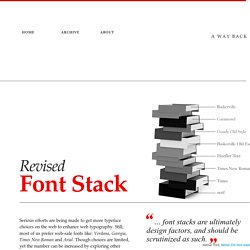
Still, most of us prefer web-safe fonts like: Verdana, Georgia, Times New Roman and Arial. Though choices are limited, yet the number can be increased by exploring other pre-installed fonts. “… font stacks are ultimately design factors, and should be scrutinized as such.” —Nathan Ford, Better CSS font stacks Baskerville, Garamond and Palatino have already been used a few times to create font-stacks that inspire.
I’ve selected 10 popular typefaces, serif and sans-serif, each from the survey. MicrosoftTahoma, Verdana, Segoe, sans-serif;Microsoft.com will be (in most cases) rendered in Verdana on Mac, and in Tahoma on Windows. Times New RomanIf we look at the above snapshots taken from Sushi & Robots’ about page, we will find that Palatino and Georgia have different x-height (and weight) than Baskerville and Garamond. Pricing - WebINK. Cool Font Pairings. Why And How To Use Icon Fonts. As great as images are, they present challenges in designing websites. They add file weight.
They require additional http requests. They don’t scale well. Sometimes the best solution for using images in a responsive design is not to use an image. Last week I offered an overview of a key problems with images in responsive design, specifically how to serve the most appropriate image to different devices. The Advantages of Icon Fonts Bitmap images don’t scale well. Fonts don’t have these problems. Icon fonts are awesome. Scale easilyChange color easilyInclude shadows easilyCan have transparent knockoutsHave good browser support in generalCan use text based css (still needs better support)Can be designed on the fly (by making changes on :hover, etc.)Can do anything image icons can do (change opacity, rotate, etc.)Have smaller file sizes since they contain fewer characters than full typeface Let’s see your bitmapped images do all that.
How to Use Icon Fonts Wrap Icon Fonts in HTML Summary. Font comparer. A complete collection of web safe CSS font stacks. Font Awesome, the iconic font designed for use with Twitter Bootstrap. Как это работает. Все работает через @import Все шрифты подключаются через импортирование стилей в ваш css. В свою очередь автор предварительно разложил шрифты по полочкам, настроил все пути, приготовил архивы и написал пару сниппетов. Алгоритм работы Было сделано предположение, что во время работы не надо отвлекаться на поиск шрифта(если его не приложил дизайнер), генерирование кита и настройку путей в проекте. Шрифт можно импортировать в проект, а по завершении работ скачать готовый кит, который и надо будет приложить к верстке и отдать заказчику. Подключение через ctrl+c ctrl+v Выбираем нужное семейство шрифтов в списке вверху страницы. Подключение с помощью сниппетов В меню справа выбираем пункт «Сниппеты».
После того, как проект закончен, вы можете перейти по предоставленной ссылке и скачать готовый кит со шрифтом. Стало:@import " ваш_каталог_со_шрифтом/fontin.css" Еще раз важно: импортируемые файлы не содержат в себе ничего, кроме @font-face и ни коим образом не могут повлиять на ваш рабочий css! Avoiding Faux Weights And Styles With Google Web Fonts. Advertisement Today, too many websites are still inaccessible.
In our new book Inclusive Design Patterns, we explore how to craft flexible front-end design patterns and make future-proof and accessible interfaces without extra effort. Hardcover, 312 pages. Get the book now! If you’re using Google Web Fonts on your websites, then there’s a very good chance that 1 in 5 visitors are seeing faux bold and italic versions of your fonts — even if you correctly selected and used all of the weights and styles. (As of 21 May 2012, StatCounter1 reports that Internet Explorer 7 or 8 was used for 19.4% of the 45 billion page views collected in February, March and April 2012.) As an experienced print and Web typographer, I embrace and use the term “font” when talking about Web fonts; it’s the term used in CSS syntax and by a myriad of Web font providers.
Faux Bold And Italic Fonts Are Stretched And Slanted Link Any designer who loves type will tell you that faux bold and italic aren’t beautiful. Nice Web Type. Good Web Fonts: Lively, subtle, perfectly legible fonts for the web.