
Infographics. Infographic: Absolute zero to ‘absolute hot’ How cold can it get on Earth?
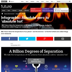
How hot can hot truly get? And, perhaps more importantly, what’s the ideal temperature a hazelnut souffle should be cooked at? All important questions, and to find out the answers we’ve created the ultimate thermometer, which takes you from absolute zero to what scientists think is the absolute heat limit. Dress appropriately. To see more infographics, click here. _m66tj9Ot1Q1r4k4dho1_r5_1280.png (426×1920) 9-Foods-That-Last-Forever.jpg (JPEG Image, 610 × 1095 pixels) - Scaled (91%) 18 Inventions By Women That Changed The World.
40 Maps That Will Help You Make Sense of the World. If you’re a visual learner like myself, then you know maps, charts and infographics can really help bring data and information to life.
Maps can make a point resonate with readers and this collection aims to do just that. Hopefully some of these maps will surprise you and you’ll learn something new. A few are important to know, some interpret and display data in a beautiful or creative way, and a few may even make you chuckle or shake your head. Science-of-happiness1.jpg (1500×8996) The Art of Complex Problem Solving.
Infographic: Get More Out Of Google. Media-5001.jpg (JPEG Image, 500×700 pixels) - Scaled (93%)