

7 reasons why Infinite Scrolling is probably a bad idea — Simple = Human. 7 reasons why Infinite Scrolling is probably a bad idea On more than one occasion I have found myself trying to convince team-mates that Infinite Scrolling and its close relative Show More is more likely to degrade the experience than improve upon it.

I thought I would jot down my notes on the matter and share them with you. Here they are: 1. The footer becomes unusable. On-Page SEO Basics. What it takes to get a page ranked on the search engines today, isn't as basic as those without much experience in search engine optimization (SEO) might think.
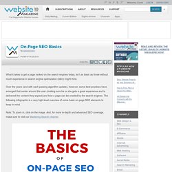
Over the years (and with each passing algorithm update), however, some best practices have emerged that center around the user (making sure he or she gets a great experience and is delivered the content they expect) and how a page can be crawled by the search engines. The following infographic is a very high-level overview of some basic on-page SEO elements to keep in mind. Note: To zoom in, click on the image. And, for more in-depth and advanced SEO coverage, make sure to visit our Mastering Search channel. Request Website Magazine's Free Weekly Newsletters view more. Usability.gov. Aarron Walter. Usability.gov. Readability: the Optimal Line Length. Having the right amount of characters on each line is key to the readability of your text.
It shouldn’t merely be your design that dictates the width of your text, it should also be a matter of legibility. The optimal line length for your body text is considered to be 50-60 characters per line, including spaces (“Typographie”, E. Ruder). Other sources suggest that up to 75 characters is acceptable. So what’s the downsides of violating this range? Too wide – if a line of text is too long the reader’s eyes will have a hard time focusing on the text. It turns out that the subconscious mind is energized when jumping to the next line (as long as it doesn’t happen too frequently, see above bullet point). In order to avoid the drawbacks of too long and too short lines, but still energize your readers and keep them engaged, we suggest keeping your text within the range of 50-75 characters per line.
Here at baymard.com we use FF Tisa Pro in size 18 for our articles. Image by m4tik. Christian Holst. The Current State Of E-Commerce Search When e-commerce search works, it’s fast, convenient and efficient.
An Extensive Guide To Web Form Usability. Advertisement Contrary to what you may read, peppering your form with nice buttons, color and typography and plenty of jQuery plugins will not make it usable.
Indeed, in doing so, you would be addressing (in an unstructured way) only one third of what constitutes form usability. In this article, we’ll provide practical guidelines that you can easily follow. These guidelines have been crafted from usability testing, field testing, website tracking, eye tracking, Web analytics and actual complaints made to customer support personnel by disgruntled users. Why Web Form Usability Is Important The ISO 9241 standard defines website usability as the “effectiveness, efficiency and satisfaction with which specified users achieve specified goals in particular environments.” Developer User Experience Tutorials. Making Infield Form Labels Suck Less.
Let me start off by saying you really shouldn’t put form labels—or even placeholder text—inside of form fields if you want to be safe.
But we can’t always play it safe. Sometimes putting labels inside of form fields is the best option we’ve got. Jeremy Fields, Steve Schoeffel, and I found ourselves making that decision on a recent project, and we set out to make the best of a tricky usability situation. Why Shouldn’t I Put Labels Inside Of Form Fields? There are a number of usability issues with putting labels inside of form fields especially if they’re not implemented well.
Text inside the field can get mixed with user input if it’s not removed from the field. If—like we did—you’ve found that infield form labels are your best option given the project requirements, there are some ways to mitigate these usability issues. Group related fields (e.g. addresses, credit card information) Clearly differentiate labels from user input Provide good visual feedback Pros: Cons: Catch common usability problems before user testing. Ideal line length for content. Date: 3 May 2003 Author: Russ Weakley Is there an ideal line length for content?
To quote a passage from “Web Style Guide – Basic design principles for creating web sites”. The ideal line length for text layout is based on the physiology of the human eye… At normal reading distance the arc of the visual field is only a few inches – about the width of a well-designed column of text, or about 12 words per line. Research shows that reading slows and retention rates fall as line length begins to exceed the ideal width, because the reader then needs to use the muscles of the eye and neck to track from the end of one line to the beginning of the next line. If the eye must traverse great distances on the page, the reader is easily lost and must hunt for the beginning of the next line. The challenge. Set Your Measure: Optimizing Line Length for Reading. This post is part of a series entitled Better Web Typography that I will be publishing over the coming months.
Widescreen monitors are quickly becoming ubiquitous and from high resolution desktop monitors down to little 13” laptops we’ve grown accustomed to designing for ample screen real estate. For many web designers this creates an overwhelming temptation to fill that space. Unfortunately, when setting blocks of type, this is often done at the readers expense. Services such as Readability, Instapaper, and Safari’s own Reader have grown in popularity in part to aid readers in overcoming this obstacle.
Simply put, though they can easily be found all over the web, long line lengths are difficult to read. In The Elements of Typographic Style, Robert Bringhurst suggests: Anything from 45 to 75 characters is satisfactory. 66-character lines are ideal.