
ddata.over-blog.com/xxxyyy/1/07/65/99/BigPresentation. Everything is a Remix. Inul-Team. YOUTH-LEADER MAGAZINE. 39 grands acteurs du changement partagent leur sagesse sur comment faire pousser des initiatives qui puissent soutenir leur besoins.
Il s’agit d’une valeur énorme... Read More L’Ecole Cela fait maintenant trois décennies que le visionnaire Russe Mikhail Shetinin révolutionne les manières traditionnelles et alternatives de concevoir... Read More Ré-émergence du langage des oiseaux à travers Twitter ? Harmoniser la configuration des interjections et exclamations avant-gardistes par Anthony Judge. Read More Journées de formation “MeToWe Academy Days” MeToWe est le mouvement d’animation de la jeunesse le plus influent sur la planète. Read More POÉSIE POSITIVE … Positv : Paradox Une poésie vraiment extraordinaire qui fait rimer changement positif avec style ! Read More Alex Grey – Visionary Artist Alex est sans aucun doute un des esprits artistiques les plus visionnaires de notre temps. Read More Animation de 10 minutes ; la vision de Jeremy Rifkin d’une civilisation empathique Read More Read More T.I.A. SimpleShow. Jonathan Jarvis » Archive » Crisis of Credit Visualized. The Short & Simple Story of the Credit Crisis Visit the Project Website » The Crisis of Credit Visualized distills the economic crisis into a short and simple story by giving it form.
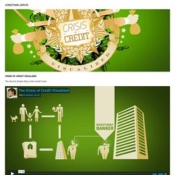
It is also argues that designers have the ability to see a complex situation, then turn around and communicate it to others. By giving graphic form to the credit crisis, it becomes comprehensible. Not only do economic activities take shape, but new relationships can emerge between these shapes. My interest in the project stems from 3 primary sources: my simple desire to understand it, diagramming work I conducted at UNICEF, and my earlier motion design work. In the summer of 2008 I was awarded a fellowship to join The Innovation Team at UNICEF in New York. After returning from New York, I realized that the earlier motion designs (see Harper’s Index in Motion & Tangible Interactions) I had done were in a sense glorified, moving diagrams. I’ve also created these print spreads from the video’s assets: The Girl Effect: The Clock is Ticking. Brain Rules for Presenters. Identity 2.0 Keynote.
17 Examples of Great Presentation Design. We can all agree that, in most cases, there's more than one way of doing something.

For example, some people default to the "loop, swoop, and pull" method when they tie their shoes, while others swear by the "bunny ears" technique. Either way you swing it, your shoes get tied, right? Trouble is, in some areas of life, different approaches don't always return the same results. When it comes to presentation design, for instance, there's no shortage of avenues you can take. And while all that choice -- colors, formats, visuals, fonts -- can feel liberating, it's important that you're careful in your selection as not all design combinations add up to success.
Download the full collection of PowerPoint presentation design examples here. We're not saying there's one right way to design your next PowerPoint presentation, but we are saying that some designs make more sense than others. 1) "The Search for Meaning in B2B Marketing," Velocity Partners 2) "You Don't Suck at PowerPoint," Jesse Desjardins.