
Great product image design ideas. Images for every color Sep 25th, 2014 If your product is available in multiple colors, have photos for each color so that your shoppers know what it will look like in the chosen color.
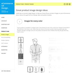
When they see visuals of the exact product they are going to get, your shoppers will get a stronger sense for the product and will be more confident that they will get what they have in mind. Show product in context. Provocation Can Lead to Emotional Design. Years ago I loaded all my belongings into my tiny sports car and prepared to head for Los Angeles.
A close friend asked me why I wanted to l leave Northern California, where I had a good job, good friends, and a nice place to live. “It’s all too comfortable here,” I told him. Progress Bars vs. Spinners: When to Use Which. By anthony on 11/15/16 at 8:13 pm How would you feel if you asked someone at the store where an item was and they just stood there?
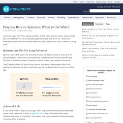
You would probably get frustrated and move on. Users find themselves in this situation when same they see a spinner on their screen for a long time. Spinners Are Not For Long Processes. What is UX Writing? There’s a new job in town.

Well, maybe not “new,” but certainly popping up with increasing frequency. Google’s looking. Amazon’s looking. Dropbox, Paypal…many of the big players in tech are now looking for User Experience Writers. Visual Weight of Primary and Secondary Action Buttons. By anthony on 07/07/11 at 9:33 pm When a user interface prompts users to take action, they’ll see at least two buttons.
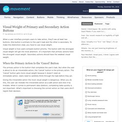
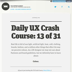
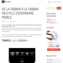
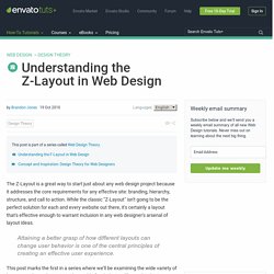
One button is primary to the user’s task and the other is secondary. To make this distinction clear, you have to use visual weight. Visual weight is how users compare button priority. The button with the strongest visual weight will get the most attention. When the Primary Action Is the ‘Cancel’ Button The primary action is the button that completes the user’s task. Giving the irreversible action the most visual weight is dangerous. How to Make Your Primary Actions Strong. 3 Design Layouts: Gutenberg Diagram, Z-Pattern, And F-Pattern. Several layout patterns are often recommended to take advantage of how people scan or read through a design. 3 of the more common are the Gutenberg diagram, the z-pattern layout, and the f-pattern layout.
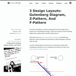
Each offers advice for where to place important information, but I think these patterns are often misunderstood and followed without thought to what they really describe. I want to walk through the what and why of each pattern and then offer something else that gives you as a designer more control over where your viewer’s eye moves across your design. The Gutenberg Diagram The Gutenberg diagram describes a general pattern the eyes move through when looking at evenly distributed, homogenous information. The Golden Rules Of Bottom Navigation Design. 13 of 31. (If you’re just starting the UX Crash Course, Start Here.)
There are a few things we can learn about colour from the 60’s-inspired Rubber Duckies above. As UX designers, we usually rock the wireframes in black-and-white. And that’s a good thing! We focus on the function, while the UI designers can focus on the style. De la Tabbar à la tabbar, un cycle d'ergonomie mobile. On le savait la mode est un cycle qui dure 20 ans.
Understanding the Z-Layout in Web Design. The Z-Layout is a great way to start just about any web design project because it addresses the core requirements for any effective site: branding, hierarchy, structure, and call to action.
While the classic "Z-Layout" isn't going to be the perfect solution for each and every website out there, it's certainly a layout that's effective enough to warrant inclusion in any web designer's arsenal of layout ideas. Attaining a better grasp of how different layouts can change user behavior is one of the central principles of creating an effective user experience. This post marks the first in a series where we’ll be examining the wide variety of layout paradigms that exist in the world of web design.
The goal: to better understand why you might choose one layout concept over another. Hamburger menu alternatives for mobile navigation – Medium. If you’re working on digital products, you have already read dozens of articles describing how and why the hamburger navigation on mobile (and desktop!)
Hurts UX metrics due of its low discoverability and efficiency. (You can read some of best articles on the topic here, here, here, and here.) Luckily, more and more sites and apps are experimenting with alternative, more efficient solutions for this very problem. None of the ideas listed here is better than the others, their viability and performance obviously depend on the content and the context. 1. If you have a limited number of sections in your website or app and users should be able to quickly switch between these sections, a tabbed navigation might be the solution.
Tabs seem to be the simplest navigation pattern, however, you need to consider a few things when designing them: Examples: LinkedIn and Google Photos. The Anatomy of a Landing Page. Marketing landing pages are composed of a group of definable elements. These building blocks represent the foundation of most pages and can be used as a guide when defining and creating your content.
Améliorez votre moteur de recherche - Capitaine Commerce. Le moteur de recherche est l’outil le plus utilisé après la navigation pour trouver un article. Son importance va croissante devant la complexité des offres et les habitudes des internautes de plus en plus influencés par Google. Ceux-ci tolèrent de moins en moins qu’un moteur ne leur fournisse pas de résultats pertinents, à tel point que certains d’entre eux préfèrent utiliser Google plutôt que le moteur interne d’un site pour aboutir à une réponse.
Toutefois, tous les moteurs de recherche ne sont pas aussi performant que Google, loin de là. Un mauvais paramétrage, une mauvaise compréhension des mots clés peuvent entraîner des résultats sans intérêts pour l’internaute et le décourager. The Rules for Modern Navigation. Websites provide access to all sorts of information. Whether we want to to learn more about an organization, purchase an item, donate to a cause, or access a resource, we’re dependent on site navigation to help us find what we’re looking for. However, many websites have navigation that just works “well enough,” allowing people to access what they need to – but after some struggle. A few best practices allow designers to create more effective, clearer navigation experiences. In his article “Navigation is more important than search,” Gerry McGovern discusses how his team “did some extensive task testing with a technical audience. 70 percent started the task by clicking on a link, 30 percent used search.”
McGovern states that people rely on navigation first because it’s easier and faster to click on links than to use search. Mega-menu design trends in ecommerce: 2014 vs 2016. Mega-menus are a mainstay of desktop ecommerce. Five years ago, we published a post dissecting 26 of these menus, back when they were relatively novel. In 2014, we revisited the topic, seeing that full-width menus with a greater number of products and featured images were en vogue. Numeric Filters: Issues and Best Practices. Numeric Sliders for Filters Numeric sliders have recently become the rage for faceted search. Sliders can add a touch of interactive fun to what many business people refer to as a boring finding interface. Note that boring user interfaces usually work extremely well, because they are intuitive and easy to use, and UX powerhouses like Amazon and Netflix do quite well without any sliders whatsoever.
That said, sliders can be helpful in some applications, because they give people tremendous filtering power when they are implemented correctly. Form Usability: 5 Requirements for Slider Interfaces. One of the observed issues: when the slider scale is linear it becomes very difficult for users to set their desired values. Here 50% of the slider width is used to control just 2% of the products, which makes the slider needlessly sensitive in the $50-$300 range where 5% of the slider width is used to control 50% of all the products. While testing 18 major e-commerce sites for our study on e-commerce filtering, one of the form interfaces that proved most problematic to the test subjects were sliders. In fact, dual-point range sliders for price and budget were misinterpreted by more than 50% of the test subjects and in general provoked numerous interaction issues.
UX Research: 3 Key Design Principles for Product Listing Information. Users select and reject products in the product listing pages based on the information available about each item. We’ve previously documented that 46% of e-commerce site have severe usability issues because they display too few product attributes in the product listings. Mobile eCommerce: How to Design UX Search – UX Planet. Sans titre. Accessible color palette builder. How To Use Conversion Optimization To Battle Shopping Cart Abandonment. Ecommerce sites have an average cart abandonment rate of 55% to 75%. Pourquoi éviter d’utiliser des fenêtres modales sur des sites mobiles – Testapic. Les fenêtres modales comptent parmi les expériences les plus frustrantes auxquelles les utilisateurs peuvent être confrontées sur des sites mobiles.
Sur un ordinateur de bureau, les fenêtres modales s’affichent sans problème au vue de la taille de l’écran. Cependant, sur le petit écran d’un téléphone portable, elles se retrouvent généralement coupées : les utilisateurs ne voient qu’une partie de la fenêtre et ne peuvent pas la quitter ni l’afficher facilement. Principles for Successful Button Design. Webdesign.tutsplus. Unbox the Web! – uxdesign.cc – User Experience Design. Progress & activity - Components - Material design guidelines. 7 enseignements pratiques tirés du eye-tracking : le F-pattern. Mobile Patterns. Question 1 - How to Find an Engagement Ring. GoodUI.