
Hans Rosling shows the best stats you've ever seen. Hans Rosling's 200 Countries, 200 Years, 4 Minutes - The Joy of Stats - BBC Four. World#$majorMode=chart$is;shi=t;ly=2003;lb=f;il=t;fs=11;al=30;st. Many Eyes. Prezi - The Zooming Presentation Editor. Create. 28 Rich Data Visualization Tools - InsideRIA. Information aesthetics. Heat Maps. A Periodic Table of Visualization Methods. Infographics Fix. Visualization (computer graphics) See also Information graphics Visualization or visualisation is any technique for creating images, diagrams, or animations to communicate a message.
Visualization through visual imagery has been an effective way to communicate both abstract and concrete ideas since the dawn of man. Examples from history include cave paintings, Egyptian hieroglyphs, Greek geometry, and Leonardo da Vinci's revolutionary methods of technical drawing for engineering and scientific purposes. Visualization today has ever-expanding applications in science, education, engineering (e.g., product visualization), interactive multimedia, medicine, etc. Typical of a visualization application is the field of computer graphics. Charles Minard's information graphic of Napoleon's march Computer graphics has from its beginning been used to study scientific problems.
Scientific visualization is usually done with specialized software, though there are a few exceptions, noted below. List of graphical methods. List of graphical methods From Wikipedia, the free encyclopedia Jump to: navigation, search There is also a list of computer graphics and descriptive geometry topics.
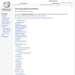
Contents [hide] Simple displays[edit] Set theory[edit] Descriptive geometry[edit] Engineering drawing[edit] Systems analysis[edit] Cartography[edit] Biological sciences[edit] Physical sciences[edit] Let's focus Export - Mapping Tools Radar visual literacy.pos. Version 2.6.
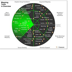
A simple and versatile visual brainstorming software supporting a variety of visual templates and methods (incl. mind mapping). www.mind-pad.com The Headcase Mind Mapper is a reasonably priced mind mapping program that - according to some reviews- is still quite buggy. www.nobox.de A comprehensive, high-quality mapping suite enabling concept and mind maps, as well as a variety of other formats, such as network diagrams or technical drawings. www.conceptdraw.com/ Supports a whole range of mapping methods, incl. Www.smartdraw.com Based on the cognitive mapping approach, Banxia's decision explorer helps group clarify their rationale and reach consensus-based decisions.
Data visualization examples. Graphics Generators.