
Detect Mobile Browsers - Open source mobile phone detection. Hosts files and the Google Android emulator. Html - Get iPhone font-size to be the same as other browsers. Welcome to dotMobi. Emulators & Simulators for Mobile Web. Finding the right tools for developing mobile web is not simple.

There is no information, and every vendor doesn’t care about mobile web developers right now. Try to look at any vendor website to see if, in the description, you can find if the SDK or the emulators works fine for mobile web testing. This post is an extract of Chapter 4 of my book “Programming the Mobile Web”. Android Emulator The Android emulator is available in conjunction with the SDK to create native Java applications for Android and it includes the browser. Nokia Emulators Nokia always had the better emulators since the beginning of mobile web development. iPhone Simulator Only available for MacOS X, the iPhone Simulator is offering a free simulation environment including Mobile Safari. The iPhone Simulator is included with the iPhone SDK for native development, available free at developer.apple.com/iphone.
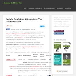
Palm Emulator Palm had emulator support for more than 10 years and always had great support on these tools. Mobile Emulators and Simulators - The ultimate guide to mobile developers. The most useful tools for mobile web are emulators and simulators.

In Chapter 4 of Programming the Mobile Web I’ve made an extensive description and installation guideline for creating a desktop mobile testing environment. And in Chapter 13, I’ve also reviewed other solutions for mobile testing, including four device remote lab solutions. I’ve mixed all this information to create this ultimate guide to 37 download resources for hundreds of emulators and simulators.
Enjoy! This list includes content from Programming the Mobile Web book with frequent updated information & links. Installation and Usage Guide In Chapter 3 there is an installation and usage guide for mobile web emulators, including how to open local files, keyboard shorcuts and proxy configuration. Emulators and Simulators Generally speaking, an emulator is a piece of software that translates compiled code from an original architecture to the platform where it is running, such as the great MAME.
Do you know any other emulator? Html - How to set viewport meta for iPhone that handles rotation properly. Tutorial: optimizing your website for mobile devices - Element Fusion. Please note: This article was created in 2009, so the screen dimensions and/or phone names might be out of date.

Since we announced our optimization of the Element Fusion website for mobile devices including the iPhone, we've had quite a few requests to share the steps that were taken to complete this task. While there are different ways to accomplish such a task, the following is a look at how we did it. NOTE: the site used in this example runs our company's own content management system for web designers, LightCMS, but the technique described here can be implemented in static websites as well as sites running on any CMS that, like LightCMS, provides you with full control over your HTML, CSS and JS. Phone considerations For our purposes, we divided all mobile devices into three categories. Devices with screens that have widths between 320 and 480 pixels, that support CSS, and that support screen media types and media queries. Design Implementation Development Testing & troubleshooting. The 5-Minute CSS Mobile Makeover. More people are surfing the Web via mobile device than ever before.

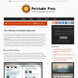
It’s just so convenient to have that mobile access to anything you need. Sadly, most websites have not yet considered their mobile visitors, who probably move on to the next site before trying to make sense of a jumbled mess. Those of you who surf the Mobile Web know exactly what I’m talking about here: sites that “get it” are a joy to visit, but those that don’t are a total pain. What’s to get? Well, for one, if you do nothing else for your mobile visitors, take five minutes and implement a basic stylesheet to make your site readable via mobile device.
You think I’m joking Before we begin, I feel it necessary to emphasize the serious need for millions of mobile makeovers. Mobile screenshots of WordPress.com, and About.com, Go.com Mobile screenshots of Alexa.com, DailyMotion.com, MediaFire.com, and Hi5.com.