
Crowd visualizations. On June 2, 2015, U.S.

Sens. Cory Booker (D-NJ) and Barbara Boxer (D-CA) introduced the Police Reporting Information, Data, and Evidence Act of 2015. Co-sponsors were Sens. Al Franken (D-MN), Ed Markey (D-MA), and Barbara Milkulski (D-MD). Short and straightforward, the PRIDE Act would fund state efforts to collect data on all police shootings and other incidents resulting in deaths or serious injuries. FatalEncounters.org is proud of our role in putting the first reliable numbers to the issue of police-involved homicides in the United States in 2013, 2014 and 2015. We support this legislation. Sen. And we’ve been effective. The introduction of the PRIDE Act is an important milestone and worth applauding. The work of Fatal Encounters, creating an impartial, comprehensive and searchable national database of people killed during interactions with law enforcement, continues. A 3D plot of the planes that flew around my house last night [OC] : dataisbeautiful.
Negative Views of New Congress Cross Party Lines : dataisbeautiful. Discover Magazine sur Twitter : "Your birth month influences your risk for certain diseases: Nadieh Bremer sur Twitter : "Wrote a small #d3js tutorial on creating transition with a "Gooey" effect for your #dataviz. Ekimetrics. sur Twitter : "How we are drinving the success of #DataScience solutions at #MachinLearning #BigData #DataViz. Brighter decisions. Kirk Borne sur Twitter : "Building Blocks of #DataScience and #Statistics: #MachineLearning, #DataViz, OR, +more: #abdsc. Building blocks of data science. Welcome.
Is your degree worth it?: It depends what you study, not where. DataHero Snags $6.1M To Democratize Data Visualization. DataHero, the SaaS company that wants to bring data visualization to non-technical end users, announced $6.1 million in Series A funding today.
It also announced a new chief executive and a partnership with Hubspot. The round was led by existing investor Foundry Group. The company also announced it was bringing on veteran executive Ed Miller, who has been CEO at several startups with successful exits including Xythos, a content management company, which was acquired by Blackboard Inc. in 2008. DataHero previously raised $4.5M in seed rounds bringing the total raised to $10.6 million. Company founder Chris Neumann will shift to the chief product officer position when Miller takes over.
DataHero is software as a service that’s designed to enable non-technical business users to build charts and graphs from a variety of pre-defined data sources such as Salesforce.com, Eventbrite or Box, among others. Emilio Ferrara sur Twitter : "Example of poor #dataviz #infoviz in recent Facebook filter bubble paper (imho). Can you tell what are the issues? Jack Levis of UPS. In anticipation of his upcoming conference keynote presentation, UPS Analytics – The Road to Optimization, at Predictive Analytics World for Business Chicago, we asked Jack Levis – Senior Director, Process Management at UPS, a few questions about his work in predictive analytics.
Q: In your work with predictive analytics, what behavior do your models predict? A: We use a tremendous number of predictive and prescriptive models at UPS. They are used to help make decisions, which range from where to build a facility and what type of aircraft to purchase to which packages go in each trailer and how to maintain our delivery fleet. We currently have 700 dedicated resources working on a system called ORION, which has been called "arguably the world's largest Operations Research Project. " With ORION, we are using analytics to determine the best way for a driver to serve our customers at the lowest cost. What Really Scares Tech Leaders About Artificial Intelligence? Gridlock vs. Bottlenecks. "Emails show [Chris Cristie]'s aides did plan bridge gridlock," says Salon.
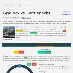
To a transportation engineer, the aides are innocent: bridges can't have gridlock. While we often say "gridlock" to mean "bad traffic," it has a technical meaning. Bottlenecks explain "standard" congestion: when more people want to use some facility (e.g., bridge, off-ramp) than it can handle at once, cars form a queue (a line).
Below, the yellow zone is a bottleneck with a low speed limit, and the queue is represented by red cars slowed down in the green zone. The queue's size depends on the arrival rate (the rate cars enter). Beer Across America. California ranks highest in all categories California ranks highest in the , as well as the highest number of places in each category.
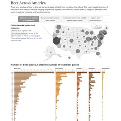
This could be because California is the most populous state. Many Coloradan brewers, fewer sellers Colorado ranks second highest in the and third in , but interestingly it only ranks eighth in the . 4 Ways Interactive Data Visualization Enhances Digital Marketing - Tech Cocktail. Gregory Piatetsky sur Twitter : "7 #HubHacks #DataVisualizations Were Showcased at #FaneuilHall #DataViz #BigData #PublicData. ?utm_content=buffer7a076&utm_medium=social&utm_source=twitter. Jeff vG sur Twitter : "In case anyone learning #DataScience #dataviz #probability #statistics #Python #complexity #topology doesn't know... The tallest buildings on each continent throughout history, visualized.
Chrome Visual History Shows You Your Surfing Habits. 50 Great Examples of Data Visualization. Wrapping your brain around data online can be challenging, especially when dealing with huge volumes of information.

And trying to find related content can also be difficult, depending on what data you’re looking for. But data visualizations can make all of that much easier, allowing you to see the concepts that you’re learning about in a more interesting, and often more useful manner. Below are 50 of the best data visualizations and tools for creating your own visualizations out there, covering everything from Digg activity to network connectivity to what’s currently happening on Twitter. Music, Movies and Other Media Narratives 2.0 visualizes music. Liveplasma is a music and movie visualization app that aims to help you discover other musicians or movies you might enjoy. Tuneglue is another music visualization service. MusicMap is similar to TuneGlue in its interface, but seems slightly more intuitive.
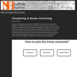
Digg, Twitter, Delicious, and Flickr Internet Visualizations. Datavisualization. Data_Visualization_101_How_to_Design_Charts_and_Graphs. Jeff vG sur Twitter : "Is this the most efficient #dataviz I've seen yet? Quite possibly. #gg #DataScience #macroproblems @hadleywickham. GitHut - Programming Languages and GitHub. Bait and Switch, A Common Ploy of Patriots and Seahawks - NYTimes.com. Creating the Dayton Weather Visualization. Randy Olson sur Twitter : "Where pictures are taken in San Francisco by tourists (red) and locals (blue): #dataviz. Locals and Tourists #3 (GTWA #4): San Francisco. André Vermeij sur Twitter : "Toyota Releases Fuel Cell Patents: What's On Offer? A Network View #dataviz #Gephi #sigmajs. Toyota Releases Fuel Cell Patents: What’s On Offer? « Kenedict Innovation Analytics. Toyota recently announced that it will make 5,680 of its patents related to fuel cells available for royalty-free use by other car manufacturers.
Much like Tesla’s move last year (when Elon Musk announced Tesla would make all its patents available for use to anyone), Toyota aims to accelerate Research & Development in next-generation vehicle manufacturing. Visualizing K-Means Clustering. January 19, 2014 Suppose you plotted the screen width and height of all the devices accessing this website.
You'd probably find that the points form three clumps: one clump with small dimensions, (smartphones), one with moderate dimensions, (tablets), and one with large dimensions, (laptops and desktops). Getting an algorithm to recognize these clumps of points without help is called clustering. To gain insight into how common clustering techniques work (and don't work), I've been making some visualizations that illustrate three fundamentally different approaches. This post, the first in this series of three, covers the k-means algorithm.
K-Means Algorithm The k-means algorithm captures the insight that each point in a cluster should be near to the center of that cluster. Data Visualization and D3.js Newsletter Issue 110. 20 new data viz tools and resources of 2014. We continue our special posts with the best data viz related content of the year, with a useful list of new tools and resources that were made available throughout 2014.
A pretty straightforward compilation that was much harder to produce than initially expected, we must say, since the number of mentions to include was way beyond our initial (poorly made) estimates. So many new options out there! So, we had a hard time gathering 20 of those new platforms, tools and resources – if you’re a frequent reader of our weekly Data Viz News posts, you’ll might recall several of the mentions in this list, -, and we deliberately left out the new releases, versions and updates of existing tools, such as CartoDB, Mapbox, Tableau, D3.js, RAW, Infogr.am and others.
Data Visualization App Using GAE Python, D3.js and Google BigQuery - Tuts+ Code Tutorial. Imagine that you have a large set of data with millions of rows and you're faced with the task of extracting information from the data.
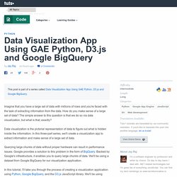
How do you make sense of a large set of data? The simple answer to this question is that we do so via data visualization, but what is that, exactly? Data visualization is the pictorial representation of data to figure out what is hidden inside the information. See The Most Beautiful Data Visualizations Of 2014. An eye-catching infographic which maps rappers according to the depth of their vocabulary won Gold for Data Visualization at the annual Kantar Information is Beautiful Awards 2014 which were announced in London on November 12. "Rappers, Sorted by Size of Vocabulary" by Matthew Daniels, a digital strategist at marketing firm Undercurrent, was created using language processing software and data from RapGenius.
Daniels then cross-referenced his findings with analysis of Shakespeare’s vocabulary—reputedly the largest, ever. (In case you’re wondering, ranked in first place is . . . Aesop Rock). 20 Free Data Visualization Tools. Data visualization simply means the creation and analysis of data represented visually. Data abstraction and representation is done in various forms with several attributes and variables serving as units of information. There are myriad of free Data Visualization Tools available over Internet, amongst them we have compiled a list of 20 Free Data Visualization Tools to serve your purpose, following tools allow end user to view all types of data and to better understand this data provided within a visually defined manner – and this is the definitive purpose of what visualization tools stand for. We hope you will find the list useful for your tasks. Enjoy !! 1. Zoho Reports is an online reporting and business intelligence service that helps you easily analyze your business data, and create insightful reports & dashboards for informed decision-making. 2.
What makes for a stable marriage? About a decade ago, the gossip on everyone’s lips was that “1/2 of all marriages in the U.S. end in divorce.” That factoid was later disproven, but it left a lasting impression on the eligible bachelors and bachelorettes of America. In an effort to not become a part of that statistic, I started doing a little research on what makes for a stable marriage in America. Earlier today, I ran across an interesting study on divorce titled ‘A Diamond is Forever’ and Other Fairy Tales: The Relationship between Wedding Expenses and Marriage Duration. The authors of this study polled thousands of recently married and divorced Americans (married 2008 or later) and asked them dozens of questions about their marriage: How long they were dating, how long they were engaged, etc. Projected Life Expectancy in Europe. R programming tips – 5 easy ways to get started in R. Introduction to the Data Visualization Tutorial – New Coder.
Data visualization is quite fun. Perhaps when you think of data visualization, you think of ugly Microsoft Excel spreadsheets with half-a$$ed graphs. This tutorial is meant to push you out of the Excel mindset just a little bit, and introduce you to the popular Python library, matplotlib. The Project The project we will create takes the sample data from the repository that you will download (a.k.a. clone) in Part 0: Setup, parse the sample data from columns and rows to a list of dictionaries, then render that data in two different graphs and in Google Maps. The sample data that is included is a snapshot of public crime filings from the San Francisco police. Goals. The Best Visualizations Of Yesterday’s Elections.
Whether or not the votes go your party’s way, election night always captures the feeling of progress. Part of that is because every two years, the media gets a little bit better at covering the event, treating us to better data science and visual journalism. This year was no different, with media like NPR and the New York Times rolling out their latest design innovations for the midterm elections. Here’s the best coverage we’ve seen from around the web. FiveThirtyEight Leading up to the election, FiveThirtyEight published a fantastic statistical interactive that teased just how likely Republicans were to take over the Senate. The Wall Street Journal The WSJ published a traditional series of U.S. election maps, in which you can toggle between the House, Senate, and gubernatorial races. Quantified Self: The Ultimate Beginner's Guideand List of the Best Personal Data Tools Out There) A transformation is happening.
People, like you, are taking control of something conventional wisdom has told us is not ours to understand: our health. Most Income Gains In Recent Expansions Went To Top 1 Percent. Most Income Gains In Recent Expansions Went To Top 1 Percent. Most Income Gains In Recent Expansions Went To Top 1 Percent. Governing the Smart, Connected City - Susan Crawford. By Susan Crawford | 12:00 PM October 31, 2014 As politics at the federal level becomes increasingly corrosive and polarized, with trust in Congress and the President at historic lows, Americans still celebrate their cities.
When Visualization Gets Spooky...3 Bewitched Data Dashboards. Something wicked has descended on the GoodData offices. Improving Health around the World. Share this presentation on Twitter - Scientists find the largest US methane 'hotspot' — from space. Scientists at NASA and the University of Michigan have used satellite data to find a huge spike in emissions of the powerful greenhouse gas, methane, over the Four Corners region of the United States.
Pip install sandwich sur Twitter : "My favorite #infographic from @pewresearch's polarization in media piece #dataviz #transmedia. Liberationtech sur Twitter : "#DataViz: how #Ebola compares to other infectious diseases h/t @Guardian... Visualised: how Ebola compares to other infectious diseases. With Ebola panic spreading, we thought it might be timely to visualise the data on the infectiousness of various pathogens. To give a universal metric for infectiousness, we’ve used the average ‘basic reproduction number’ (also ratio or rate). It’s a statistical measure of how likely and widespread an infectious disease outbreak might be - if nothing is done to control the situation. Art and Calculus. Visualoop sur Twitter : "The solar system visualized, new post by @SusanaSPereira #dataviz #space... The solar system visualized. On the 15th of October, the “Innovation by Design Awards” will take place in New York, at the conclusion of the conference with the same name.
The Journalist, The Artist And The Engineer: The Ethics Of Data Visualization by onlinenewsassociation. How 'Wee Things' Make a Big Difference in Design by ProPublica. Dance to the (Circadian) Rhythm - The Jawbone Blog. +376 Google+ Facebook Twitter LinkedIn A few months ago, Jawbone explored how people move and sleep in the cities of the world. We saw the ways that our lives are shaped by culture, work habits, and holidays, among other factors. Free Charts - Dynamic Yield Curve. Deconstructed Bird and Insect Wing Patterns by Eleanor Lutz. Watson supercomputer looks for genetic heart danger - tech - 01 October 2014. Great list of resources: data science, visualization, machine learning, big data. Oculus Rift and the future of data visualization. [WEBINAR] How to Harvest, Structure, and Visualize Big Data on the Web. AnalyticsChap : Cool article from @Tableau ... Do good with data. This Graphic Shows How Americans Spend Money In Real Time.
Iomap - Visualize Your Cloud. D3 Tutorials, Screencasts and a Newsletter. In the News: Week of 5/21/2014. How Americans Die. A Disturbing Visualization of Global Small Arms Trade. The Intricate, Beautiful Patterns of Civilization Seen From Above. Neat statistical graphics help you choose your next TV series binge. World Bank Dataviz. Design Thinking: Fight Complexity and Failure.