
Infographics & Data Visualization. OurGoods. Global Marathon 2012. Our gratitude goes out to: Our fantastic lineup of speakers: Richard Saul Wurman, Alberto Cairo, and Kim Rees.
The expert designers who answered participants questions in Q&A Broadcasts: Ben Hosken, Scott Murray, Moritz Stefaner, and Mahir Yavuz. A special thanks to Santiago Ortiz, who collected the data sets and worked with us to craft the challenges. Visualized Conference - November 8 & 9 - NYC. Mission Timeline. The Enlightened Happy Hour: An Interactive Guide to What You're Sipping. Column Five: Infographics, Data Visualization and Motion Graphics. Minutos de terror 11-S. Usain Bolt vs. 116 years of Olympic sprinters.
OlympicsMobileGrowth.jpeg (972×4281) ¿Qué es una infografía? Explicación al estilo Lego. Las infografías son herramientas que nos ayudan a entender de manera concisa y visual noticias, procesos, acontecimientos y datos relacionados con distintos temas.
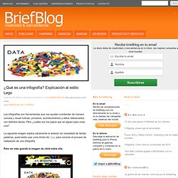
Pero ¿cuáles son los pasos que se siguen para crear una? La siguiente imagen explica claramente lo anterior sin necesidad de tantas palabras, pues basta usar unos bricks de Lego para conocer el proceso de realización de una infografía.Para ver más grande la imagen da click sobre ella. Sigue a Evelyn Castillejos Tagged como: explicación con bricks de Lego, qué es una infografía Únete a más de 3,949 lectores Registra tu email en la siguiente forma y recibe a primera hora las noticias más importantes de mercadotecnia, publicidad y medios.
Infographics and Data Visualizations by Infographic Design Team. Ever wondered how infographics are made ? If you are curious like me, you probably have. For those who do not know what I am talking about, infographics are visual representations of information, data and knowledge. Infographic Design Team is a team of over 100 designers that offers world-class infographics and data visualizations. Their infographics are so inclusive yet visually pleasing that, they clearly illustrate the usually complex issues, and users just have a smooth ride to assimilate the entire story. Infographic Design Team offers the following infographic design services : Informative & Editorial Infographic designPromotional Branded Infographic designInteractive Infographic designInfographic design for PublishersAnimated Infographic designInfographic Resume designConsultancy for the use of Infographics in various media The process of getting your infographic is really straight-forward from start (your order) to finish (your final infographic design).
How to Design an Infographic. Following up along the lines of this recent post on infographics, it seemed like a good idea to create a guide to the basics of creating an infographic.
If you’ve ever browsed the Internet, you’ve likely run across your fair share of infographics. It’s no wonder why they’re so popular. At their best, infographics are an eye-catching, compelling way to tell a visual story about complex data – a way that’s more accessible and universal than the boring, text-heavy graphs that preceded them. But at their worst, infographics leave the data behind in their haste to embrace flashy visual techniques. Sure, they look nice, but who cares if no one can understand what they mean? We’ve put together this guide to help pinpoint the best techniques as well as to illuminate what are fast becoming classic infographic pitfalls.
Keep the words to a minimum. Data Visualization and Infographics Examples and Resources. Things wordy, geeky, and webby Since taking a class that discussed Edward Tufte‘s work, I’ve been fascinated by turning information into visual data.
His site contains many examples that you could easily spend hours on the site. I have. Plus, I spent several days browsing sites with articles, resources, and examples of infovis (information visualization) in action. It’s not just about presenting data in a presentation or making things colorful. It’s a struggle for me as I haven’t practiced this process or created any charts in a long time.
Updated: 9 February 2013 ShortURL to this post: Examples 5 Amazing Infographics for the Health Conscious10 Outstanding Social Media Graphics10 Revealing Infographics about the Web10×10 is “100 words and pictures that define time.”35 Great Social Media Infographics3D Animation of Linux Code Development7 Nights of Bright Eyes article and accompanying visual analysis of Conor Oberst.AInews.org: Note the .org! Blogs Resources.
Public Data Explorer. Bank of Imagination. 20 Inspiring Uses of Data Visualization. Data is boring, information is interesting!
I’ve always used this statement whenever the issue of data is being discussed. No one is really interested in looking at a large number of data rows, or even a small one. As humans, we tend to better understand a particular issue when it is presented to us in a visual way, and in this roundup you will find 20 sites using data visualization that deliver information to the user in an effective and inspiring way. 1. BreathingEarth.net A real-time simulation displaying the CO2 emissions, birth and death rates of every country. 2.
A web application that visually reflects the constantly changing landscape of Google News. 3. Create typographic maps of current news stories by doodling on a blank canvas. 4. An overview of currently popular items on social news sites such as delicious, reddit, and digg. 5. digg labs 5 visualizations of Digg community’s activities.