Find Sets and MOCs to Build. Typewar. Handpicked free fonts for graphic designers with commercial-use licenses. 5 Use Cases for Icon Fonts. The following is a guest post by Tim Pietrusky.
Tim knows this site has long been a proponent of using fonts for icons, and had his own interesting use cases to share. While creating the demos, to make things easier for himself, he created a free service for icon font hosting. It makes for a nice gift to the community as well. I'll let him tell you about it... Icon fonts are great: You can CSS the crap out of them and they don’t mindThey look good on any display or resolutionThere is only one HTTP request for any size set of icons Let's look at 5 typical uses cases for icon fonts. Before we start We won't be using any vendor prefixes to keep the example code clean and readable. As you will see in the examples, I use the icon fonts hosting service weloveiconfonts.com. 1. There are quite a few awesome, pure CSS loaders out there and you can even create your own at cssload.net.
This is the basic HTML. Import the icon font Fontelico into your CSS: FontLister: The fastest font manager on Windows. Web Fonts. Revised Font Stack. Serious efforts are being made to get more typeface choices on the web to enhance web typography.
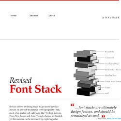
Still, most of us prefer web-safe fonts like: Verdana, Georgia, Times New Roman and Arial. Though choices are limited, yet the number can be increased by exploring other pre-installed fonts. “… font stacks are ultimately design factors, and should be scrutinized as such.” —Nathan Ford, Better CSS font stacks Baskerville, Garamond and Palatino have already been used a few times to create font-stacks that inspire. I’ve selected 10 popular typefaces, serif and sans-serif, each from the survey. MicrosoftTahoma, Verdana, Segoe, sans-serif;Microsoft.com will be (in most cases) rendered in Verdana on Mac, and in Tahoma on Windows.
Times New RomanIf we look at the above snapshots taken from Sushi & Robots’ about page, we will find that Palatino and Georgia have different x-height (and weight) than Baskerville and Garamond. Shape Type, the letter shaping game. Kern Type, the kerning game. The Typography of Sanborn New York City Maps. NEW YORK Staten Island.
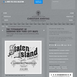
Atlas 159, 1885 BROOKLYN New York. Atlas 80. Vol. 6, 1888 Variations of this design appeared between 1886 and 1988. NEW YORK Brooklyn Suburbs. Insurance maps of the city of NEW YORK 1896 Variations of this design appeared between 1894 and 1902. Insurance maps of the Borough of Richmond. Borough of Queens. NEW YORK Manhattan 1905 The same design was used for the maps of The Bronx. WhatTheFont! IP. RM Regular. How to prevent uneven linespacing when subscripts or superscripts are used on web pages. The problem The use of subscripts (sub markup) or superscripts (sup markup) tends to make lines of texts unevenly spaced on web pages.
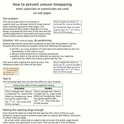
The seriousness of the problem depends on many things, including the font face of the text and the vertical alignment of subscripts and superscripts. These factors partly depend on the browser. Solution: kill vertical-align, do positioning Several approaches have been proposed to deal with the problem, but the simplest and most effective appears to be the following CSS approach: set the vertical-align property of subscripts and superscripts to zero (or, equivalently, to the value baseline) declare those elements as relatively positioned position them in the vertical direction as desired, e.g. lowering subscripts by 0.8ex and raising superscripts by 1ex.
This works well, making line spacing even. Test it! The following table lets you test the effect on your browser. Making the spacing large enough Additional notes Choosing the displacement The unit ex. Styler la balise <hr /> La balise <hr> (ou <hr /> en XHTML), qui signifie horizontal rule, est une règle horizontale servant de séparation, pouvant marquer un changement notable dans le contenu.
L'une de ses utilisations courantes est de marquer la fin de blocs flottants grâce à la propriété clear qui lui permet de gérer les débordements dûs aux positionnements flottants. Styler la balise <hr> Le premier problème à contourner est alors celui de la décoration de la balise <hr> puisque les différents navigateurs ne sont pas d'accord entre eux. Certains liens anglophones sont alors bien utiles : On y apprend, entre autre, que la couleur de la règle se définit soit par la propriété color, soit par background-color.
Un exemple concret ? Abréviations sur le web, balisage sémantique et exemples de code. Les règles typographiques de la langue française sont merveilleuses, riches et alambiquées à la fois.