
Why You Should Never Center or Right Align Your Logo. Many designers assume that center or right aligning their website logo will make their brand more memorable.
Research has shown this assumption is not true at all. In fact, straying from a left aligned logo can make your brand less memorable and even your site harder to navigate. Right Aligned Logos Weaken Brand Recall A study conducted by the Nielson Norman group concluded that more users remember brands when their logos are placed on the left rather than on the right.
They found the “average lift in brand recall was 89%” when the logo is on the left. When users scan sites, their visual gaze leans toward the left. Centered Logos Impede Navigation to Homepage. UI Movement - The best UI design inspiration, every day. A Study of Homepages Over Time – Sourcerer Blog. As a student of history, I’m a firm believer that one of the most efficient ways in moving forward is by first understanding the past.
This has and will always be something that I carry with myself into my professional life. Specifically speaking, I find that there is a lot of value when creating a product to understand/visualize/contemplate the changes, experiments, and decisions of others as it pertains to their user interface and experience online or within an app. Because of this, I view the waybackmachine as an invaluable tool in my product creation process.
I will even go as far as saying it’s required homework before bringing any idea/concept to the table. Building A Large-Scale Design System: How A Design System Was Created For The U.S. Government (Case Study) Components. Making Your Design Optically Perfect - Rafal Tomal. HTML5 UP! Responsive HTML5 and CSS3 Site Templates.
How to construct a design system – freeCodeCamp. Designing a style palette Before we can start designing shiny components, we need to lay the foundations for those components.
We need to break the product down into its most bare-bones form. Even the simplest heading component is a collection of multiple reusable styles… We need to break things down until we reach the irreducible minimum; the most essential styles. A good place to start is the full list of CSS style properties. When we’re finished, not a single style should exist in our product that has not been predefined in our global style palette. Colour Let’s start with the most obvious style property — the only style property it seems modern design tools understand can be named, stored and reused: colour. For our primary brand colour, let’s choose blue. Utilising colour to communicate success and failure is a common design pattern, so let’s add green and red to our colour palette for that purpose. Lastly, we need some grey colours. Colorado Minimal GUI: 150+ items. Colorado is a minimal GUI that offers a breath of fresh air, designwise, being clean, very basic but appealing and eye catching at the same time.
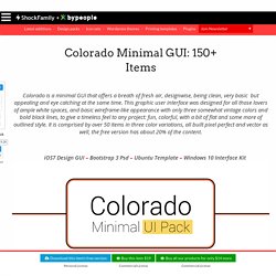
This graphic user interface was designed for all those lovers of ample white spaces, and basic wireframe-like appearance with only three somewhat vintage colors and bold black lines, to give a timeless feel to any project: fun, colorful, with a bit of flat and some more of outlined style. It is comprised by over 50 items in three color variations, all built pixel perfect and vector as well, the free version has about 20% of the content. iOS7 Design GUI – Bootstrap 3 Psd – Ubuntu Template – Windows 10 Interface Kit.
Adapting To A Responsive Design (Case Study) Advertisement.
Free minimal logos – free minimal logos for both personal and commercial use! How To Use Shadows And Blur Effects In Modern UI Design. When you examine the most successful interaction designs of recent years, the clear winners are those who provide an excellent functionality.
While functional aspect of a design is key to product success, aesthetics and visual details are equally important — particularly how they can improve those functional elements. In today’s article, I’ll explain how visual elements, such as shadows and blur effects, can improve the functional elements of a design. If you’d like to try adding these elements to your designs, you can download and test Adobe XD1 for free and get started right away. Shadows And User Interface Discoverability Link There’s a reason GUI designers incorporate shadows into their designs — they help create visual cues in the interface which tell human brains what user interface elements they’re looking at. Design Affordance Link Since the early days of graphical user interfaces, screens have employed shadows to help users understand how to use an interface. Blur Effects Link. TinyFaces □□□□□□ - Avatars & Random data for your designs. Untitled. Hey Hollywood: Mit diesen 10 Flimposter-Klischees macht ihr euch nur noch lächerlich.
Redesigning The Paris Metro Map. Advertisement Meet the new Sketch Handbook, our brand new Smashing book that will help you master all the tricky, advanced facets of Sketch.
Stop Using Arial & Helvetica. Arial and Helvetica are the default font stack for most browsers and for most of the websites.
That's bad, really really bad. Arial and Helvetica suck on web and for paragraphs of text - they are unreadable (as compared to many other typefaces created specifically for web). And Helvetica looks ugly without proper kerning and Arial is just an ugly bastard son of Helvetica. Understanding the Critical Rendering Path. When a browser receives the HTML response for a page from the server, there are a lot of steps to be taken before pixels are drawn on the screen.
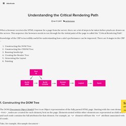
This sequence the browsers needs to run through for the initial paint of the page is called the "Critical Rendering Path". Knowledge of the CRP is incredibly useful for understanding how a site's performance can be improved. More Than Just Pretty: How Imagery Drives User Experience. Advertisement Meet the new Sketch Handbook, our brand new Smashing book that will help you master all the tricky, advanced facets of Sketch.
Filled with practical examples and tutorials in 12 chapters, the book will help you become more proficient in your work. Infinite Scrolling: Let's Get To The Bottom Of This. Advertisement. Beyond The Button: Embracing The Gesture-Driven Interface. Advertisement Today, too many websites are still inaccessible. Social Media Image Sizes Infographic for 2017. For creatives, social media is all about crafting a personal bond with your audience through your work, but with the ever-changing layouts your bond can become fuzzy. Social media is a sea of likes, shares, retweets and hashtags with a constant bombardment of quick-scroll visual imagery. There are few strategies that are as effective at conveying a brand personality, than a well-used image. The digital face of your brand is often the first thing your audience sees and it might be the one thing they remember, and it might be for the wrong reason. [Rewind: 30 ESSENTIAL TOOLS AND FEATURES IN PHOTOSHOP CC]
Flat Design: History and Modern Practice.
Colors. Icons. Pictures. Bootstrap Themes. Placeholders & Lorem Ipsum.