
The EU Provenance Project. Using VisTrails and Provenance for Teaching Scientific Visualization - Silva - 2010 - Computer Graphics Forum. Enhanced PDF available Options for accessing this content: Type your institution's name in the box below.

If your institution is a Wiley customer, it will appear in the list of suggested institutions and you will be able to log in to access content. Some users may also log in directly via OpenAthens. Please note that there are currently a number of duplicate entries in the list of institutions. Registered Users please login: Access your saved publications, articles and searchesManage your email alerts, orders and subscriptionsChange your contact information, including your password Please register to: Save publications, articles and searchesGet email alertsGet all the benefits mentioned below! Register now > Provenance Visualization and Usage. The task in this project is to incorporate provenance information in the visual data analysis workflow.

This includes the acquisition and visualization of provenance data as well as the usage of the obtained information to improve navigation and data retrieval. The typical working process in visual data analysis projects leads to a large and steadily increasing number of datasets and visualizations. The first step towards a provenance-based project management is the capturing of the provenance information for every data and visualization object. We want to integrate this functionality in Amira, based on the specification proposed by the Open Provenance Model. Data visualization primer: What they are and why they're important. Acquiring data is no longer a problem.

It's everywhere, and we're already quite adept at hoarding it in databases. The issue now is making sense of all those signals and finding stories in the stream. That's where visualizations come in. Whether you're dealing with a static graph or a real-time data wave, the act of seeing data unlocks much of its utility. Ben Fry, an author and speaker at next week's Making Data Work online conference, has been studying and furthering visualization for years.
How do you visualize too much data? We live in the data deluge era.

You can hear it everywhere: massive databases, thousands of organizations taking decisions based on their data, millions of transactions executed every second. Fast and large. Massive and relentless. Do you think it’s hard to find examples of databases with a million items? No, it’s not. But wait a moment … how do you visualize a million items? Visualization is being developed fast and I love the way this whole community is pushing forward to create more and more clever designs.
When is data too much? It’s not easy to define when data is too much. We can intuitively say that data is too much simply when it doesn’t fit the screen. But if the limit is the number of pixels then, what if we just increase the number of pixels according to the size of the data we want to visualize? Why Is Data Visualization So Hot?
Noah Iliinsky is the co-author of Designing Data Visualizations and technical editor of, and a contributor to, Beautiful Visualization, published By O’Reilly Media.

He will lead a Designing Data Visualizations Workshop at O’Reilly’s Strata conference on Tuesday, Feb. 28. The Importance of Data Visualization. No votes for this yet Dashboards are a powerful tool when the right metrics are displayed.

But it is equally important to properly visualize the metrics. Great Data Visualization Tells a Great Story. Think of all the popular data visualization pieces out there - the ones that you always hear in lectures, read about in blogs, and the ones that popped into your head as you were reading this sentence.

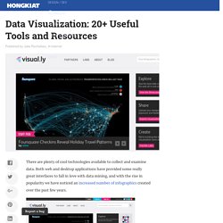
What do they all have in common? They probably all told a great story. Maybe the story was to convince us of something, compel us to action, enlighten us with new information, or force us to question our own preconceptions. Data Visualization: 20+ Useful Tools and Resources. There are plenty of cool technologies available to collect and examine data.

Both web and desktop applications have provided some really great interfaces to fall in love with data mining, and with the rise in popularity we have noticed an increased number of infographics created over the past few years. Today we’ll be looking into some really cool and popular online resources for data visualization. You can see all kinds of data like human population, world condition and even human emotion presented via the visualization. While some of the visualization might be experimental, all of them have one similarity: they help you understand the data better, and this is exactly what visualization is for. If you’ve designed your own infographic or visualization tool we’d love to check it out. Recommended Reading: More Infographic related posts. Better World Flux. Provenance: From e-Science to the Web Of Data. Data Visualization: Modern Approaches.
About The Author Vitaly Friedman loves beautiful content and doesn’t like to give in easily. When he is not writing or speaking at a conference, he’s most probably running … More about Vitaly Friedman … Data presentation can be beautiful, elegant and descriptive. There is a variety of conventional ways to visualize data - tables, histograms, pie charts and bar graphs are being used every day, in every project and on every possible occasion.
However, to convey a message to your readers effectively, sometimes you need more than just a simple pie chart of your results. Data presentation can be beautiful, elegant and descriptive. So what can we expect? Let’s take a look at the most interesting modern approaches to data visualization as well as related articles, resources and tools. 1. Trendmap 2007 Informationarchitects.jp presents the 200 most successful websites on the web, ordered by category, proximity, success, popularity and perspective in a mindmap. Stanford Visualization Group. David McCandless: The beauty of data visualization.