
A thing from alwaystwisted.com. PSD Grid Templates. What's this?
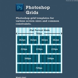
It's a collection of PSDs with predetermined grids for common design scenarios. Each template contains a columnar grid defined with guides and overlays. Chosen - a JavaScript plugin for jQuery and Prototype - makes select boxes better. Chosen is a jQuery plugin that makes long, unwieldy select boxes much more user-friendly.

Downloads Project Source Contribute Standard Select Turns This. LESS Elements: a collection of useful LESS mixins. iPad/iPhone/mobile HTML/CSS template for web apps (responsive, no javascript) iPad/iPhone template made in pure HTML and CSS (no JavaScript needed) that works perfectly on any modern browser (iPad (including iPad 3), iPhone, tablets, mobiles, laptops, etc.).
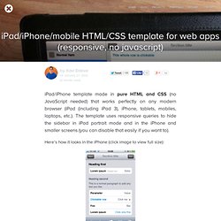
The template uses responsive queries to hide the sidebar in iPad portrait mode and in the iPhone and smaller screens (you can disable that easily if you want to). Here’s how it looks in the iPhone (click image to view full size): MQFramework. Webbyrå Norrköping Angry Creative. Download foneFrame mobile web framework. Preboot.less by Mark Otto. Mixins Mixins are basically supercharged includes for CSS, allowing you to combine a set of rules into one.
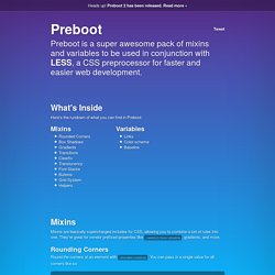
They're great for vendor prefixed properties like -webkit-box-shadow, gradients, and more. Rounding Corners Round the corners of an element with .border-radius. You can pass in a single value for all corners like so: Or get fancy with it and selectively apply rounding to certain corners: .border-radius(3px,3px,0,0); Box (Drop) Shadows Give any element some depth in all the best browsers with a single rule. Gradients Take any two colors and turn them into a most bodacious gradient of awesome. #gradient > .vertical(#333,#000); #gradient > .horizontal(@blue,@red); Two colors not enough? #gradient > .vertical-three-colors(#777,#333,.25,#000); #gradient > .vertical-three-colors(@blue,@red,@purple); Go easy on those three color gradients though—they can get out of hand quick. Transitions Elegantly transition elements in style with a single rule. Simple Clearfix .container { .clearfix; } Font Stacks.
Unique variations on a 3×4 grid. Presentation tool based on the power of CSS3 transforms and transitions in modern browsers. Bear CSS - Helping you build a solid stylesheet foundation based on your markup. LESS Elements: a collection of useful LESS mixins. Vladocar/Box-CSS-Framework. Handlebars.js: Minimal Templating on Steroids. Dust. Dust is a JavaScript templating engine designed to provide a clean separation between presentation and logic without sacrificing ease of use.
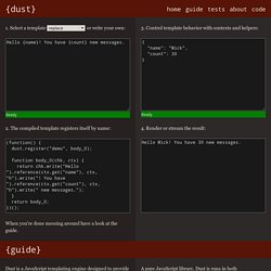
It is particularly well-suited for asynchronous and streaming applications. Syntax Dust templates use two types of tags: keys and sections. Keys reference fields within the current view context. You can think of them as placeholders that allow the context to insert data into the template. Keys To reference a key from the view context within the template, enclose the key in curly braces. Hello {name}! And the following view context: The resulting output would be: Hello Fred! If the name key cannot be found in the view, Dust outputs an empty string: Hello !
Generally, Dust casts whatever values it finds to strings. Filters By default, the content of all key tags is HTML escaped, so assuming the name key above resolves to a dangerous script tag: <script>alert('I am evil! ') This would be rendered as: Hello {name|s} Hello {name|s|h|u} Sections.
Fluid Baseline Grid - A sensible HTML5 and CSS3 development kit. Skeleton: Beautiful Boilerplate for Responsive, Mobile-Friendly Development. Magazine Grid. It's an ultramodern CSS-Framework which comes with common magazine design elements such as pagination, gutters and of course a basic grid.
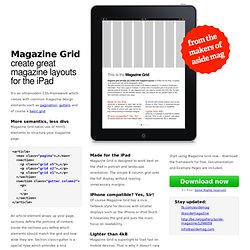
More semantics, less divs Magazine Grid takes use of html5-elements to structure your magazine page. Gridpak - The Responsive grid generator. Golden Grid System. GGS was my next step after Less Framework.
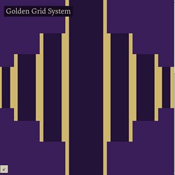
Instead of a fixed-width grid, it used a fully fluid-width one, without even a maximum width. The resources it was published with are still available on GitHub. The idea was to take a 18-column grid, use the outermost columns as margins, and use the remaining 16 to lay elements out. On smaller screens the 16 columns could be folded into 8, 4 and 2. This behaviour was inspired by Massimo Vignelli's Unigrid system. The Heads-Up Grid. Responsive web design, as described/defined by Ethan Marcotte anyway, is the act of creating various forms of the same basic site design that are optimized for different ranges of browser window widths. Luckily, the way that I originally constructed the Heads-Up Grid made it relatively easy to adapt to the needs of responsive web design. You can quickly and easily define as many different grids as you need by way of basic JavaScript conditional statements. Even if you are not extremely comfortable with JavaScript, if you are ambitious enough to tackle responsive web design you will most likely have no problem figuring this out.