
All Websites, page four — siteInspire. Unouplus. A.H.A. Design. One Design Company – Chicago Web Design. Sketchy - iOS 8 compatible wireframe kit. The Elements Of The Mobile User Experience. Advertisement Mobile users and mobile usage are growing.
With more users doing more on mobile1, the spotlight is on how to improve the individual elements that together create the mobile user experience. 4 tools that enable small town designers to sell an idea to companies like Coca Cola. “Tools like FROONT, Webflow, Adobe Edge Reflow and Macaw enable small town designers to sell big ideas to Coca Cola.

Making advanced web prototypes, which you can show on different devices is pretty simple and it comes across much better than traditional pen and paper - you do not have to imagine anything and by that you save both you and your client time. Show it – don’t tell it.” says designer from Denmark Kasper Friis Jørgensen. "My love towards design began when I started to work for Saatchi & Saatchi in 2003.
Web design has changed a lot since then and also the type of work a designer does. However the problem has always been that you make a mockup and when it comes back from the programmer, you see that there are 10 pixels off in some places. Good web design is about guiding users through the site. I see that society is getting more and more visual. Everybody can make a working website - even your mom. It is not hard to make a website now. Webflow Adobe Edge Reflow Macaw. Navigating the Mobile Application: 5 UX Design Patterns.
Photo credits Perhaps the most important thing to keep in mind when designing a mobile application is to make sure it is both useful and intuitive.
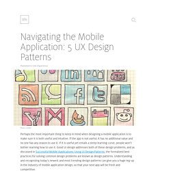
If the app is not useful, it has no additional value and no one has any reason to use it. If it is useful yet entails a steep learning curve, people won’t bother learning how to use it. Navigating the Mobile Application: 5 UX Design Patterns. Designing for Mobile Part 3: Visual design. As a direct response to platform capabilities, the first mobile sites were an exercise in ‘compromise’ rather than ‘craft’.
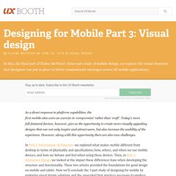
Today’s more full-featured devices, however, give us the opportunity to create more visually appealing designs that can not only inspire and attract users, but also increase the usability of the experience. However, along with this opportunity there are also new challenges. In Part 1: Information Architecture we explored what makes mobile different from desktop in terms of physicality and specifications; how, where, and when we use mobile devices; and how we behave and feel when using these devices.
Then, in Part 2: Interaction Design we looked at the impact these differences have when developing the structure and functionality. Designing for Mobile, Part 2: Interaction Design. My first mobile phone, a Nokia 5110 (purchased in 1998!)
, offered very few features: I could call, text or play Snake. What’s more, these interactions were completely controlled by the manufacturer. With the advent of smartphones, touch screens, and “app stores,” however, the opportunities for designers are now innumerable. It’s incumbent upon us to familiarize ourselves with the conventions of this still-relatively-new medium. Welcome to Designing for Mobile, Part 2: Interaction Design. Part 1 concluded with an exploration of information architecture in the mobile context.
Most modern, mobile devices employ touch screens; which provide their own set of opportunities and constraints. Designing for mobile ergonomics requires that we pay attention to device dimensions as well as the pragmatic concerns of touch screens. Hit areas, or “areas of the screen the user touches to activate something” require adequate space for the user to accurately (and confidently) press. Main navigation. Designing for Mobile, Part 1: Information Architecture. Around 1993, my dad brought home a large, brick-shaped mobile phone.
We were all incredibly excited by the new technology, even though none of us thought it would have a massive impact on our lives. I actually still thought of it as a gimmick, a few years later, when some of my friends decided to purchase them. Today there are six-billion mobile subscribers in the world – meaning if there were one mobile per owner then 87% of the world’s population would have one. And considering that fewer than three billion people use a desktop computer, that’s quite a big difference. Mobile devices are clearly here to stay, and along with them come a whole host of new constraints (and opportunities) for our designs. Red Ant and Samsung showcase truly seamless shopping at Westfield - Red Ant.
As the mobile channel matures and technologies develop, so too does the field of Mobile User Experience.
Good UX is what separates successful apps from unsuccessful ones, and lets small upstarts take on big brands by creating more compelling apps. Below, I'll share ten quick tips that will help you on the way to great mobile design. Even if you're not involved in the actual design process, knowing these concepts will still help you come up with better concepts and give better feedback to those who do the work.